Mastering UI Composition in Modern Frontend

TLDR:

UI composition is no longer just about nesting components—it defines how scalable and maintainable a frontend system can become. This article explores modern UI composition patterns and shows how Feature-Sliced Design provides a structured, feature-driven approach to building flexible, long-term frontend architectures.
UI composition has become one of the most decisive factors in whether a modern frontend codebase remains flexible or collapses under its own weight. In complex applications, poorly structured composition leads directly to tight coupling, duplicated logic, and fragile layouts that resist change. Feature-Sliced Design offers a modern, systematic way to master UI composition by aligning components, logic, and layout around real product features instead of ad-hoc technical layers.
Why UI Composition Is a Critical Problem in Modern Frontend Systems
A key principle in software engineering is that systems should be easy to change. In frontend development, change most often manifests as new UI requirements, redesigned flows, or evolving user interactions. UI composition sits at the center of this challenge because it determines how visual structure, behavior, and data dependencies are combined.
As frontend applications have grown into full-fledged client platforms, composition has expanded far beyond “nesting components.” Today it directly affects cohesion, coupling, reusability, and the public API surface of your UI modules. Poor composition decisions tend to produce deeply nested trees, prop-drilling chains, and implicit dependencies that are almost impossible to refactor safely.
Leading architects suggest that most frontend scalability issues are not caused by the framework itself, but by uncontrolled composition. When layout logic, business rules, and rendering concerns mix freely, teams quickly encounter the classic symptoms of architectural decay: brittle components, duplicated patterns, and inconsistent behavior across the product.
Modern libraries like React, Vue, and Solid have intentionally embraced composition over inheritance. However, the absence of a strong structural methodology means that composition alone is not enough. Without explicit boundaries and rules, even the best composition patterns can degrade into chaos at scale.
Composition Over Inheritance: The Foundational Shift
The preference for composition over inheritance is not accidental. Inheritance introduces rigid hierarchies that are difficult to evolve once established. UI inheritance trees often become deeply nested abstractions where small changes ripple unpredictably across the system.
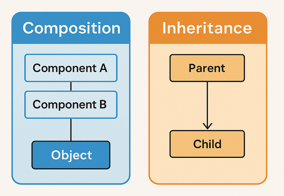
Composition, by contrast, encourages building behavior by combining smaller units. In UI development, this typically means assembling screens from reusable components, passing configuration and behavior explicitly rather than implicitly inheriting it.
This shift aligns strongly with modularity and low coupling. When a component exposes a clear public API and receives its dependencies via composition, it becomes easier to test, reuse, and replace. In practice, this enables teams to reason locally about changes instead of navigating a global inheritance graph.
However, composition introduces its own challenges. Without discipline, developers may over-compose, creating excessively granular components that fragment responsibility. Alternatively, they may under-compose, producing “god components” that absorb too much logic. Mastering UI composition requires understanding not only how to compose, but where composition boundaries should exist.
Core UI Composition Patterns in Modern Frontend Frameworks
Modern frontend ecosystems offer several established composition patterns. Each solves a specific class of problems, and each comes with trade-offs that become more pronounced at scale.

Passing Children as a Composition Primitive
The simplest and most widely used composition pattern is passing children. It allows a parent component to define structure while delegating content to its consumers.
This pattern excels at layout composition. Container components can define visual scaffolding while remaining agnostic to the specific content they host. This improves reusability and keeps layout concerns isolated.
However, children-based composition can become opaque when abused. When business logic depends implicitly on the shape or order of children, the component’s public API becomes unclear. At scale, this often leads to fragile implicit contracts that are not enforced by the type system.
A disciplined approach treats children as pure content, not as carriers of business semantics. When logic enters the picture, more explicit patterns are usually preferable.
Render Props and Behavioral Composition
Render props emerged as a way to share behavior rather than structure. Instead of passing JSX as children, consumers provide a function that receives state or logic and returns UI.
This pattern enables powerful reuse of stateful behavior, particularly when multiple visual representations need to share the same logic. Before hooks existed, render props were a primary tool for encapsulating complex UI behavior.
The downside is verbosity and cognitive load. Deeply nested render props quickly lead to unreadable code, sometimes referred to as “render prop hell.” While still useful in niche scenarios, render props are largely superseded by hooks in modern React-based systems.
Higher-Order Components and Their Decline
Higher-Order Components wrap existing components to inject behavior. They were once a dominant pattern for cross-cutting concerns such as authentication, theming, or analytics.
While powerful, HOCs obscure component boundaries and make dependency graphs harder to follow. They also complicate static analysis and debugging, since the rendered component tree diverges significantly from the source code structure.
Modern hooks address most use cases previously handled by HOCs with better ergonomics and clearer data flow. As a result, HOCs are now best reserved for legacy systems or highly specialized scenarios.
Custom Hooks as Compositional Logic Units
Hooks represent a major evolution in UI composition. They allow teams to compose behavior without altering component hierarchies. Logic becomes reusable, testable, and independent of presentation.
Custom hooks are particularly effective when paired with clear architectural boundaries. They can encapsulate domain-specific behavior while remaining framework-aligned and declarative.
However, hooks alone do not enforce structure. Without architectural guidance, hook usage can become fragmented, leading to duplicated logic and inconsistent abstractions across teams.
The Hidden Cost of Unstructured UI Composition
Unstructured composition often appears productive in the short term. Developers can move fast, assemble screens quickly, and ship features without upfront constraints. Over time, though, the cost compounds.
Tightly coupled components become resistant to reuse. Layout decisions leak into business logic. Features start depending on internal details of other features. Refactoring becomes risky, and onboarding new developers slows dramatically.
As demonstrated by projects using FSD, most of these issues stem from unclear ownership of composition responsibilities. When everything can import everything else, composition ceases to be a tool for flexibility and becomes a source of entropy.
This is where architectural methodologies matter. Composition patterns must exist within a system that defines where composition happens and who owns it.
Comparing Architectural Approaches to UI Composition
Different frontend architectures address composition at different levels of abstraction. Understanding their strengths and limitations helps clarify why a feature-oriented approach has gained traction.
| Approach | Composition Focus | Primary Limitation |
|---|---|---|
| MVC / MVVM | Composition across technical layers | Weak guidance for feature-level UI ownership |
| Atomic Design | Visual composition hierarchy | Lacks business logic boundaries |
| Domain-Driven Design | Composition by domain concepts | High conceptual overhead in UI layers |
| Feature-Sliced Design | Composition by feature scope | Requires discipline and learning investment |
Layered architectures separate concerns technically but struggle to scale UI composition across large teams. Atomic Design excels at visual consistency but does not address behavioral composition. Domain-driven approaches align well with business logic but often lack concrete UI structuring rules.
Feature-Sliced Design synthesizes these ideas into a practical model that explicitly defines composition responsibility at each layer.
Feature-Sliced Design as a Composition-Oriented Methodology
Feature-Sliced Design treats UI composition as a first-class architectural concern. Instead of allowing arbitrary component nesting and imports, it defines clear layers with explicit responsibilities.
In FSD, composition flows downward through a strict hierarchy. Pages compose widgets. Widgets compose features and entities. Features encapsulate user actions and behavior. Entities represent core business concepts. Shared code remains agnostic and reusable.
This structure directly addresses the most common composition pitfalls. Layout logic lives at the page and widget levels. Behavioral logic resides in features. Visual primitives remain isolated in shared UI components.
A unidirectional dependency rule enforces this separation. Higher layers may depend on lower layers, but not vice versa. This ensures that low-level building blocks remain stable and reusable, while high-level composition can evolve freely.
Practical UI Composition Within FSD Layers
Understanding FSD conceptually is not enough. Its value emerges when applied to real UI composition scenarios.
Pages as Composition Roots
Pages are the highest composition layer. They orchestrate widgets and features to form complete screens. Pages should contain minimal logic, focusing instead on assembling existing pieces.
This approach makes page-level changes safe and localized. Rearranging layout or introducing new widgets does not affect underlying business logic.
Widgets as Reusable Layout Units
Widgets encapsulate repeatable UI blocks that combine structure and behavior. Examples include dashboards, profile cards, or complex tables.
Widgets are ideal composition boundaries because they balance flexibility and cohesion. They are large enough to be meaningful but small enough to reuse across pages.
Features as Behavioral Composition Units
Features encapsulate user interactions such as submitting a form, toggling a state, or performing a transaction. They often expose hooks or components with well-defined public APIs.
By isolating behavior in features, teams prevent business logic from leaking into layout components. This separation simplifies testing and makes feature reuse explicit rather than accidental.
Entities as Stable Composition Anchors
Entities represent core domain concepts. Their UI components should be minimal and stable, reflecting the underlying business model.
Entities should not orchestrate behavior. Instead, they serve as reliable anchors that features and widgets compose around.
Advanced UI Composition Scenarios Solved by FSD
In large-scale systems, advanced composition challenges are inevitable. Conditional layouts, feature flags, cross-cutting concerns, and asynchronous data flows all stress architectural boundaries.
FSD addresses these by enforcing locality of change. Feature flags remain inside features. Conditional rendering happens at widget or page level. Shared concerns are abstracted into shared utilities without leaking feature-specific logic.
This approach reduces the blast radius of changes. When a feature evolves, its impact remains contained within its slice, preserving global stability.
Why FSD Improves Long-Term Maintainability
Maintainability is not achieved through clever abstractions but through predictable structure. FSD’s strength lies in making composition decisions obvious and repeatable.
New developers can navigate the codebase by understanding feature boundaries. Refactoring becomes safer because public APIs are explicit. Teams can scale independently without stepping on each other’s toes.
From an E-E-A-T perspective, this consistency signals architectural maturity. Projects that adopt FSD demonstrate intentional design rather than accidental growth.
Conclusion
Mastering UI composition in modern frontend development requires more than knowing individual patterns like render props or hooks. It demands a coherent system that defines where composition happens, how responsibilities are divided, and how dependencies flow.
Feature-Sliced Design provides a robust methodology for addressing these challenges. By aligning UI composition with business features and enforcing clear architectural boundaries, FSD helps teams build systems that scale gracefully over time.
Adopting FSD is not about rigidity. It is about creating a shared mental model that empowers developers to compose UIs confidently, refactor safely, and evolve products sustainably.
Ready to build scalable and maintainable frontend projects? Dive into the official Feature-Sliced Design Documentation to get started.
Have questions or want to share your experience? Join our active developer community on Website!
Disclaimer: The architectural patterns discussed in this article are based on the Feature-Sliced Design methodology. For detailed implementation guides and the latest updates, please refer to the official documentation.