The Power of styled-components Architecture

TLDR:
Styled components redefine how modern React applications handle component styling through CSS-in-JS, enabling dynamic theming, scoped styles, and improved modularity. This article explores how to architect styled-components at scale and integrate them with Feature-Sliced Design (FSD) to achieve long-term maintainability, clear boundaries, and enterprise-level frontend structure.
Styled components have transformed how we think about component styling, yet many teams still struggle with CSS-in-JS scalability, inconsistent theming, and tightly coupled UI logic. When styling grows organically without architectural boundaries, even elegant code becomes fragile. This is where Feature-Sliced Design (FSD) provides a modern, structured solution—bringing clarity, modularity, and cohesion to large-scale React applications using styled components and other CSS-in-JS patterns.
Why styled components Architecture Matters More Than Ever
In 2025, frontend systems are no longer simple presentation layers. They are complex client-side applications responsible for routing, orchestration, domain logic, state management, accessibility, and performance optimization. Styling is not separate from this complexity—it is deeply integrated into the system.
A key principle in software engineering is separation of concerns with controlled coupling. When styling is scattered across global CSS files or tightly bound to implementation details, it increases:
- Implicit dependencies
- Cascade conflicts
- Unpredictable overrides
- High onboarding friction
- Refactoring risks
Styled components, as a leading CSS-in-JS solution, allow developers to colocate styles with logic. This increases cohesion at the component level. However, without an overarching architecture, colocated styles can still form a monolith.
The question is not whether to use styled components.
The real question is:
How do we structure styled-components architecture so it scales with business complexity?
Understanding the CSS-in-JS Pattern
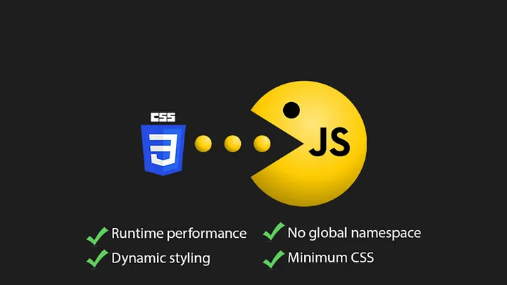
Before diving into architecture, we must understand the conceptual shift introduced by CSS-in-JS.
CSS-in-JS allows developers to:
- Write CSS inside JavaScript files
- Scope styles to components automatically
- Dynamically adapt styles using props
- Avoid global namespace collisions
- Enable theme-driven design systems
Example:
import styled from 'styled-components'

const Button = styled.button<{ variant: 'primary' | 'secondary' }>`
  padding: 8px 16px;
  border-radius: 4px;
  background: ${({ variant }) =>
    variant === 'primary' ? '#0052cc' : '#eaeaea'};
  color: white;
`

This pattern increases:

• Component isolation
• Dynamic styling capabilities
• Co-location of behavior and presentation

However, CSS-in-JS introduces architectural questions:

* Where should styled components live?
* Should styles be colocated inside feature folders?
* How do we prevent duplication?
* How do we structure theme tokens?
* How do we manage global styles safely?

Without structure, CSS-in-JS can become “JavaScript spaghetti with prettier syntax.”

---

## Core Concepts of styled-components

To master styled components architecture, we must understand its foundational APIs.

### Creating Styled Elements

The most common usage:

```tsx
const Card = styled.div`
  background: white;
  padding: 16px;
  box-shadow: 0 2px 8px rgba(0,0,0,0.08);
`
Key characteristics:
• Automatic class generation • No global CSS leakage • SSR compatibility • Style encapsulation
Adapting Styles via Props
Dynamic styling is one of its most powerful features.
const Text = styled.p<{ size: 'sm' | 'lg' }>`
  font-size: ${({ size }) => (size === 'lg' ? '20px' : '14px')};
`
This enables:
• Variant systems • Conditional styling • Design token integration
Theming with ThemeProvider
Theming is essential for scalable design systems.
import { ThemeProvider } from 'styled-components'

const theme = {
  colors: {
    primary: '#0052cc',
    danger: '#ff5630'
  }
}
<ThemeProvider theme={theme}>
  <App />
</ThemeProvider>
Inside components:
color: ${({ theme }) => theme.colors.primary};
This allows:
• Dark/light modes • Brand customization • Centralized design tokens • Runtime theme switching
Global Styles with createGlobalStyle
import { createGlobalStyle } from 'styled-components'

const GlobalStyle = createGlobalStyle`
  body {
    margin: 0;
    font-family: system-ui;
  }
`
Use carefully.
Global styles should belong to the app layer, not scattered inside features.
The Architectural Problem: When CSS-in-JS Scales
Styled components solve CSS scoping.
They do not solve:
- Business domain boundaries
- Feature encapsulation
- Cross-team collaboration
- Layered dependency control
- Refactor safety
Consider this typical folder structure:
/components
  Button.tsx
  Card.tsx
/hooks
/services
/pages
Where do styled components go?
Common anti-patterns:
• Massive shared ui folder
• Cross-feature style imports
• Design tokens scattered
• Circular dependencies
This is where Feature-Sliced Design becomes powerful.
Applying Feature-Sliced Design to styled components
Feature-Sliced Design structures frontend systems around business-driven slices rather than technical layers.
FSD layers:
app/
pages/
widgets/
features/
entities/
shared/
Each slice exposes a public API.
Where Should styled components Live in FSD?
Rule of thumb:
• UI specific to a feature → inside that feature • Reusable design system primitives → shared/ui • Global resets → app
Example:
features/
  like-post/
    ui/
      LikeButton.tsx
    model/
    index.ts
shared/
  ui/
    Button/
      Button.tsx
      index.ts
This ensures:
- High cohesion
- Low coupling
- Explicit dependency flow
- Safe refactoring
Public API Enforcement
A key principle in modular architecture is controlled exposure.
Each slice exports only what is necessary.
Example:
// features/like-post/index.ts
export { LikeButton } from './ui/LikeButton'
Other modules cannot import internal styled components directly.
This prevents:
• Accidental tight coupling • Hidden dependencies • Cascade architectural erosion
Leading architects suggest that explicit boundaries are the difference between scalable systems and fragile codebases.
Comparing styled-components and Emotion
Both are leading CSS-in-JS libraries.
| Aspect | styled-components | Emotion |
|---|---|---|
| API Style | Tagged template literals | Template + object styles |
| Performance | Runtime injection | Slightly lighter runtime |
| Theming | Built-in ThemeProvider | Compatible, flexible |
| SSR | Mature support | Strong SSR support |
| Ecosystem | Large adoption | Strong adoption in design systems |
Emotion supports object syntax:
/** @jsxImportSource @emotion/react */
<div css={{ color: 'red' }} />
Styled components focuses on:
• Semantic component-based styling • Clear design token integration • Declarative component variants
In large-scale architecture, the choice is often team preference.
However, architectural discipline matters more than library choice.
Integrating Theming with FSD
The theme belongs in the shared/config or app layer.
Example:
app/
  providers/
    ThemeProvider.tsx
Never define themes inside features.
Why?
Because themes are cross-cutting concerns.
This ensures:
• Single source of truth • Predictable override behavior • Stable design tokens
Handling Global Styles the Right Way
Global styles must be isolated.
Correct placement:
app/
  styles/
    GlobalStyle.ts
Inject once at root level.
Avoid:
• Multiple global injections • Feature-level resets • Hard-coded font definitions in slices
Advanced Patterns: Variant Systems & Design Tokens
To scale styled components architecture:
- Use design tokens
- Define variant patterns
- Create shared primitive components
Example design token system:
shared/config/theme.ts
export const theme = {
  spacing: {
    sm: '4px',
    md: '8px'
  }
}
Variants:
const Button = styled.button<{ variant?: 'primary' | 'danger' }>`
  background: ${({ variant, theme }) =>
    variant === 'danger'
      ? theme.colors.danger
      : theme.colors.primary};
`
This ensures:
• Consistency • Maintainability • Theming scalability
Architectural Comparison: MVC vs Atomic vs FSD with styled components
| Pattern | Styling Placement | Scalability |
|---|---|---|
| MVC | Global or per View | Moderate |
| Atomic Design | UI-centric | Strong UI, weak domain |
| Feature-Sliced Design | Business-slice aligned | High long-term scalability |
Atomic Design organizes UI well.
It does not enforce:
• Business boundaries • Feature ownership • Dependency direction
FSD solves those gaps.
Performance Considerations
Modern styled-components uses:
- Hash-based class generation
- Lazy style injection
- SSR hydration compatibility
Best practices:
• Avoid recreating styled components inside render • Prefer static styled definitions • Memoize heavy variant logic
When combined with proper architectural layering, performance remains stable even at scale.
Practical File Structure Example
src/
  app/
    providers/
    styles/
  pages/
    ProductPage/
  widgets/
    ProductCard/
  features/
    add-to-cart/
      ui/
      model/
  entities/
    Product/
      ui/
      model/
  shared/
    ui/
      Button/
    config/
      theme.ts
This structure ensures:
• Business alignment • Clear ownership • Controlled imports • Reduced cognitive load
Why This Architecture Improves Team Productivity
As demonstrated by projects using FSD, teams benefit from:
- Faster onboarding
- Predictable structure
- Safer refactoring
- Reduced merge conflicts
- Clear feature boundaries
Styled components become a tool inside a structured system—not an architectural decision on their own.
Conclusion
Styled components provide a powerful CSS-in-JS foundation for modern React applications. They enable dynamic styling, scoped CSS, and scalable theming. However, without deliberate architectural boundaries, even elegant component styling can devolve into complexity.
By integrating styled-components architecture with Feature-Sliced Design, teams gain modularity, isolation, explicit public APIs, and long-term maintainability. The combination of CSS-in-JS flexibility and business-driven slicing creates a system that scales with both product complexity and team growth.
Adopting a structured architecture like FSD is a long-term investment in code quality and team productivity.
Ready to build scalable and maintainable frontend projects? Dive into the official Feature-Sliced Design Documentation to get started.
Have questions or want to share your experience? Join our active developer community on Website!
Disclaimer: The architectural patterns discussed in this article are based on the Feature-Sliced Design methodology. For detailed implementation guides and the latest updates, please refer to the official documentation.