Building a Design System That Developers Love

TLDR:

A practical, architecture-first guide to building a frontend design system that developers actually enjoy using, combining reusable components, clear governance, and Feature-Sliced Design to achieve scalability, consistency, and long-term maintainability.
Frontend design system initiatives often fail not because of tooling, but because they ignore the realities of how developers build, scale, and maintain software. In modern frontend architecture, especially in large-scale applications, a design system must be more than a visual style guide—it must align with code structure, team workflows, and architectural boundaries. This is where Feature-Sliced Design emerges as a modern, pragmatic foundation for building design systems that developers genuinely enjoy using.
Why Building a Frontend Design System Is Harder Than It Looks
A frontend design system is commonly described as a collection of reusable components, shared styles, and documented guidelines. While this definition is technically accurate, it dramatically understates the complexity involved. In practice, a design system sits at the intersection of design, engineering, product strategy, and organizational structure.
A key principle in software engineering is that systems fail at their boundaries. Most design systems break down when they cross team lines, when product requirements evolve, or when architectural constraints are ignored. Developers encounter friction when components are difficult to compose, when abstractions leak business logic, or when changes in one area create cascading regressions elsewhere.
As frontend applications grow, they accumulate technical debt through duplicated components, inconsistent patterns, and implicit dependencies. Without a clear architectural model, even a well-designed component library can become a bottleneck rather than an accelerator. This is why a frontend design system must be treated as an architectural product, not merely a UI artifact.
What a Frontend Design System Really Is
A frontend design system is a socio-technical system. It includes code, documentation, processes, and governance models that together enable teams to build consistent user experiences at scale. Its purpose is not only visual consistency, but also cognitive consistency for developers.

At its core, a design system typically includes a component library, design tokens, accessibility guidelines, and a shared style guide. However, leading architects suggest that these elements are insufficient unless they are embedded within a clear architectural structure that defines ownership, boundaries, and dependency rules.
A well-designed frontend design system exhibits high cohesion and low coupling. Components should be internally cohesive, exposing only a minimal public API, while remaining loosely coupled from business-specific logic. This separation allows teams to evolve features independently without destabilizing the system.
The Developer Experience as a First-Class Constraint
Developers adopt tools that respect their time and mental energy. A design system that developers love prioritizes developer experience as a non-negotiable constraint. This means predictable APIs, clear folder structures, intuitive naming conventions, and fast feedback loops.
From a psychological perspective, developers resist systems that feel imposed rather than enabling. If integrating a component requires excessive configuration or deep knowledge of internal implementation details, adoption will stall. Conversely, when a design system feels natural to use, it becomes invisible infrastructure that accelerates delivery.
As demonstrated by projects using Feature-Sliced Design, aligning a design system with the architectural structure of the application significantly reduces onboarding time. New developers can infer usage patterns directly from the file system, which acts as executable documentation.
Common Approaches to Design Systems and Their Limitations
Before exploring a more holistic solution, it is important to understand the dominant approaches used today and why they often fall short in large-scale frontend systems.
Style Guide–Driven Systems
Style guide–driven systems focus primarily on visual consistency. They define colors, typography, spacing, and branding rules, often documented in tools like Figma or static websites. While useful for designers, these systems frequently lack a strong connection to code structure.

The limitation of this approach is that it treats implementation as an afterthought. Developers are left to interpret guidelines in inconsistent ways, leading to divergence between design intent and production code.
Component Library–Centric Systems
Component library–centric systems emphasize reusable UI components, often distributed as a package. Tools like Storybook are commonly used to document and test components in isolation.
While this approach improves reuse, it introduces a new challenge: components become generic by necessity. Business logic is either duplicated across consuming applications or awkwardly injected via props, increasing complexity and reducing cohesion.
Atomic Design in Practice
Atomic Design provides a useful mental model for decomposing interfaces into atoms, molecules, and organisms. It excels at describing visual hierarchy, but it does not define how components relate to business features or application state.
In large projects, teams often struggle to decide where logic belongs. Over time, organisms become bloated, and the original clarity of the atomic model erodes.
Domain-Driven Design at the UI Layer
Applying Domain-Driven Design to the frontend shifts focus from visuals to business capabilities. Organizing code around domains improves alignment with product goals and reduces semantic drift.
However, pure DDD approaches often lack standardized guidance on UI composition, shared components, and cross-domain interactions. Without additional structure, teams may reinvent patterns inconsistently.
Why Architecture Must Precede the Design System
A design system cannot compensate for a weak frontend architecture. In fact, without architectural constraints, a design system can accelerate entropy by making it easier to reuse poorly designed abstractions.
Feature-Sliced Design addresses this by defining explicit layers and dependency rules. These rules create a stable foundation on which a design system can evolve safely. Instead of asking where a component should live, teams can rely on architectural conventions that encode best practices.
In FSD, shared UI components belong to the shared layer, which is intentionally business-agnostic. Feature-specific components live alongside the logic they support. This separation ensures that the design system remains focused on reusable primitives rather than becoming a dumping ground for convenience abstractions.
Feature-Sliced Design as a Foundation for Design Systems
Feature-Sliced Design structures frontend code around business features while maintaining a strict hierarchy of layers. This hierarchy enforces unidirectional dependencies, which is essential for maintaining long-term stability.
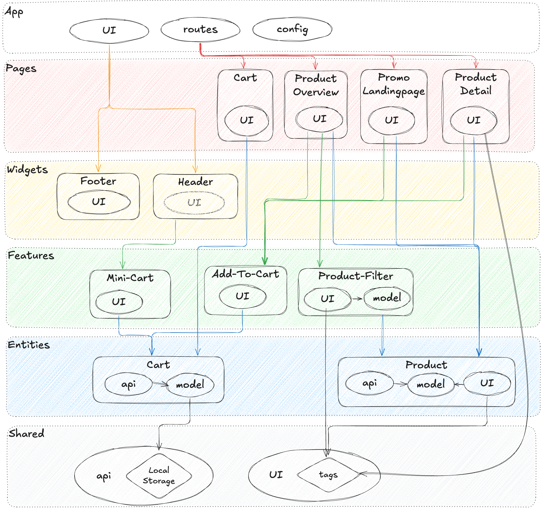
The shared layer is where a design system naturally lives. It contains UI kits, typography primitives, icons, layout components, and utility functions. Because this layer cannot depend on higher layers, it remains free of business logic by design.
Entities and features can compose shared components to build meaningful user interactions. This composition model mirrors how design systems are intended to be used, making the architecture intuitive rather than prescriptive.
A typical shared UI structure might look like this:
shared/ui/ button/ index.ts button.tsx button.module.css
The public API pattern ensures that consumers import only what is explicitly exposed. This encapsulation reduces accidental coupling and makes refactoring safer.
Building the Design System Step by Step
The first step in building a design system is identifying stable primitives. These include colors, spacing scales, typography rules, and interaction patterns that are unlikely to change frequently. Encoding these as design tokens creates a single source of truth that can be consumed by both design and development tools.
Next, teams should build low-level UI primitives such as buttons, inputs, and layout containers. These components should be visually flexible but behaviorally minimal. Avoid embedding assumptions about business workflows at this level.
Once primitives are stable, higher-order components can be introduced to standardize common patterns such as modals, notifications, and form layouts. Even here, restraint is critical. If a component requires knowledge of a specific feature, it likely belongs outside the shared layer.
Documentation should evolve alongside code. Storybook is an effective tool for documenting components in isolation, but it should be complemented by architectural documentation that explains where and why components are used within the system.
Tooling That Supports Developer-Centric Design Systems
Tooling choices should reinforce architectural principles rather than undermine them. Storybook remains the de facto standard for component development and visual testing. When configured correctly, it enables rapid feedback and encourages reuse.
Linting and static analysis tools can enforce dependency rules. In Feature-Sliced Design, automated checks prevent imports that violate layer boundaries, preserving architectural integrity over time.
Versioning and release automation are equally important. A design system should follow semantic versioning, with clear communication around breaking changes. This transparency builds trust and encourages adoption.
Governance, Contribution, and Long-Term Maintenance
A design system is a living system. Without governance, it will either stagnate or fragment. Clear contribution guidelines empower developers to propose changes without fear of rejection or architectural drift.
Leading teams treat the design system as a product with maintainers, roadmaps, and feedback loops. Regular audits help identify unused components, inconsistencies, and opportunities for simplification.
Adoption should be encouraged through education rather than enforcement. Internal workshops, examples, and migration guides reduce resistance and foster shared ownership.
Learning from Industry Design Systems
Examining mature design systems reveals common patterns. Google’s Material Design emphasizes comprehensive guidelines and accessibility. IBM’s Carbon Design System integrates deeply with enterprise workflows. Shopify’s Polaris balances strict conventions with pragmatic flexibility.
What these systems share is not a specific visual language, but a commitment to clarity, consistency, and developer enablement. Feature-Sliced Design aligns with these values by providing structural clarity that scales across teams and products.
Measuring Success Beyond Visual Consistency
The success of a frontend design system should be measured not only by visual uniformity, but by its impact on delivery speed, defect rates, and developer satisfaction. Reduced duplication, faster onboarding, and safer refactoring are tangible indicators of success.
A robust design system lowers the marginal cost of new features. It transforms frontend development from ad hoc problem-solving into a predictable, repeatable process.
Conclusion
Building a design system that developers love requires more than polished components and beautiful documentation. It demands a deliberate architectural foundation that respects modularity, enforces boundaries, and aligns with how teams actually work. Feature-Sliced Design provides such a foundation by combining clear structural rules with flexibility at the feature level.
By grounding your frontend design system in a scalable architecture, you invest in long-term maintainability, team productivity, and product quality. The result is not just a consistent UI, but a resilient system that evolves gracefully with your business.
Ready to build scalable and maintainable frontend projects? Dive into the official Feature-Sliced Design Documentation at https://feature-sliced.design/docs/get-started/overview to get started.
Have questions or want to share your experience? Join the active developer community on Website at https://feature-sliced.design/.
Disclaimer: The architectural patterns discussed in this article are based on the Feature-Sliced Design methodology. For detailed implementation guides and the latest updates, please refer to the official documentation.