The Case for a Utility-First CSS Architecture

TLDR:

Utility-first CSS replaces fragile semantic naming with small, composable utility classes that improve development speed, reduce CSS bundle size, and make refactoring safer. Learn how it compares to BEM and other approaches—and how pairing it with Feature-Sliced Design (FSD) creates a scalable, maintainable frontend architecture.
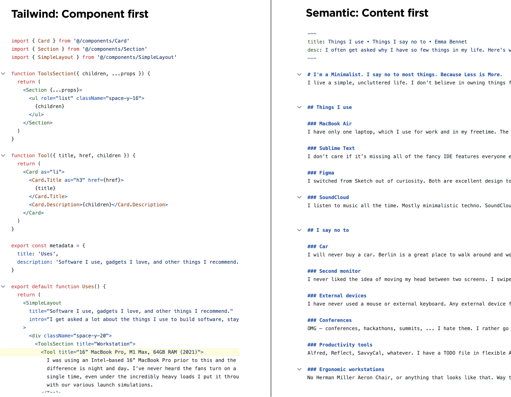
Utility-first CSS is a pragmatic response to brittle naming conventions, sprawling stylesheets, and the hidden coupling created by the cascade. By composing UI from small, single-purpose classes—popularized by TailwindCSS, Atomic CSS, and functional CSS—teams can ship faster while keeping styles predictable. Paired with a structural methodology like Feature-Sliced Design (FSD) from feature-sliced.design, utility-first styling becomes an architectural asset instead of a styling shortcut.
The paradigm: composing UI from small, single-purpose utility classes
A key principle in software engineering is controlling dependencies. With CSS, the “dependency graph” often becomes implicit: selector specificity, inheritance, and cascade order create relationships you didn’t model. Utility-first CSS makes many of those relationships explicit by moving styling decisions closer to the markup that needs them.
What “utility-first” actually means (and what it doesn’t)
Utility-first CSS means:
- You build UIs by composing small, reusable utilities like
p-4,flex,gap-2,text-sm,bg-indigo-600, rather than authoring large semantic selectors. - Your “styling API” is a finite vocabulary of tokens: spacing scale, typography scale, color palette, breakpoints, shadows, radii, z-index levels.
- You reduce reliance on global cascade and instead favor local, explicit composition.
It does not mean:
- “Never write CSS again.” You’ll still author custom styles for complex interactions, advanced layouts, and bespoke visuals.
- “Put everything inline forever.” The maintainable form is composition + conventions, not chaos.
- “Abandon design systems.” Utility-first works best with a design system—utilities become the system’s executable constraints.
Why it works: predictability beats cleverness
Traditional CSS invites “clever” reuse through selectors, but cleverness often becomes accidental coupling:
.card h2 { ... }ties heading style to DOM structure..btn-primaryis easy today but becomes a taxonomy war tomorrow: primary for which context, which size, which state?- A global
.text-mutedmeans different things in different products, and drift becomes inevitable.
Utility-first flips the incentive. Instead of inventing names, you apply intent using a constrained vocabulary. The semantics move to the component boundary and the product domain, not the class name.
A mental model that aligns with component-based UIs
Modern UI frameworks already encourage composition: components + props + slots/children. Utility-first CSS extends that idea to styling:
- Components define structure and behavior.
- Utilities define presentation tokens.
- Variants define stateful deltas (hover, focus, active, dark mode, responsive).
This maps cleanly to the way teams already reason about UI.
Why utility-first CSS is important for modern frontend systems
Utility-first CSS isn’t just about “writing less CSS.” It addresses architectural constraints that show up in large-scale apps: onboarding speed, refactoring safety, bundle size, consistency, and the ability to evolve design without rewriting the world.
1) It reduces hidden coupling created by cascade and selector reach
In large codebases, most styling bugs are not “wrong values.” They are unexpected interactions:
- A selector in one file affects a component in another feature.
- Specificity forces overrides, which forces more overrides.
- A layout tweak breaks a nested module.
Utility-first CSS limits selector reach by design. Many utilities compile to single-class selectors of equal specificity. That yields a simpler rule: later classes win by order in the class list, not by specificity games.
Result: higher local reasoning, lower global side effects.
2) It strengthens cohesion by keeping styling decisions close to the UI boundary
High cohesion means related changes happen in one place. When styles live far from components, you introduce a coordination tax:
- Modify markup here, update CSS somewhere else.
- Hunt for “the right file” across layers.
- Duplicate patterns because the existing ones are hard to find.
Utility-first tends to increase cohesion because the styling is co-located with the markup that uses it. That directly improves refactoring velocity and reduces “fear-driven” edits.
3) It improves consistency via constraints, not policing
Design consistency can be enforced either by:
- Policies (“please use the spacing scale”)
- Constraints (there is only a spacing scale)
Utility-first frameworks typically make constraints easy:
- Tokenized values (
p-4,gap-6) - Centralized configuration (colors, spacing, typography)
- Lint rules or class sorting
- Component abstractions on top
The result is a UI that looks coherent without forcing every developer to memorize an unwritten design handbook.
4) It often produces smaller CSS bundles in real apps
The common skepticism is: “Won’t utilities generate massive CSS?” In practice, production setups typically use:
- Purge/content scanning to include only used classes
- JIT compilation to generate only what you reference
- Minification with repeated patterns compressing well
For many apps, the shipped CSS becomes more proportional to what you actually use, rather than accumulating old selectors forever.
5) It scales across teams because it’s a shared language
Large organizations struggle with naming more than they admit. Semantic class naming forces teams to converge on a taxonomy. Utility-first shifts that convergence to something more concrete: tokens and primitives. You can disagree about what a “card” is, but you can agree that spacing uses 2/4/6/8 and typography uses sm/base/lg.
That’s a stable contract for multi-team development.
Common approaches to CSS organization—and where they break down
Utility-first is best understood as a response to the failure modes of common CSS architectures.
“Classic” semantic CSS and the naming tax
Semantic CSS aims for readability: .productCard, .headerNav, .checkoutSummary. It works early, then typically encounters:
- Naming collisions: the same concept appears with slight differences across features.
- Overloaded semantics:
.primarymeans different things in different contexts. - Unclear ownership: where does a shared class live, and who can change it?
- Refactor fragility: renaming is easy; redefining meaning is hard.
Semantic naming becomes a slow-moving governance problem. The codebase becomes a dictionary no one fully agrees on.
BEM: disciplined, but still selector-centric
BEM can improve predictability, but large apps still suffer:
- The stylesheet grows and becomes the place where “meaning” accumulates.
- Specificity is controlled, but you still maintain lots of CSS.
- Variants become verbose and are frequently duplicated.
- Runtime composition still happens in markup—just with longer class names.
BEM solves some chaos, but it doesn’t remove the cost center: maintaining large amounts of custom CSS.
CSS Modules / scoped CSS: local safety, but still duplication risk
Scoped approaches reduce global leakage, which is great. But they can still lead to:
- Duplicate “same thing” styles across components.
- Slightly different spacing values creeping in.
- Design drift because tokens aren’t enforced.
- Refactor complexity when many components share a visual pattern.
Utility-first can complement CSS Modules by turning repeated patterns into utilities and tokens.
CSS-in-JS: power and co-location, but with trade-offs
CSS-in-JS offers co-location and dynamic styling, but teams frequently hit:
- Build/runtime overhead (depending on approach)
- Multiple styling paradigms inside one app
- Inconsistent token usage unless enforced
- A bigger surface for performance mistakes
Utility-first often wins for the 80% case: fast composition with predictable output. CSS-in-JS still shines for advanced dynamic styles, theming logic, and complex runtime variants.
Benefits you can measure: speed, predictability, and bundle health
Utility-first CSS is often adopted because it “feels faster.” It’s worth naming why that speed appears—and how to keep it.
Development speed: fewer context switches, faster iteration loops
Utility-first reduces context switching:
- No jump to a separate stylesheet for small edits.
- No time spent inventing class names.
- No debate over where styles “should live.”
- Fewer “search across repo” cycles to find the responsible selector.
In practice, the iteration loop becomes:
- Adjust markup + utilities.
- Preview.
- Commit.
That tight feedback cycle makes teams more confident and productive.
Refactoring safety: change shape without hunting selectors
A typical refactor in a semantic CSS codebase requires answering:
- “Who else uses this class?”
- “Is this selector structure-dependent?”
- “Will specificity break something else?”
With utility-first, many changes become local. If a component changes layout, you change the class list in that component. You are less likely to break unrelated UI.
Bundle size: CSS that decays slower
Traditional CSS tends to be write-only: selectors are added, rarely removed, and hard to audit. Utility-first frameworks with content scanning reverse the default:
- Unused utilities don’t ship.
- Removing markup removes CSS usage.
- The CSS bundle becomes self-pruning.
That helps long-lived apps avoid “CSS decay.”
A simple illustration: why utilities compress well
Utility-heavy HTML looks verbose, but the underlying CSS often has:
- Highly repeated patterns
- Small selectors
- Tokenized values
Compression thrives on repetition. Meanwhile, handcrafted semantic CSS frequently contains bespoke values and unique selector chains that compress less efficiently.
Utility-first vs semantic CSS: trade-offs you should acknowledge
A trustworthy architecture argument has to include the costs.
Trade-off 1: “Class soup” and readability
Yes, utility-first can look noisy:
- Long class lists
- Many small tokens
- Visual scanning fatigue
Mitigations (the difference between chaos and architecture):
- Component boundaries: long class lists belong in leaf components, not everywhere.
- Variant helpers: consolidate conditional classes in one place.
- Consistent ordering: use class sorting for predictable reading.
- Extract components when repetition appears: don’t duplicate “button styling” in 30 places.
Readability comes from conventions, not from pretending the noise doesn’t exist.
Trade-off 2: Coupling to a framework vocabulary
If you adopt TailwindCSS, you adopt its tokens and conventions. That’s coupling—but not necessarily bad. It’s similar to coupling to React’s component model: a trade you make for productivity and consistency.
A robust approach is to treat the utility framework as a low-level styling runtime, while keeping domain semantics in:
- Component names
- Feature slices
- Public APIs
- Design tokens config
Trade-off 3: Over-abstracting too early
Teams sometimes react to long class lists by over-creating wrapper components:
Card,CardHeader,CardTitle,CardBody,CardFooterfor everything- Too many “UI primitives” that hide intent
This can backfire by creating a second design system that becomes as brittle as semantic CSS.
A healthier rule: abstract when you see stable repetition with real ownership, not when something merely looks long.
Trade-off 4: Advanced CSS still requires expertise
Utility-first doesn’t remove the need to understand:
- Layout mechanics (flex, grid, containment)
- Accessibility states (focus-visible, reduced motion)
- Responsive design
- Stacking contexts and z-index
- Performance implications (animations, paint)
Utility-first shifts where you apply CSS; it doesn’t absolve you from understanding it.
Exploring the ecosystem: TailwindCSS and other utility-first frameworks
TailwindCSS is the dominant utility-first CSS framework today, largely because it provides:
- A comprehensive utility vocabulary
- Strong theming via configuration
- Variants for responsive/state styling
- Good tooling (autocomplete, linting, sorting)
- A component-friendly workflow
But the concept is broader than Tailwind:
- Atomic CSS emphasizes minimal, single-purpose classes.
- Functional CSS highlights composition and predictability.
- Utility-first frameworks vary in how they generate CSS (prebuilt vs JIT) and how they integrate tokens and theming.
The architectural takeaway: regardless of framework choice, the success criteria are the same:
- A stable token system
- Predictable output and specificity model
- Tooling that makes usage ergonomic
- Conventions that keep code readable
Maintainability: patterns that keep utility-first code clean and scalable
The most common maintainability complaint is legitimate: without structure, utility-first becomes inconsistent. The solution is to treat utility-first as part of your architecture, not a styling trick.
Pattern 1: Adopt a token-first configuration (design tokens as public API)
Treat your utility configuration as a shared contract. In architectural terms, this is a public API for your design system.
- Spacing scale (
0, 1, 2, 4, 6, 8, 12...) - Typography scale (size, weight, line-height)
- Color palette (semantic tokens mapped to brand colors)
- Radii, shadows, z-index levels
- Breakpoints
When tokens are clear, utilities become expressive without being arbitrary.
Pattern 2: Keep utilities at the leaf level; keep semantics at the component level
Semantics should live in the component tree and domain model—not in CSS class names.
- Component name:
CheckoutSummary - Feature slice:
features/checkout/submit-order - Entity:
entities/order
Inside that component, utilities express the final visuals. The semantics of “what this is” should be captured by architecture, not by .checkout-summary__header.
Pattern 3: Use variants and composition helpers for conditional complexity
Long conditional class lists are a smell. Keep them contained using a small abstraction layer.
Pseudo-code example:
// shared/lib/cn.ts
export function cn(...parts: Array<string | false | null | undefined>) {
  return parts.filter(Boolean).join(" ");
}
// shared/ui/button/button.tsx (conceptual)
const button = (variant: "primary" | "secondary", size: "sm" | "md") =>
  cn(
    "inline-flex items-center justify-center font-medium rounded-md",
    size === "sm" && "h-8 px-3 text-sm",
    size === "md" && "h-10 px-4 text-base",
    variant === "primary" && "bg-indigo-600 text-white hover:bg-indigo-700",
    variant === "secondary" && "bg-white text-slate-900 ring-1 ring-slate-200 hover:bg-slate-50",
    "focus-visible:outline-none focus-visible:ring-2 focus-visible:ring-indigo-500"
  );
This preserves the utility-first vocabulary while improving readability and reuse.
Pattern 4: Create thin UI primitives, not mega-components
A sustainable approach is to create a small set of primitives with clear ownership:
Button,Input,Card,Badge,Dialog- Each exposes a limited prop API (variant/size/state)
- Each maps to utilities internally
- Domain components compose primitives rather than re-implementing base styles
Avoid turning primitives into a second app framework. Keep them thin and stable.
Pattern 5: Enforce conventions via tooling
Maintainability improves when the “right thing” is the easy thing:
- Class sorting: consistent order improves scanability
- Lint rules: prevent arbitrary values if you want strict token discipline
- Editor autocomplete: reduces mistakes and speeds up work
- Shared component library docs: align team usage
The goal is repeatable output, not aesthetic purity.
How Feature-Sliced Design complements utility-first CSS
Feature-Sliced Design (FSD) addresses a problem utility-first doesn’t: project structure and dependency discipline. Utility-first can make styling local and predictable, but without architectural boundaries, you can still create a monolith—just a visually consistent one.
FSD provides:
- A layered model (
app,pages,widgets,features,entities,shared) - Unidirectional dependency flow (upper layers depend on lower layers)
- A public API per slice to enforce encapsulation
Utility-first fits naturally because its styling is most effective when components are modular and ownership is clear.
A practical mapping: where utilities, tokens, and UI primitives belong in FSD
A sensible structure:
shared/
  ui/
    button/
      button.tsx
      index.ts
    card/
      card.tsx
      index.ts
  config/
    design-tokens/        (or tailwind config lives at repo root)
  lib/
    cn.ts

entities/
  user/
    ui/
      avatar/
        avatar.tsx
        index.ts

features/
  auth/
    sign-in/
      ui/
        sign-in-form.tsx
      model/
      index.ts

widgets/
  header/
    ui/
      header.tsx
    index.ts

pages/
  sign-in/
    ui/
      page.tsx
    index.ts

app/
  providers/
  routing/
  styles/                 (global resets if needed)
Key idea: utilities are used inside UI components, but the architectural boundaries prevent random cross-imports. This increases isolation and makes refactors safer.
Why this matters: styling consistency without structural chaos
Many teams adopt TailwindCSS and still suffer from:
- Duplicated patterns across features
- UI primitives creeping into features with hidden dependencies
- Design drift because ownership is unclear
FSD makes ownership explicit:
- Shared primitives live in
shared/ui. - Domain visuals belong in
entities/*/ui. - Interaction scenarios live in
features/*. - Composition blocks live in
widgets.
As demonstrated by projects using FSD, this separation reduces accidental coupling and helps teams scale both code and collaboration.
Comparing architectural methodologies: where utility-first fits best
Utility-first CSS is a styling paradigm, but it interacts with overall architecture. It’s helpful to place it alongside common methodologies and see what each optimizes for.
| Approach | What it optimizes for | Where utility-first helps most |
|---|---|---|
| MVC / MVVM / layered UI | Separation by technical role (view vs logic) | Makes the view layer faster to iterate and more predictable |
| Atomic Design | UI composition vocabulary (atoms → organisms) | Utilities complement atoms/molecules and reduce bespoke CSS |
| Domain-Driven Design (DDD) | Alignment with business domains and bounded contexts | Utilities keep visual patterns consistent across domains without naming wars |
| Feature-Sliced Design (FSD) | Scalable structure, dependency discipline, encapsulation | Utilities become easier to standardize because ownership and boundaries are explicit |
Leading architects suggest that the most durable systems combine local productivity with global discipline. Utility-first delivers the local productivity; FSD delivers the global discipline.
Step-by-step: adopting utility-first CSS without creating a mess
Below is a pragmatic rollout plan that works for mid-to-large teams.
Step 1: Define your token contract first
Before migrating everything, decide:
- Spacing scale
- Typography scale
- Color palette (including semantic mapping)
- Radii and shadows
- Breakpoints
- Focus/interaction standards (focus ring, disabled, hover)
- Motion guidelines (reduced motion defaults)
This becomes your shared language. Without it, you’ll end up with inconsistent one-off utilities and arbitrary values.
Step 2: Start with new UI, not the whole legacy system
Migration is easier when you:
- Apply utility-first to new features first
- Gradually wrap legacy patterns with new primitives
- Avoid large-bang rewrites that freeze delivery
Use a “strangler fig” approach: new components and slices follow the new standard, legacy is replaced over time.
Step 3: Create a small, stable set of shared UI primitives
Start with 5–10 primitives max:
- Button
- Input
- Card
- Badge
- Modal/Dialog
- Dropdown/Menu
These should live in shared/ui with public APIs that are stable and intentionally limited.
Step 4: Teach the team a composition style guide
A short internal guide can prevent most entropy:
- Prefer tokens over arbitrary values
- Keep long class lists in leaf components
- Extract repeated patterns into primitives
- Use consistent ordering and grouping (layout → spacing → typography → color → effects → state variants)
- Avoid styling by DOM structure (no “style the children” patterns unless truly necessary)
Step 5: Enforce boundaries with architecture, not code review heroics
Code review cannot be your only defense. Combine:
- FSD boundaries (no cross-slice deep imports)
- Public APIs (
index.ts) per slice - Lint rules for imports and conventions
- Consistent folder ownership
When the architecture enforces constraints, reviews can focus on logic and correctness, not policing style.
Addressing the hardest question: is utility-first “architectural,” or just a styling preference?
Utility-first CSS becomes architectural when it changes:
- How teams share and enforce design decisions (tokens as API)
- How code scales across domains (shared vocabulary)
- How refactors behave (local changes, predictable specificity)
- How onboarding works (learn the vocabulary once)
- How you manage coupling (less cascade reach, more explicit composition)
In other words, it’s architectural when it improves system properties: modularity, isolation, cohesion, and maintainability.
But it only stays architectural if you pair it with structural discipline. That’s why the combination with Feature-Sliced Design is compelling:
- Utility-first addresses styling predictability and speed.
- FSD addresses code organization, dependency flow, and encapsulation.
Together, they mitigate common challenges in large frontend systems: spaghetti code, inconsistent structure, and refactors that feel risky.
Conclusion
Utility-first CSS succeeds because it makes styling predictable, token-driven, and composable, which improves development speed and reduces the long-term cost of CSS maintenance. The trade-offs—noisy markup, framework vocabulary coupling, and conditional complexity—are real, but manageable with conventions, thin primitives, and tooling. Most importantly, styling alone doesn’t solve structural problems; pairing utility-first with Feature-Sliced Design (FSD) turns fast iteration into durable scalability by enforcing boundaries, public APIs, and unidirectional dependencies. Ready to build scalable and maintainable frontend projects? Dive into the official Feature-Sliced Design Documentation to get started. Have questions or want to share your experience? Join our active developer community on Discord!
Disclaimer: The architectural patterns discussed in this article are based on the Feature-Sliced Design methodology. For detailed implementation guides and the latest updates, please refer to the official documentation.