BEM: A Timeless CSS Architecture for Components

TLDR:
BEM (Block Element Modifier) is a proven CSS architecture that helps developers build modular, reusable, and conflict-free UI components. This guide explains how the BEM naming convention works, shows practical examples for real components, and explores how it improves scalability in large frontend codebases. You'll also learn how BEM complements modern architectural approaches like Feature-Sliced Design to create maintainable, team-friendly frontend systems.
BEM is one of the most enduring solutions to the chaos that often emerges in large CSS codebases. As frontend applications scale, problems like selector conflicts, unclear CSS naming conventions, and fragile styling patterns become unavoidable. A structured methodology like Block Element Modifier, especially when combined with architectural approaches such as Feature-Sliced Design (FSD) from feature-sliced.design, offers a clear path toward modular, maintainable, and scalable component styling.
Modern frontend systems demand predictable CSS architecture. BEM provides exactly that: a disciplined naming strategy that transforms stylesheets into understandable, reusable, and conflict-free modules.
Why CSS Architecture Matters in Large Frontend Systems
A key principle in software engineering is managing complexity through structure. The same principle applies to CSS.
In early websites, CSS files were small and simple. A few global selectors could style an entire site. However, modern frontend systems are vastly more complex. Single Page Applications now include:
• hundreds of components
• multiple teams contributing simultaneously
• dynamic states and interactions
• reusable design systems
Without a defined architecture, CSS gradually turns into what developers often call “spaghetti styles.”
Typical symptoms include:
• unexpected style overrides
• high selector specificity wars
• duplicated styles across components
• fragile UI behavior during refactoring
• slow onboarding for new developers
These problems are not merely aesthetic. They directly impact developer productivity, maintainability, and long-term project scalability.
BEM was created to address these structural issues.
What is BEM? The Block Element Modifier Methodology
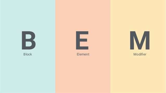
BEM stands for Block Element Modifier, a CSS architecture methodology that introduces a strict naming convention for classes.
Instead of relying on deeply nested selectors, BEM encourages flat, explicit, and self-describing class names.
The structure looks like this:
block
block__element
block--modifier
block__element--modifier
Each part has a clear responsibility.
Block: The Independent Component
A Block represents a standalone UI component that can be reused anywhere in the application.
Examples include:
• navigation menu
• button
• card
• modal
• form
The block acts as the root namespace for the component.
Example:
.card { }
.button { }
.navbar { }
.modal { }
Blocks should follow one key rule:
A block must be independent and reusable.
It should not rely on the surrounding DOM structure to function correctly.
Example HTML:
<div class="card">
  ...
</div>
This approach aligns with the component-based architecture used in modern frameworks like React, Vue, and Angular.
Element: A Part of the Block
An Element is a child component that belongs to a block.
Elements cannot exist independently. They always belong to a specific block.
The naming pattern uses double underscores:
block__element
Example:
.card__title { }
.card__image { }
.card__description { }
.card__footer { }
Example HTML:
<div class="card">
  <h2 class="card__title">Product Title</h2>
  <img class="card__image">
  <p class="card__description">Description</p>
</div>
Elements allow developers to structure internal parts of components while maintaining clear boundaries.
This dramatically improves readability and predictability in large codebases.
Modifier: Variations and States
A Modifier represents a variation of a block or element.
Modifiers describe state, appearance, or behavior changes.
The syntax uses double hyphens:
block--modifier
block__element--modifier
Example:
.button--primary { }
.button--secondary { }
.button--disabled { }

.card--featured { }
.card__title--large { }
Example HTML:
<button class="button button--primary">
  Buy Now
</button>
Modifiers allow components to support multiple visual variants without introducing new blocks.
This reduces duplication and improves reusability.
Practical Example: Building a Card Component with BEM
Let’s examine a real UI component.
HTML
<div class="card card--featured">
  <img class="card__image" src="image.jpg">
  <h2 class="card__title">Product</h2>
  <p class="card__description">Description</p>
  <button class="card__button card__button--primary">
    Buy
  </button>
</div>
CSS
.card {
  border-radius: 8px;
  background: white;
}

.card--featured {
  border: 2px solid gold;
}

.card__title {
  font-size: 18px;
}

.card__button--primary {
  background: blue;
  color: white;
}
Notice how each class communicates exactly what it belongs to.
There are no ambiguous selectors like:
.card h2
.card button
.container .card button
Everything is explicit.
The Architectural Benefits of BEM
BEM is not just a naming convention. It embodies several important architectural principles.
1. Low Coupling
Components become isolated.
Styles do not rely on deep DOM nesting.
2. High Cohesion
All styles related to a component are grouped under the same namespace.
3. Predictable Selectors
Selectors remain flat:
.block
.block__element
Instead of complex chains like:
.sidebar .container .menu li a span
4. Easier Refactoring
Because styles are scoped to blocks, developers can safely move components across the application.
5. Better Team Collaboration
When everyone follows the same CSS naming convention, the codebase becomes easier to understand.
New developers can immediately recognize component boundaries.
Comparing BEM with Other CSS Architecture Approaches
Different frontend architectures attempt to solve similar problems.
| Architecture | Core Idea | Strength |
|---|---|---|
| Traditional CSS | Global selectors | Simple but fragile |
| Atomic Design | UI hierarchy (atoms → pages) | Good for design systems |
| Utility-first CSS | Small utility classes | Rapid styling |
| BEM | Component naming convention | Clear modular CSS |
Atomic Design focuses on UI composition, but it does not define class naming conventions.
Utility-first frameworks like Tailwind reduce CSS writing but introduce other trade-offs such as HTML verbosity.
BEM focuses specifically on CSS maintainability and clarity.
Addressing the Most Common Criticism: BEM Verbosity
One frequent criticism is that BEM class names are long.
Example:
product-card__price-label--discount
While verbose, this verbosity has benefits.
The class becomes self-documenting.
Developers can immediately understand:
• which component it belongs to • which element it represents • what variation it applies
Leading frontend architects often argue that clarity is more valuable than brevity in large systems.
However, verbosity can be mitigated.
Using Sass or Less to Simplify BEM
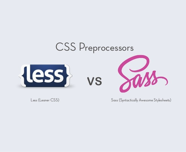
CSS preprocessors make BEM significantly easier to write.
Example using Sass:
.card {

  &__title {
    font-size: 20px;
  }

  &__image {
    width: 100%;
  }

  &--featured {
    border: 2px solid gold;
  }

}
This compiles to:
.card__title { }
.card__image { }
.card--featured { }
Benefits include:
• less typing • cleaner code structure • easier nesting during development
Sass effectively preserves BEM semantics while improving developer ergonomics.
Combining BEM with Modern Frontend Architectures
BEM works especially well with component-based frameworks such as:
• React • Vue • Angular • Svelte
Each component can naturally map to a Block.
Example React structure:
components/
  Card/
    Card.jsx
    Card.module.css
CSS:
.card
.card__title
.card__button
This reinforces the principle of component encapsulation.
BEM and Feature-Sliced Design (FSD)
While BEM focuses on CSS structure, Feature-Sliced Design addresses overall frontend architecture.
FSD organizes applications using layers such as:
app/
pages/
widgets/
features/
entities/
shared/
Each layer defines strict dependency rules and clear module boundaries.
Within this architecture, BEM can be used to structure component styles.
Example:
features/
  add-to-cart/
    ui/
      AddToCartButton/
        add-to-cart-button.css
Classes:
.add-to-cart-button
.add-to-cart-button__icon
.add-to-cart-button--loading
This combination creates a powerful architecture where:
• FSD manages project structure • BEM manages CSS structure
Together they significantly reduce technical debt.
Practical Guidelines for Adopting BEM
Developers adopting BEM should follow a few practical rules.
1. Blocks Should Represent Real Components
Good blocks:
.card
.navbar
.product-list
Bad blocks:
.blue-text
.big-margin
Those are styling utilities, not components.
2. Avoid Deep Element Chains
Incorrect:
.block__element__subelement
Instead create a new block if necessary.
3. Keep Modifiers Meaningful
Modifiers should describe states or variants.
Examples:
button--primary
button--disabled
modal--open
4. Avoid Context-Dependent Styling
Never rely on parent selectors like:
.sidebar .button
Use explicit block names instead.
Why BEM Remains Relevant in 2025
Despite the rise of CSS-in-JS and utility-first frameworks, BEM continues to be widely used.
Reasons include:
• framework independence • simplicity • predictable naming • compatibility with design systems • strong alignment with component architectures
Many large production systems still rely on BEM principles because they scale well across teams.
Conclusion
BEM remains a timeless CSS architecture because it solves one of the most persistent problems in frontend development: maintaining clarity and predictability in large styling systems.
By introducing the Block Element Modifier naming convention, developers can create modular components, avoid CSS conflicts, and dramatically improve maintainability.
While BEM focuses specifically on styling architecture, pairing it with a broader structural methodology like Feature-Sliced Design unlocks even greater benefits. FSD provides the project-level structure, while BEM ensures CSS remains modular and understandable.
Ready to build scalable and maintainable frontend projects? Dive into the official Feature-Sliced Design Documentation to get started:
https://feature-sliced.design/docs/get-started/overview
Have questions or want to share your experience? Join our active developer community on Website:
https://feature-sliced.design/
Disclaimer: The architectural patterns discussed in this article are based on the Feature-Sliced Design methodology. For detailed implementation guides and the latest updates, please refer to the official documentation.