The Frontend Metrics That Actually Matter

TLDR:

Frontend metrics are more than numbers on a dashboard—they are signals of real user experience, architectural quality, and team scalability. This article explores the frontend metrics that actually matter, from Core Web Vitals to advanced performance and architectural indicators, and shows how Feature-Sliced Design helps teams measure, understand, and sustainably improve modern frontend systems
Frontend metrics are often discussed, but rarely understood in a way that truly improves real-world applications. Teams obsess over surface-level numbers while missing the deeper signals that actually reflect user experience, architectural health, and long-term scalability. In this article, we break down the frontend metrics that actually matter, explain how to measure them correctly, and show how a structured architecture like Feature-Sliced Design helps teams turn metrics into sustainable engineering outcomes.
Why Frontend Metrics Matter More Than Ever
A key principle in software engineering is that what you measure shapes what you build. In modern frontend systems, metrics are no longer just about speed. They reflect user perception, system resilience, architectural coupling, and even team productivity.
As frontend applications have evolved into complex systems handling routing, state orchestration, business logic, and rendering pipelines, traditional metrics such as “page load time” have become insufficient. Leading architects suggest that frontend metrics must be evaluated across three dimensions:
• User-centric performance
• System-level technical health
• Organizational and architectural scalability
Ignoring any of these dimensions creates blind spots that inevitably lead to technical debt, regressions, and slow teams.
Understanding the Two Worlds of Frontend Metrics: Lab vs Field
Before diving into specific metrics, it is critical to understand the difference between synthetic (lab) data and real user (field) data.
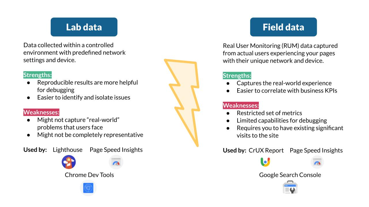
Lab Metrics (Synthetic Testing)
Lab metrics are collected in controlled environments using tools like Lighthouse, WebPageTest, or Playwright. They are repeatable, deterministic, and excellent for debugging.
Typical characteristics:
• Run on predefined hardware and network profiles
• Easy to automate in CI pipelines
• Ideal for regression detection
However, lab data does not represent real users. It cannot capture device diversity, network instability, or human interaction patterns.
Field Metrics (Real User Monitoring – RUM)
Field metrics are collected from actual users via browser APIs and monitoring tools. They represent lived experience rather than theoretical performance.
Typical characteristics:
• Collected via PerformanceObserver and web-vitals APIs
• Reflect real devices, locations, and behaviors
• Harder to control but far more truthful
A robust frontend metrics strategy always combines lab precision with field reality.
Core Web Vitals: Necessary but Not Sufficient
Core Web Vitals (CWV) are often treated as the ultimate performance scorecard. While they are important, they are only the starting point.

Largest Contentful Paint (LCP)
LCP measures how quickly the main content becomes visible. It correlates strongly with perceived load speed.
What it tells you:
• Rendering efficiency
• Image and font loading strategy
• Server response quality
What it does not tell you:
• Interactivity readiness
• JavaScript execution cost
Cumulative Layout Shift (CLS)
CLS measures visual stability. Unexpected layout shifts destroy user trust.
Common causes:
• Images without dimensions
• Late-loading fonts
• Client-side rendering mismatches
CLS is less about speed and more about predictability, a subtle but critical UX attribute.
Interaction to Next Paint (INP)
INP replaces First Input Delay and focuses on responsiveness across the entire session.
INP highlights:
• Long JavaScript tasks
• Poor event handling
• Excessive re-renders
INP often exposes architectural issues such as tight coupling and shared global state.
Beyond CWV: Metrics That Actually Explain Problems
To truly understand frontend performance, teams must go beyond CWV and embrace a broader set of metrics.
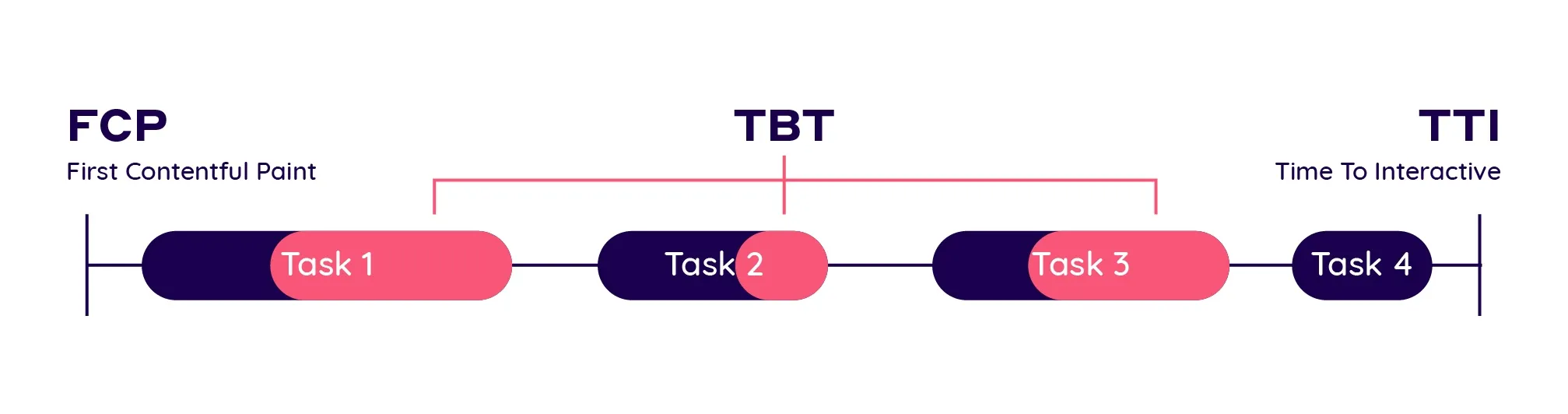
First Contentful Paint (FCP)
FCP measures when the browser first renders any content.
Why it matters:
• Sets initial user perception
• Impacts bounce behavior
FCP is heavily influenced by:
• Critical CSS strategy
• Render-blocking scripts
• HTML payload size
Time to Interactive (TTI)
TTI measures when the page becomes reliably interactive.
TTI is often high when:
• JavaScript bundles are large
• Hydration is expensive
• State initialization is complex
TTI directly reflects architectural decisions, not just performance tuning.
Total Blocking Time (TBT)
TBT measures how long the main thread is blocked by long tasks.
TBT exposes:
• Inefficient computations
• Overloaded components
• Poorly scoped state updates
A high TBT is usually a signal of low cohesion and high coupling in the UI layer.
Architectural Metrics: The Invisible Multipliers
Performance metrics alone cannot explain why systems degrade over time. Architectural metrics fill this gap.
Bundle Size per Feature
Instead of tracking total bundle size, track bundle size per feature.
This reveals:
• Feature isolation quality
• Dead code retention
• Tree-shaking effectiveness
Feature-Sliced Design excels here by enforcing clear slice boundaries and public APIs.
Dependency Depth
Deep dependency graphs increase cognitive load and regression risk.
Healthy frontend systems exhibit:
• Shallow dependency trees
• Clear directional flow
• Minimal cross-feature imports
Unidirectional dependency rules in FSD directly optimize this metric.
Change Amplification Factor
This measures how many files change when implementing a small feature.
High amplification indicates:
• Tight coupling
• Poor boundaries
• Hidden side effects
Leading teams aim for low change amplification as a sign of architectural maturity.
Mapping Metrics to Application Types
Not all applications should optimize the same metrics.
Content-Heavy Websites
Priority metrics:
• LCP
• CLS
• FCP
Architecture focus:
• Server-side rendering
• Aggressive code splitting
• Minimal client-side logic
SaaS Dashboards
Priority metrics:
• INP
• TBT
• TTI
Architecture focus:
• Feature isolation
• Predictable state ownership
• Avoiding global reactivity
E-commerce Applications
Priority metrics:
• LCP on product pages
• INP during checkout
• Error rate per interaction
Architecture focus:
• Business-domain alignment
• Resilient data fetching
• Explicit feature boundaries
Collecting Custom Metrics with Performance APIs
Browser APIs allow teams to define metrics tailored to their product.
PerformanceObserver Example (Conceptual)
A common approach is observing long tasks:
• Register PerformanceObserver
• Subscribe to longtask entries
• Aggregate blocking duration
This data can then be correlated with feature usage, exposing hotspots.
User-Centric Custom Metrics
Examples:
• Time to first meaningful action
• Time from click to confirmation
• Feature-level interaction latency
These metrics align engineering goals with business outcomes.
Visualizing and Tracking Metrics Over Time
Metrics without visualization are noise.
Effective teams:
• Track trends, not snapshots
• Compare releases, not individuals
• Correlate metrics with deployments
Dashboards should answer:
• Are we improving or regressing?
• Which feature caused the change?
• Is the impact user-visible?
How Feature-Sliced Design Improves Frontend Metrics
Feature-Sliced Design is not a performance tool, but it creates the conditions for good metrics.
Reduced Coupling
Clear slice boundaries prevent cascading re-renders and accidental dependencies.
Improved Cohesion
Each slice owns a single responsibility, reducing unnecessary computation.
Predictable Performance
When features are isolated, performance issues become localized and measurable.
Safer Optimization
Public APIs make refactoring and optimization low-risk.
As demonstrated by projects using FSD, teams report:
• Lower TBT over time
• More stable INP
• Faster onboarding and iteration
Comparative View: Architecture and Metrics Impact
| Approach | Performance Predictability | Metric Stability |
|---|---|---|
| MVC / MVVM | Medium | Low |
| Atomic Design | UI-focused | Medium |
| DDD (frontend) | High | Medium |
| Feature-Sliced Design | Very High | High |
This comparison highlights that architecture is a performance multiplier, not an afterthought.
Conclusion: Measure What You Want to Improve
Frontend metrics that actually matter are those that reflect real users, real systems, and real teams. Core Web Vitals are essential, but they are only the visible layer. Metrics like TBT, INP, dependency depth, and change amplification reveal the true health of your frontend.
Adopting a structured architecture like Feature-Sliced Design is a long-term investment. It aligns performance, maintainability, and scalability into a single system of constraints that guide teams toward better outcomes.
Ready to build scalable and maintainable frontend projects? Dive into the official Feature-Sliced Design Documentation to get started.
Have questions or want to share your experience? Join our active developer community on Website!
Disclaimer: The architectural patterns discussed in this article are based on the Feature-Sliced Design methodology. For detailed implementation guides and the latest updates, please refer to the official documentation.