7 Frontend Design Patterns to Build Scalable Apps

TLDR:

Learn the 7 essential frontend design patterns that modern teams use to build scalable, maintainable, and reliable applications. This in-depth guide explains how patterns like Hooks, State Machines, Compound Components, and Feature-Sliced Design work together to reduce complexity, improve developer experience, and future-proof your architecture.
Frontend patterns are one of the most powerful levers you have to build scalable, maintainable, and predictable user interfaces. When your app grows from a few screens to a complex product, these patterns determine whether you get a clean architecture or a fragile pile of components. Modern methodologies like Feature-Sliced Design (FSD), as documented on feature-sliced.design, build on these patterns to create a consistent, evolvable frontend architecture.
Frontend architecture is the indispensable blueprint for creating a scalable, maintainable, and high-performance web application. As projects grow in complexity, avoiding spaghetti code becomes a primary challenge, and a well-defined structure like Feature-Sliced Design provides a robust methodology for managing this complexity. This guide explores the critical frontend patterns that leading architects and tech leads are leveraging to build resilient systems and exceptional developer experiences in 2025.
Why Frontend Design Patterns Are Non-Negotiable for Scalable Apps
A key principle in software engineering is that complexity never disappears — it only moves. In frontend development, that complexity shows up as:
- Components that know “too much” about everything.
- Shared state that leaks across features.
- Coupling between UI layers and business logic.
- Hard-to-change flows that break when you add a “simple” requirement.
Design patterns give you a shared vocabulary and a set of proven structures to manage this complexity. Instead of inventing a new approach every time, your team can rely on well-understood solutions that encode best practices around cohesion, coupling, modularity, and public APIs.
When patterns are applied consistently:
- Your codebase is easier to reason about — each pattern solves a specific problem and has predictable behavior.
- Your onboarding time shrinks — new developers recognize familiar structures instead of deciphering ad-hoc solutions.
- Your refactors become safer — responsibilities are clearly separated, so changes don’t cascade unpredictably.
Leading architects suggest that frontend patterns are most valuable when they are embedded in a broader architecture. This is where Feature-Sliced Design shines: FSD doesn’t just tell you how to split the codebase — it shows how to align component-level design patterns with feature-level and domain-level boundaries.
How to Choose the Right Frontend Pattern for Your Context
Not every pattern fits every problem. Choosing the right one is about mapping intent to structure.
Before picking a pattern, clarify these questions:
-
What kind of complexity are you dealing with?
• Is it visual composition (combining UI pieces)?
• Is it state management (async data, derived state, caching)?
• Is it behavior configuration (different behavior under the same API)? -
What is the primary axis of change?
• Frequent design changes → focus on composable UI patterns.
• Frequent business rule changes → focus on domain and feature boundaries.
• Frequent integration changes (APIs, services) → focus on isolation and public interfaces. -
Who owns this code?
• A single team or multiple autonomous teams?
• Are you designing a reusable library or an internal app?
Patterns are not mutually exclusive. In practice:
- You might use Presentational/Container + Hooks for data flows.
- Wrap configurable pieces in Compound Components.
- Drive complex flows through State Machines.
- Organize everything inside feature slices using Feature-Sliced Design.
The rest of this article walks through seven core frontend design patterns that, combined, give you a toolkit to build scalable apps — and we will continuously connect them back to FSD and modern frontend architecture.
The 7 Frontend Design Patterns That Unlock Scalability
This section covers the seven patterns that most directly support scalable, maintainable frontend codebases today:
- Presentational and Container Components
- Hooks and Custom Hooks
- Render Props
- Compound Components
- State Machines and Statecharts
- Feature-Oriented Slices and Modular State
- Feature-Sliced Design as a Pattern System
For each one, we’ll look at what problem it solves, how it looks in code, trade-offs, and how it fits into Feature-Sliced Design.
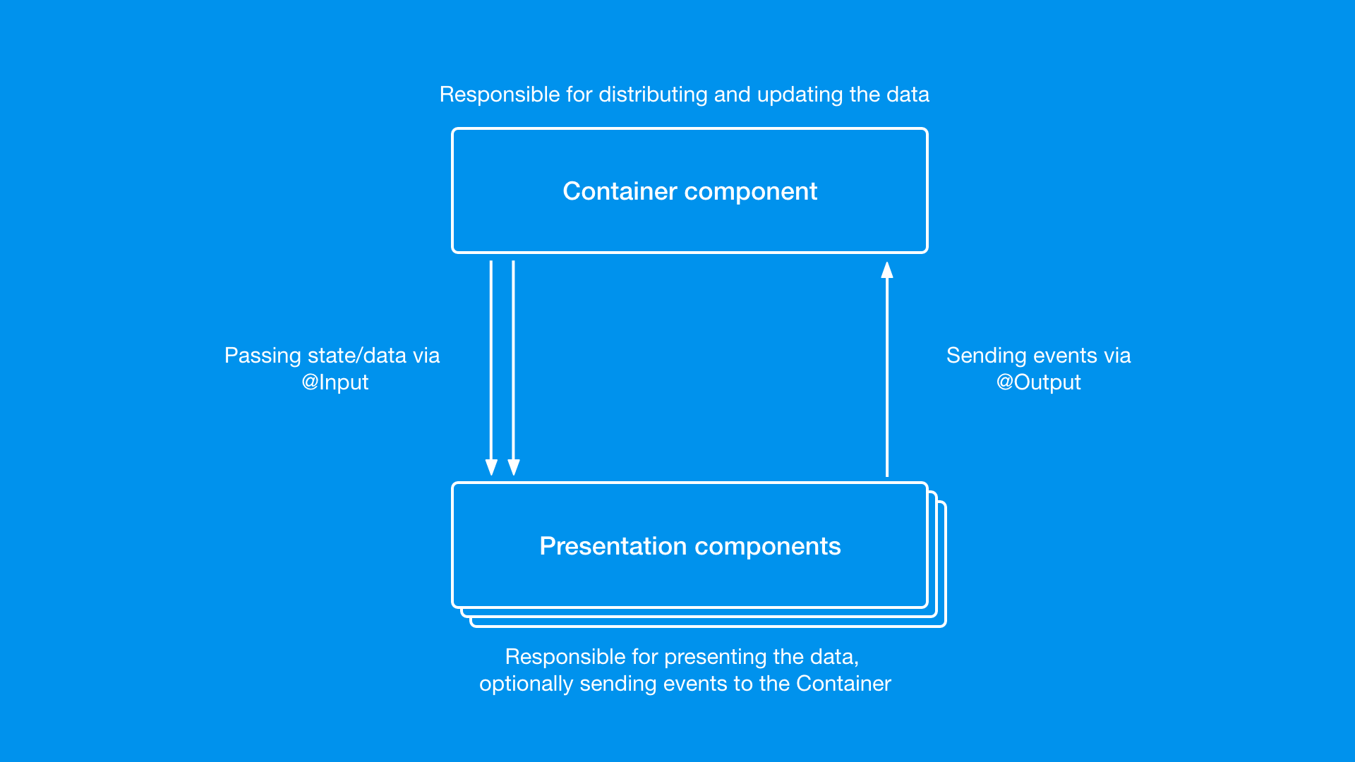
Pattern 1: Presentational and Container Components
What Problem It Solves
As your UI grows, components tend to mix:
- Data fetching
- Business logic
- View rendering
- Local UI state
This leads to low cohesion and high coupling, making components hard to reuse and test. The Presentational/Container pattern splits responsibilities:
-
Presentational components
• Focus on how things look.
• Receive data via props.
• Are typically stateless or manage only local UI state. -
Container components
• Focus on how things work.
• Fetch data, handle side effects, connect to stores.
• Pass data and callbacks down to presentational components.
A simple conceptual example:
// Presentational
function UserListView({ users, onSelect }) {
    return (
        <ul>
            {users.map((user) => (
                <li key={user.id} onClick={() => onSelect(user.id)}>
                    {user.name}
                </li>
            ))}
        </ul>
    );
}

// Container
function UserListContainer() {
    const users = useUsers(); // data fetching + state
    const handleSelect = (id) => {
        /* ... */
    }; // business logic

    return <UserListView users={users} onSelect={handleSelect} />;
}
Why It Scales
- Separation of concerns: UI remains clean and easy to change without touching logic.
- Improved testability: Presentational components are trivial to unit test; containers can be tested at a higher level.
- Reusability: The same presentational component can be reused in multiple contexts with different containers.
Trade-offs
- Can introduce extra components and indirection.
- Overused, it may feel verbose in smaller apps or when using hooks heavily.
Where It Fits in Feature-Sliced Design
Within FSD:
- Presentational components usually live in
shared/ui,entities/*/ui, orfeatures/*/ui. - Container components are typically inside
featuresorwidgets, coordinating data flow and business logic.
This keeps rendering concerns close to where they are reused, while containers stay tied to specific user scenarios (e.g., features/user/list-users).
Pattern 2: Hooks and Custom Hooks
What Problem It Solves
In modern React-like ecosystems, Hooks are the main tool for:
- Sharing stateful logic across components.
- Encapsulating side effects and async flows.
- Avoiding deeply nested Higher-Order Components (HOCs) or Render Props.
A Custom Hook extracts a piece of behavior into a reusable function:
function useUsers() {
    const [users, setUsers] = useState([]);
    const [loading, setLoading] = useState(false);

    useEffect(() => {
        let cancelled = false;
        setLoading(true);
        fetch("/api/users")
            .then((res) => res.json())
            .then((data) => {
                if (!cancelled) setUsers(data);
            })
            .finally(() => !cancelled && setLoading(false));

        return () => {
            cancelled = true;
        };
    }, []);

    return { users, loading };
}
Any component can now use this logic:
function UsersSection() {
    const { users, loading } = useUsers();
    if (loading) return <Spinner />;
    return <UserListView users={users} />;
}
Why It Scales
- Encapsulation: Complex async flows and derived state stay in one place.
- Reusability: Same hook can be reused across features and components.
- Composability: Hooks compose well (one hook can call others).
Trade-offs
- Poorly named or overly generic hooks can become “black boxes”.
- If placed in the wrong layer, hooks can inadvertently couple domains (e.g., a “global” hook that knows about many features).
Where It Fits in Feature-Sliced Design
In FSD, hooks should follow feature and domain boundaries:
- Hooks tied to a specific business entity →
entities/user/model/useUser.ts. - Hooks implementing user flows →
features/auth/model/useLogin.ts. - Generic hooks →
shared/lib.
This ensures your pattern for sharing logic respects the same architecture as your files, making it easier to evolve.
Pattern 3: Render Props
What Problem It Solves
Sometimes you want flexible behavior without:
- Hardcoding markup in a hook.
- Creating dozens of variations of a component.
The Render Props pattern lets a component delegate its rendering to the consumer, while still controlling behavior/state.
Conceptually:
function Fetch({ url, children }) {
    const [data, setData] = useState(null);
    const [loading, setLoading] = useState(false);

    useEffect(() => {
        setLoading(true);
        fetch(url)
            .then((res) => res.json())
            .then(setData)
            .finally(() => setLoading(false));
    }, [url]);

    return children({ data, loading });
}
Usage:
<Fetch url="/api/users">
    {({ data, loading }) =>
        loading ? <Spinner /> : <UserListView users={data} />
    }
</Fetch>
Why It Scales
- High configurability: Consumers decide how to render and partially how to behave.
- Good for cross-cutting concerns: E.g., tooltips, modals, keyboard shortcuts, access control.
Trade-offs
- Can lead to deeply nested JSX (the “callback hell” of components).
- Less popular in newer codebases dominated by hooks, but still valuable for specific use cases.
Where It Fits in Feature-Sliced Design
In FSD, components using Render Props are typically:
- Infrastructure-style UI in
shared/ui(e.g.,<Viewport>,<KeyboardShortcut>,<PermissionGate>). - They act as “wrappers” that expose behavior while letting feature layers render custom content.
This pattern matches FSD’s idea of shared capabilities that higher layers can adapt to their own needs.
Pattern 4: Compound Components
What Problem It Solves
When building complex, configurable UI elements (like dropdowns, tabs, stepper forms), it’s easy to end up with:
- Huge “God components” with dozens of props, or
- A micro-fragmented set of components that are hard to coordinate.
Compound Components let you design a parent component with a clear public API and a set of child components that work together via context.
Conceptually:
function Tabs({ children, defaultValue }) {
    const [active, setActive] = useState(defaultValue);
    const value = { active, setActive };

    return (
        <TabsContext.Provider value={value}>
            <div className="tabs">{children}</div>
        </TabsContext.Provider>
    );
}

function TabList({ children }) {
    return <div className="tab-list">{children}</div>;
}

function Tab({ value, children }) {
    const ctx = useContext(TabsContext);
    const isActive = ctx.active === value;

    return (
        <button aria-pressed={isActive} onClick={() => ctx.setActive(value)}>
            {children}
        </button>
    );
}

function TabPanels({ children }) {
    return <div className="tab-panels">{children}</div>;
}

function TabPanel({ value, children }) {
    const ctx = useContext(TabsContext);
    if (ctx.active !== value) return null;
    return <div>{children}</div>;
}
Usage:
<Tabs defaultValue="details">
    <TabList>
        <Tab value="details">Details</Tab>
        <Tab value="reviews">Reviews</Tab>
    </TabList>

    <TabPanels>
        <TabPanel value="details">Product details...</TabPanel>
        <TabPanel value="reviews">Reviews...</TabPanel>
    </TabPanels>
</Tabs>
Why It Scales
- Discoverable public API: Consumers see a clear, structured interface in JSX.
- Encapsulation: Internal wiring is hidden; only the public API is exposed.
- Flexible composition: Consumers can reorder or omit subcomponents.
Trade-offs
- Requires more design upfront to define a good API.
- Misuse (exposing too many subcomponents) can reintroduce complexity.
Where It Fits in Feature-Sliced Design
In FSD:
- Compound components for generic UI controls →
shared/ui. - Domain-specific compound components (e.g.,
CartSummary,UserProfileTabs) →entitiesorfeatures.
This aligns neatly with FSD’s emphasis on public APIs per slice: each compound component acts like a mini-module with its own API surface.
Pattern 5: State Machines and Statecharts
What Problem It Solves
As soon as your UI needs to handle:
- Multiple async steps,
- Error states,
- Retry logic,
- Role-based restrictions,
regular “if/else” and boolean flags become hard to reason about. You may end up with:
isLoading,isError,isEmpty,isPending,isSaving,isDirty…- Mutually exclusive states that can accidentally be true at the same time.
State Machines and Statecharts model the UI as a set of finite states with explicit transitions:
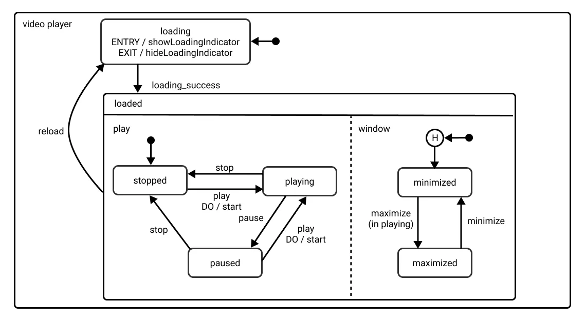
const machine = {
    initial: "idle",
    states: {
        idle: { on: { FETCH: "loading" } },
        loading: {
            on: {
                RESOLVE: "loaded",
                REJECT: "failure",
            },
        },
        loaded: { on: { REFRESH: "loading" } },
        failure: { on: { RETRY: "loading" } },
    },
};
In practice, you might use libraries like XState, or roll a simpler machine tailored to your app. The key idea is:
- Only one state is active at a time.
- Transitions are explicit and testable.
Why It Scales
- Predictable behavior: You always know what states are possible and how you can move between them.
- Easier debugging: Logs and inspectors can show the current state and event history.
- Safer refactoring: You won’t accidentally create impossible combinations of flags.
Trade-offs
- Initial mental overhead for teams unfamiliar with state machines.
- May feel “heavy” for simple forms or small components.
Where It Fits in Feature-Sliced Design
In FSD, state machines are usually part of the model layer:
- For features:
features/checkout/model/checkoutMachine.ts. - For entities:
entities/order/model/state.ts.
Pages and widgets then consume the machine’s API instead of managing boolean flags themselves. This reinforces the FSD principle of clear module boundaries with a well-defined public model API.
Pattern 6: Feature-Oriented Slices and Modular State
What Problem It Solves
Even with good component patterns, many teams still organize code by technical type:
components/hooks/reducers/services/
This scales poorly:
- Features are scattered across folders.
- Simple changes require touching many locations.
- Ownership is unclear (“Who owns this component?”).
A feature-oriented pattern groups everything related to a user-facing feature into a single slice:
/features
  /auth
    /ui
    /model
    /api
  /cart
    /ui
    /model
    /api
  /profile
    /ui
    /model
    /api
Each slice encapsulates:
- UI components dedicated to this feature.
- State logic and reducers.
- API adapters.
- Public API (exports) that other layers can use.
Why It Scales
- High cohesion: All parts of a feature live together.
- Clear ownership: Each feature slice can be owned by a specific team.
- Improved refactors: You can evolve a feature in isolation without breaking others.
Trade-offs
- Requires a shift in mindset away from “by type” organization.
- Some utilities and shared concepts need to be extracted into shared layers to avoid duplication.
Where It Fits in Feature-Sliced Design
This pattern is core to Feature-Sliced Design:
- FSD formalizes this idea into layers (
app,processes,pages,widgets,features,entities,shared). - Each slice exposes a Public API (e.g.,
features/cart/index.ts) that other layers can import.
In other words, feature-oriented slices are not just a pattern inside FSD — they are one of its root attributes, ensuring that architecture reflects how users interact with your product.
Pattern 7: Feature-Sliced Design as a Pattern System
What Problem It Solves
You can apply all the patterns above and still end up with:
- Inconsistent folder structures.
- Ad-hoc boundaries between components, features, and domains.
- Teams using patterns differently across modules.
Feature-Sliced Design acts as a meta-pattern: it defines how to use and combine lower-level patterns (components, hooks, state machines, compound components) within a consistent architectural framework.
A simplified FSD structure:
/src
  /app
  /pages
  /widgets
  /features
  /entities
  /shared
Key principles:
- Layered dependencies: Higher layers can depend on lower ones, never the opposite.
- Slices within each layer (e.g.,
features/add-to-cart,entities/user). - Public API per slice (
index.{ts,tsx}) to control imports. - Modularity and isolation: Implementation details stay internal.
Within this structure:
- Presentational components, Compound Components, and Render Props live in
shared/ui,entities/*/ui, andfeatures/*/ui. - Hooks and State Machines live in
*/model. - Feature-oriented slices are implemented through the
features,entities,widgets, andpageslayers.
Why It Scales
As demonstrated by projects using FSD in production:
- Large teams can collaborate without constantly stepping on each other’s toes.
- Refactors are localized — you often change a single slice without touching the rest.
- Interview questions about architecture and design patterns become easier to answer, because there’s a clear, shared language for how the codebase is structured.
Trade-offs
- FSD adds rules and constraints that may feel heavy on tiny projects.
- It requires initial training and buy-in from the team.
However, for medium to large apps, this methodology often pays back quickly in reduced friction and clearer mental models.
Comparing the 7 Patterns: What They Solve and When to Use Them
To choose the right pattern, it helps to see them side by side:
| Pattern | Main Problem It Solves | Key Trade-off / Consideration |
|---|---|---|
| Presentational / Container Components | Mixing UI and business logic in the same component. | More components and indirection. |
| Hooks & Custom Hooks | Sharing stateful logic across components. | Risk of opaque hooks if boundaries are unclear. |
| Render Props | Highly customizable behavior and rendering. | Can cause nested JSX and callback complexity. |
| Compound Components | Complex, configurable UI with clean public APIs. | Requires upfront API design effort. |
| State Machines & Statecharts | Complex UI workflows and async state handling. | Higher conceptual overhead, overkill for simple flows. |
| Feature-Oriented Slices | Scattered feature logic across technical folders. | Needs mindset shift away from “by type” organization. |
| Feature-Sliced Design (FSD) | Inconsistent overall architecture as app grows. | Requires adoption of a methodology and conventions. |
A robust frontend codebase rarely uses just one pattern. The most scalable systems combine them and integrate them into a coherent architecture like Feature-Sliced Design.
How These Patterns Map Onto Feature-Sliced Design
One of the most practical questions for tech leads and architects is:
“If we adopt FSD, where do these patterns actually live in our structure?”
Here’s a high-level mapping:
| Pattern | Typical Layers / Slices in FSD | Integration Highlights |
|---|---|---|
| Presentational / Container | shared/ui, entities/*/ui, features | Presentational in shared/entities, containers in features. |
| Hooks & Custom Hooks | */model, shared/lib | Business hooks per feature/entity, generic hooks in shared. |
| Render Props | shared/ui, some features/*/ui | Cross-cutting UI wrappers, feature-specific gates/wrappers. |
| Compound Components | shared/ui, entities/*/ui | Form controls, navigation, domain-specific visual shells. |
| State Machines & Statecharts | features/*/model, entities/*/model | Drive complex flows and business rules within model layer. |
| Feature-Oriented Slices | features/*, entities/*, widgets/* | Core organizational pattern for grouping domain and features. |
| Feature-Sliced Design itself | app, pages, widgets, features… | Provides global layering, dependency rules, and slice struct. |
This mapping makes the relationship between local patterns and global architecture explicit. You’re not just applying patterns in isolation; you’re embedding them into a repeatable, documented system.
Practical Guidance: Using These Patterns to Improve Code Quality
To fully satisfy the intent of improving code quality and solving real-world problems, here is a pragmatic, step-by-step way to adopt these patterns:
-
Audit your existing codebase
• Identify components that mix concerns (UI + data + logic).
• Flag modules with many boolean flags and tangled async logic.
• Look for duplicated logic across components. -
Apply Presentational/Container and Hooks first
• Extract Custom Hooks for shared data fetching and complex UI state.
• Split complex components into containers and presentational counterparts.
• Keep container-level logic inside the relevant FSD feature or widget slice. -
Introduce Compound Components for complex reusable widgets
• Tabs, menus, modals, steppers, layout primitives are good candidates.
• Define a clear public API and hide implementation details.
• Place generic ones inshared/ui; domain-specific ones inentitiesorfeatures. -
Use State Machines for critical workflows
• Checkout, onboarding, multi-step forms, and recovery flows benefit greatly.
• Implement machines in themodellayer and connect them to UI components.
• Test transitions in isolation to increase confidence. -
Refactor into Feature-Oriented Slices
• Group code by feature and domain instead of type.
• For each feature, define its Public API (index.ts) and hide internal details.
• Move cross-cutting utilities intoshared/liborshared/api. -
Adopt Feature-Sliced Design rules incrementally
• Start withshared,entities,features, andpages.
• Addwidgetsandprocessesas your flows become more complex.
• Enforce dependency rules with lint configs or structural checks. -
Use patterns to prepare for interviews and design reviews
• When asked, “How do you manage UI complexity?”, explain how you:- Use patterns (e.g., Hooks, Compound Components, State Machines).
- Embed them into FSD to maintain long-term scalability.
• Show examples of before/after refactors.
By following these steps, you do not just collect theoretical patterns — you create a roadmap for evolving your codebase with concrete, incremental improvements.
Common Interview Questions Around Frontend Patterns (and How This Article Helps)
Many readers are also preparing for interviews, where questions around frontend design patterns and architecture are increasingly common. Here are some archetypal questions and how the concepts in this article map to them:
-
“Explain the difference between Presentational and Container components.”
→ Highlight separation of concerns, improved testability, and how containers fit naturally into Feature-Sliced features. -
“How do you share stateful logic across multiple components?”
→ Discuss Custom Hooks, their benefits, and the importance of placing them in the correct slice (modellayer) in FSD. -
“When would you use Render Props versus Hooks?”
→ Explain that Hooks are the default in modern React, but Render Props still shine for controlled rendering and cross-framework patterns. -
“How do you design reusable UI primitives like Tabs or Modals?”
→ Describe Compound Components as a way to expose a clean, discoverable public API. -
“How do you manage complex UI workflows?”
→ Talk about State Machines and how they provide explicit states and transitions, often implemented in the featuremodel. -
“How do you structure a large frontend codebase?”
→ Walk through feature-oriented slices and how Feature-Sliced Design turns patterns into a consistent architecture.
Having a mental map of these patterns, plus a concrete methodology like FSD, not only helps you answer interview questions — it also gives you real-world stories to share about how you’ve improved scalability and maintainability in previous projects.
Conclusion: Patterns as Building Blocks, FSD as the Blueprint
The modern frontend is a complex ecosystem that handles routing, state management, business rules, and rich user interfaces. Relying on ad-hoc solutions inevitably leads to technical debt, slow onboarding, and fragile features. Frontend design patterns are the building blocks that let you manage this complexity in a structured, reusable way.
In this article, we explored seven key patterns:
- Presentational and Container Components to separate concerns.
- Hooks and Custom Hooks to share stateful logic.
- Render Props and Compound Components to enable flexible composition.
- State Machines and Statecharts for predictable workflows.
- Feature-Oriented Slices and Feature-Sliced Design to organize your entire codebase around business value.
Adopting these patterns is even more powerful when they are aligned under a cohesive architecture. This is where Feature-Sliced Design stands out: it gives you a robust, well-documented methodology for arranging layers, slices, and dependencies, transforming patterns from isolated tricks into a consistent, scalable system. For teams building long-lived products, FSD becomes a long-term investment in code quality, team productivity, and predictable evolution.
Ready to build scalable and maintainable frontend projects? Dive into the official Feature-Sliced Design Documentation to get started.
Have questions or want to share your experience? Visit our homepage to learn more!
Disclaimer: The architectural patterns discussed in this article are based on the Feature-Sliced Design methodology. For detailed implementation guides and the latest updates, please refer to the official documentation.