The Principles of Excellent Component Design

TLDR:

Excellent component design determines whether a frontend codebase scales cleanly or collapses into technical debt. This article explores the core principles behind well-designed components, from clear APIs and composition patterns to state management and testability, and shows how Feature-Sliced Design provides a practical, scalable foundation for building maintainable frontend systems.
markdown
Component design is one of the most decisive factors in whether a frontend codebase evolves gracefully or collapses under its own weight. Poorly designed components lead to tight coupling, unclear APIs, and a UI layer that becomes harder to change with every new feature. Modern methodologies such as Feature-Sliced Design (FSD), promoted by feature-sliced.design, approach component design not as an isolated UI concern but as a structural discipline that directly impacts scalability, maintainability, and team productivity.
Why Excellent Component Design Is the Foundation of Scalable Frontend Systems
A key principle in software engineering is that complexity should be controlled, not eliminated. In frontend development, complexity concentrates rapidly around components: UI logic, state, side effects, business rules, and integration details often end up coexisting in the same files. Without clear principles, components become accidental monoliths.
Excellent component design addresses this problem by maximizing cohesion and minimizing coupling. A well-designed component has a single, well-defined responsibility, exposes a deliberate public API, and hides its internal implementation details. This makes components easier to reason about, safer to refactor, and more predictable to reuse across the application.
As applications scale, the cost of poor component boundaries increases exponentially. Refactoring becomes risky, onboarding slows down, and developers begin to avoid change altogether. Leading architects suggest that investing early in component design principles is one of the most effective ways to reduce long-term technical debt and preserve development velocity.
Core Design Principles Applied to Components
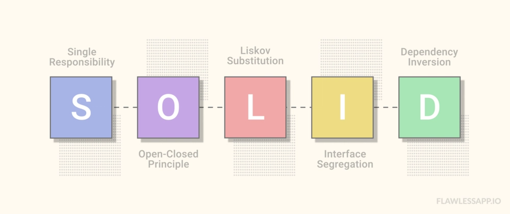
Single Responsibility at the Component Level
The Single Responsibility Principle (SRP) states that a module should have one reason to change. Applied to components, this means a component should focus on a single concern from the user’s perspective.
A common anti-pattern is the “smart UI component” that handles data fetching, validation, layout, and rendering all at once. While convenient initially, this approach tightly couples unrelated concerns and makes reuse difficult.
In contrast, excellent component design separates responsibilities clearly. Presentation-focused components handle rendering and styling. Feature-level components orchestrate behavior and state. Data access and side effects live outside the UI layer whenever possible. Feature-Sliced Design reinforces this separation by placing UI components, business logic, and data models into distinct layers with explicit boundaries.
Open/Closed Principle and Component Extensibility
Components should be open for extension but closed for modification. In practice, this means you should be able to adapt a component to new requirements without rewriting its internal logic.
This principle is strongly connected to API design. Components that expose flexible, intention-revealing props can be extended through composition instead of conditionals. When a new requirement forces you to add boolean flags like isSpecial, variantX, or enableY, it is often a signal that the component’s API is leaking internal decisions.
A more robust approach is to design components around variation points. Slots, render props, and controlled composition allow consumers to customize behavior while preserving internal invariants. This reduces churn and keeps components stable over time.
High Cohesion and Low Coupling
Cohesion measures how closely related the responsibilities of a component are. Coupling measures how dependent a component is on its surroundings. Excellent component design aims for high cohesion and low coupling simultaneously.
High cohesion means everything inside a component contributes directly to its purpose. Low coupling means the component relies on as few external assumptions as possible. This includes avoiding implicit dependencies on global state, hidden context providers, or unrelated domain logic.
Feature-Sliced Design enforces low coupling structurally. Slices communicate only through their public APIs, and dependency direction is strictly controlled. This architectural constraint naturally encourages components that are focused, isolated, and reusable within well-defined contexts.
Designing Clear and Intentional Component APIs
Props as a Public Contract
Props are the primary interface between a component and its consumers. A key principle in software engineering is that public APIs should be smaller and more stable than private implementations. The same applies to component props.
A clear component API uses descriptive names, predictable data shapes, and minimal configuration. Instead of exposing many low-level options, the API should express intent. For example, onSubmit communicates purpose more clearly than onClick, and status="error" is often preferable to multiple boolean flags.
Overexposed APIs increase cognitive load and make misuse more likely. Excellent component design treats props as a contract: once published, changes should be rare and deliberate.
Avoiding Boolean Explosion
Boolean props are easy to add but hard to scale. Multiple booleans interacting with each other create combinatorial complexity that is difficult to test and reason about.
A more maintainable approach is to replace booleans with enums, configuration objects, or composition patterns. This keeps the API expressive while reducing ambiguity. It also aligns with the Open/Closed Principle by allowing new variations without modifying existing logic.
Controlled vs Uncontrolled Components
Another important API decision is whether a component should manage its own state or defer control to its parent. Controlled components expose state and behavior through props, while uncontrolled components manage internal state.
Neither approach is universally correct. Controlled components are easier to integrate into complex flows and global state management. Uncontrolled components are simpler and reduce boilerplate for isolated use cases. Excellent component design makes this choice explicit and consistent.
In Feature-Sliced Design, this decision often correlates with layer responsibility. Shared UI components tend to be controlled and stateless, while feature-level components manage state as part of a user interaction scenario.
Composition as the Primary Reuse Mechanism
Why Composition Beats Inheritance
Inheritance creates rigid hierarchies that are difficult to evolve. Composition, on the other hand, promotes flexibility by assembling behavior from smaller pieces.
Modern UI frameworks embrace composition as a first-class concept. Components receive other components as children, functions, or slots, allowing behavior to be layered dynamically. This approach aligns with the principle of building small, focused units that can be combined in many ways.
Feature-Sliced Design complements composition by ensuring that composed parts come from appropriate layers, preserving architectural integrity while maximizing reuse.
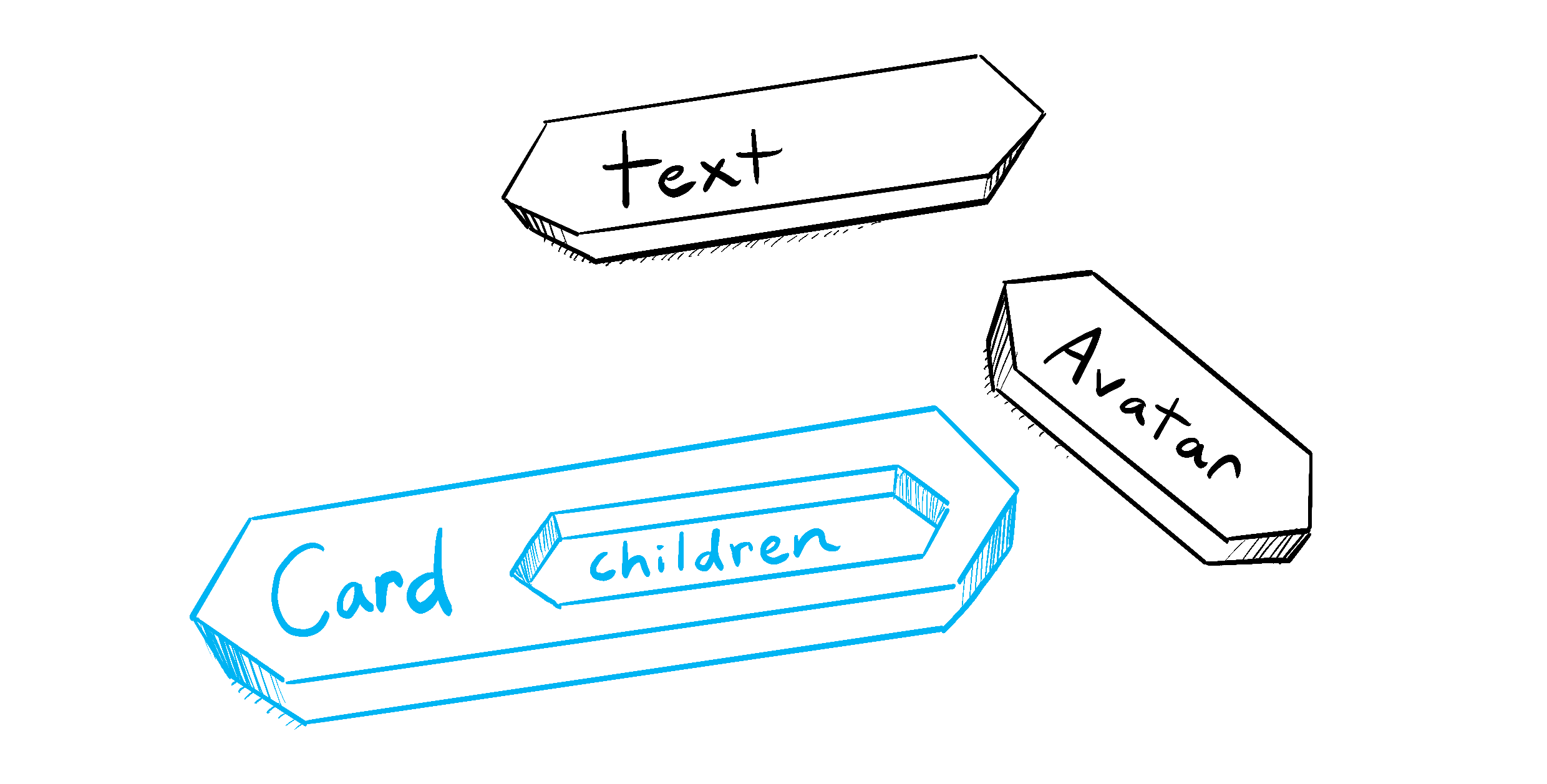
Compound Components Pattern
The compound components pattern allows multiple components to share state implicitly while presenting a declarative API. This is particularly useful for complex UI elements such as dropdowns, tabs, or accordions.
Instead of exposing internal state through props, the parent component manages shared logic, and child components consume it through context. The result is an expressive, readable API that mirrors the structure of the UI itself.
When used carefully, compound components improve cohesion and encapsulation. However, they should remain internal to a slice to avoid hidden dependencies across architectural boundaries.
Render Props and Function-as-Children
Render props provide maximum flexibility by allowing consumers to define rendering behavior as a function. This pattern is powerful for abstracting logic while delegating presentation.
The downside is verbosity and reduced readability when overused. Excellent component design balances render props with simpler composition techniques, reserving them for cases where customization requirements are genuinely complex.
Managing State with Intentional Boundaries

Local State vs Lifted State
One of the most common design questions is where state should live. Local state improves encapsulation and reduces dependencies, but lifted state enables coordination between components.
A useful heuristic is to colocate state as close as possible to where it is used, and lift it only when multiple consumers genuinely need access. Prematurely lifting state leads to tangled dependencies and makes components harder to reuse.
Feature-Sliced Design encourages state ownership at the feature or entity level, avoiding global stores for purely local concerns. This results in clearer data flow and fewer unintended side effects.
Derived State and Source of Truth
Derived state is often a sign of design issues. When the same information exists in multiple places, inconsistencies are inevitable. Excellent component design minimizes derived state and clearly defines a single source of truth.
Selectors, memoized computations, and pure functions are preferred over duplicating state. This approach simplifies reasoning and improves testability.
Testability as a Design Outcome
A component that is difficult to test is usually poorly designed. Tight coupling, hidden dependencies, and implicit behavior all increase testing friction.
Well-designed components are testable by construction. Clear inputs, predictable outputs, and isolated side effects make unit and integration tests straightforward. Components that rely on composition instead of inheritance are easier to mock and verify.
As demonstrated by projects using FSD, architectural boundaries directly support testing strategies. Features can be tested independently, entities can be validated in isolation, and shared UI components remain simple and predictable.
Comparing Component Design Approaches Across Architectures
| Approach | Strengths | Limitations |
|---|---|---|
| MVC / MVVM | Clear separation of technical concerns | UI components often become tightly coupled to view-models |
| Atomic Design | Strong UI consistency and reuse | Does not address business logic placement |
| Domain-Driven Design | Aligns code with business concepts | Requires deep domain understanding |
| Feature-Sliced Design | Explicit boundaries, scalable component structure | Initial learning curve |
This comparison highlights a recurring theme: excellent component design does not exist in isolation. It is deeply influenced by the surrounding architecture. Feature-Sliced Design stands out by providing concrete rules that guide component design decisions consistently across the codebase.
Practical File Structure Example with Feature-Sliced Design
A simplified feature slice might look like this: features/ add-to-cart/ ui/ add-to-cart-button.tsx model/ use-add-to-cart.ts index.ts
The UI component focuses solely on rendering and interaction. Business logic lives in the model. The public API exposes only what other slices are allowed to consume. This structure reinforces excellent component design by default, not by convention alone.
Conclusion: Component Design as a Long-Term Investment
Excellent component design is not about writing clever abstractions or minimizing file count. It is about creating stable, intention-revealing building blocks that support change rather than resist it. By applying principles such as single responsibility, clear API design, composition over inheritance, and intentional state boundaries, teams can build UI systems that scale both technically and organizationally.
Adopting a structured architecture like Feature-Sliced Design is a long-term investment in code quality and team productivity. It helps mitigate common challenges such as spaghetti code, unpredictable refactors, and slow onboarding, while providing a clear mental model for growth.
Ready to build scalable and maintainable frontend projects? Dive into the official Feature-Sliced Design Documentation to get started.
Have questions or want to share your experience? Join our active developer community on Website!
Disclaimer: The architectural patterns discussed in this article are based on the Feature-Sliced Design methodology. For detailed implementation guides and the latest updates, please refer to the official documentation.