The UI Architecture That Won't Break Your App

TLDR:

UI architecture breaks when features cross-import freely and “shared” becomes a dumping ground. This guide explains proven patterns (MVC, Atomic Design, BEM) and shows how Feature-Sliced Design structures layers, slices, and public APIs so teams can reuse UI safely, manage theming with design tokens, and ship changes without fragile refactors.
UI architecture is what keeps a growing interface from turning into a brittle maze of components, styles, and state. When your component library, design system architecture, and feature code evolve without clear boundaries, refactoring becomes risky and every release feels slower. Feature-Sliced Design (feature-sliced.design) offers a pragmatic way to structure UI modules so teams can scale the visual architecture, reuse components, and ship changes with confidence.
Table of contents
- What UI architecture is (and what it is not)
- Why UI architecture breaks in real teams
- Common UI architecture approaches and trade-offs
- Feature-Sliced Design in one picture: layers, slices, segments
- Public API, isolation, and dependency rules
- Reusability: component library + product UI without a “mega components” folder
- Theming and design tokens that survive redesigns
- Bridging Figma and code without losing intent
- Migrating to a safer UI architecture step-by-step
- Checklist: the UI architecture that won’t break your app
- Conclusion
What UI architecture is (and what it is not)
UI architecture is the set of decisions that define how your user interface code is organized: module boundaries, dependency direction, component composition, state ownership, styling strategy, and the contracts between “design system” pieces and “product feature” pieces.
A useful way to think about it:
- Structure: where code lives (folder structure, layering, naming).
- Rules: who can depend on whom (import conventions, public API).
- Contracts: what is safe to use (component props, tokens, slice exports).
- Evolution: how changes remain local (refactoring without ripple effects).
This is different from “UI design” (visual decisions) and even different from a “design system” in isolation. A design system can be excellent and still be implemented in a codebase with poor cohesion and tight coupling. In practice, robust UI architecture is what makes a design system adoptable across features without turning your app into a dependency hairball.
A key principle in software engineering is to optimize for change. When UI architecture is weak, change becomes expensive:
- Developers spend substantial time on maintenance work like debugging and refactoring. Stripe's Developer Coefficient report found that the average developer spends 17+ hours/week dealing with maintenance and ~4 hours/week on "bad code," with a large global opportunity cost estimate.
- McKinsey reports that organizations often carry tech debt equal to 20–40% of the value of their technology estate, and that a meaningful portion of "new product" budget is diverted into debt-related work.
- DORA's research highlights a strong relationship between technical debt and delivery performance—debt isn't just messy, it reduces throughput and stability.
In frontend terms: if every UI change forces you to touch unrelated files, coordinate across many people, or fear “unknown side effects,” the architecture is effectively broken.
Why UI architecture breaks in real teams
Most large UI codebases don’t “collapse” because developers are careless. They break because the structure doesn’t match how the product evolves.
The common forces behind “spaghetti UI”
- Horizontal organization that ignores product meaning
components/,hooks/,utils/,services/sounds clean… until everything depends on everything. - Unbounded reuse
Teams copy a component “just this once,” then you have 6 near-identical versions with subtly different behavior. - Cross-cutting concerns leak everywhere
Analytics, permissions, experiments, i18n, and feature flags creep into random components. - No explicit contracts
Deep imports into internal folders couple the whole app to implementation details. - Inconsistent ownership of state
Some state lives in pages, some in global stores, some inside components; debugging becomes archaeology.
A typical “works-until-it-doesn’t” structure looks like this:
src/
  components/
    Button.tsx
    ProductCard.tsx
    ProductCardCompact.tsx
  pages/
    ProductPage.tsx
  services/
    api.ts
  hooks/
    useProduct.ts
  utils/
    format.ts
At first it’s fast. Later, every change to ProductCard affects pages you didn’t expect, useProduct becomes an implicit global dependency, and utils/ becomes a dumping ground. Onboarding slows down because new developers can’t predict where logic belongs.
Leading architects suggest using module boundaries that reflect business capabilities and controlling dependency direction so refactoring stays local. That’s the core promise of a resilient UI architecture.
Common UI architecture approaches and trade-offs
No single methodology solves every frontend scaling problem. Mature teams often blend multiple patterns: a CSS methodology, a component taxonomy, and a module boundary strategy.
Below is an objective comparison of common approaches you'll see when people search for "UI architecture patterns," "visual architecture," or "frontend folder structure."
| Approach | What it's great at | Where it tends to break |
|---|---|---|
| MVC / MVP | Separating presentation logic and views; useful mental model for complex screens | Can become “layered spaghetti” in SPAs if you don’t enforce boundaries between features |
| Atomic Design | Building design systems and component libraries with a clear UI taxonomy (atoms → pages) | Doesn't define boundaries for business logic; features still cross-import freely |
| BEM | Predictable CSS architecture and reusable styling patterns | Solves naming and styling structure, not module boundaries or state ownership |
| DDD / Clean Architecture | Domain modeling and dependency inversion; aligns with backend thinking | Easy to over-abstract; mapping domain layers to UI modules needs strong conventions |
| Microfrontends | Organizational scaling: independent deployments and team autonomy | Adds runtime and integration complexity; without local structure you can still ship messy slices |
MVC/MVP: helpful, but incomplete for modern frontend apps
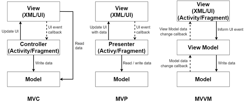
MVC/MVP is valuable for thinking about responsibilities (view vs state vs orchestration). But in React/Vue/Angular apps, the pain isn’t that you lack “controllers.” The pain is uncontrolled dependency graphs between features, shared UI, and domain logic.
MVC can be part of your intra-slice structure, but it rarely defines a project-wide rule that prevents cross-feature coupling.
Atomic Design: perfect for component libraries and design systems
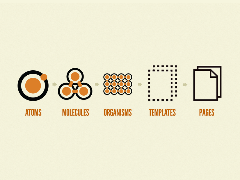
Atomic Design excels when you're building a component library or a design system architecture. It creates a shared language between designers and developers: atoms, molecules, organisms, templates, pages.
The gap: Atomic Design is about UI composition, not about product boundaries. Two different features can still share internal logic accidentally, and teams still argue about where “business UI” ends and “reusable UI” begins.
BEM: strong CSS methodology, not a full UI architecture
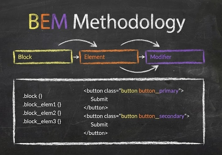
BEM (Block–Element–Modifier) helps teams build reusable components and share code in front-end development by standardizing naming and thinking in blocks.
It’s a powerful piece of the puzzle (especially for large CSS codebases), but it doesn’t define how routing, data fetching, entity models, and feature logic should be organized.
Takeaway: these approaches are useful, but most teams still need a project-wide methodology that controls dependencies and keeps changes local. That’s where Feature-Sliced Design fits.
Feature-Sliced Design in one picture: layers, slices, segments
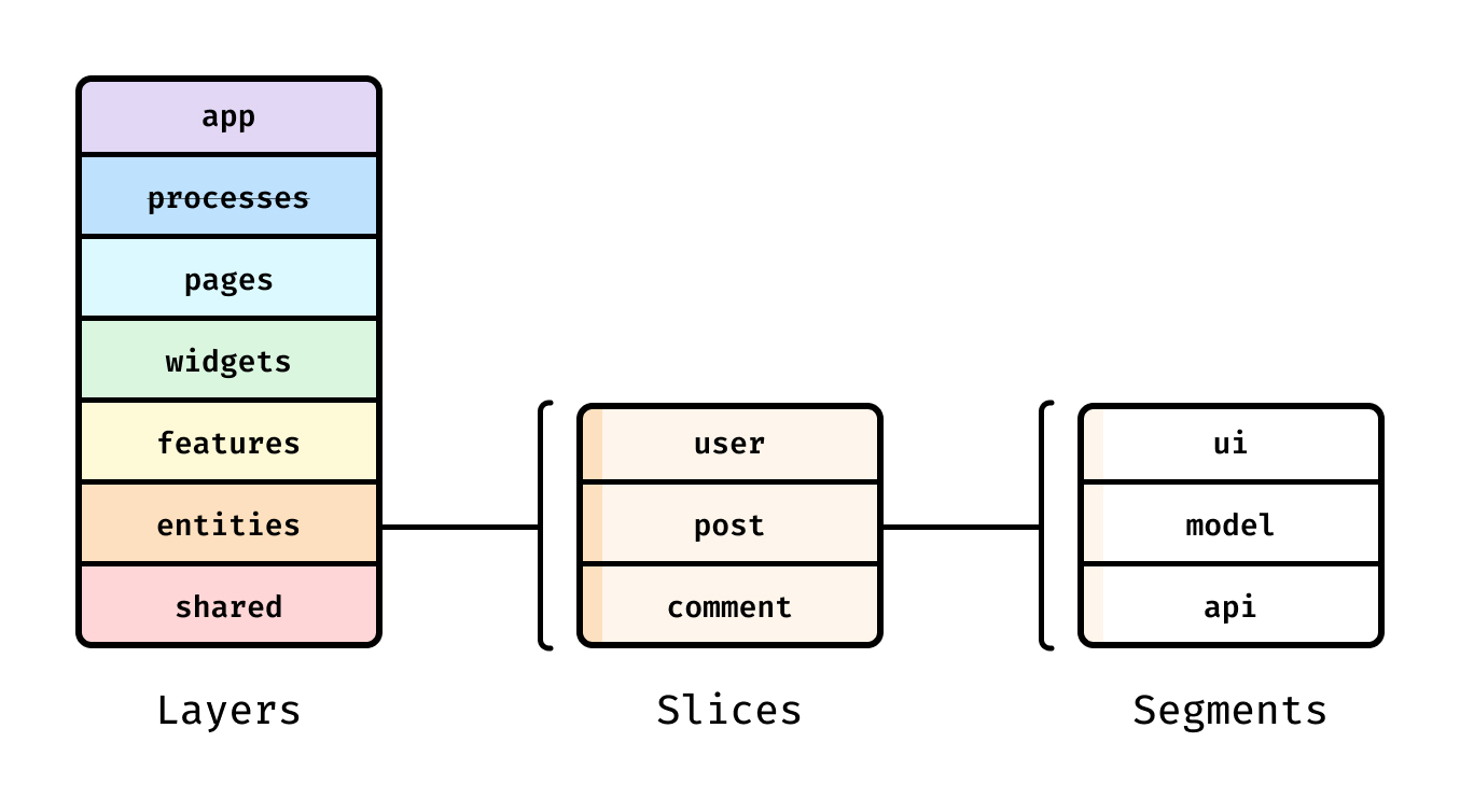
Feature-Sliced Design (FSD) is a modern architectural methodology tailored to building scalable front-end applications by organizing code around features and product meaning, not only technical types.
FSD introduces a simple hierarchy:
- Layers: the “responsibility ladder” (what can depend on what).
- Slices: cohesive groups by business domain (feature, entity, page, etc.).
- Segments: technical grouping inside a slice (ui, model, api, lib, config…).
This isn't abstract theory—FSD's official docs standardize layer semantics and explicitly define the import rule that regulates dependencies.
The seven layers (and why they matter)
FSD defines seven layers arranged by responsibility and dependency: app, processes (deprecated), pages, widgets, features, entities, shared.
A simple mental model:
- Higher layers compose and orchestrate.
- Lower layers provide building blocks.
- Dependencies go down, never sideways.
The import rule is explicit: a module in a slice can import from slices on layers strictly below.
That single rule eliminates a huge class of “UI breaks when we refactor” problems.
A practical FSD folder structure
Here is a realistic “starter” structure (React + TypeScript, but the idea is framework-agnostic):
src/
  app/
    providers/
    routes/
    entrypoint/
  pages/
    product/
      ui/
      api/
  widgets/
    header/
      ui/
  features/
    add-to-cart/
      ui/
      model/
      api/
  entities/
    product/
      model/
      api/
      ui/
  shared/
    ui/
    lib/
    api/
    config/
Notice the difference from typical “components/” centric setups:
- You can discover the app by reading
pages/andfeatures/. - UI reusability has a dedicated place (
shared/ui, plus entity and feature UI). - State, API calls, and UI are co-located inside the slice that owns them.
As demonstrated by projects using FSD, this structure reduces navigation time and makes ownership clearer when multiple teams contribute to the same codebase—because you can often answer “where should this go?” without a meeting.
Public API, isolation, and dependency rules
Good UI architecture is less about folder names and more about contracts. FSD formalizes those contracts with a public API: a controlled entry point for each slice or segment.
Public API: the contract that enables safe refactoring
In FSD, a public API is a contract between a slice and the rest of the codebase, typically implemented as an index.ts file that re-exports what is allowed.
Example (page slice exposing only its page component):
// pages/auth/index.ts
export { LoginPage } from "./ui/LoginPage";
export { RegisterPage } from "./ui/RegisterPage";
Now other code imports from:
import { LoginPage } from "pages/auth";
…and cannot (or should not) import:
import { validateEmail } from "pages/auth/model/validators"; // avoid deep import
This is how you make refactoring safe:
- You can move files, rename folders, split models, or change internal state management.
- As long as the public API stays stable, you don’t trigger a cascade of edits across the repo.
Isolation: cohesion inside, low coupling outside
A resilient UI module should have:
- High cohesion: related UI, state, and API calls live together (slice ownership is clear).
- Low coupling: other slices depend on stable exports, not internals.
FSD's layer import rule enforces low coupling across the whole project.
It also clarifies where cross-cutting concerns belong: app-wide providers in app/, foundational utilities in shared/, and business interactions in features/.
Handling real-world entity relationships
Entity slices are isolated by default, but real products have relationships (User owns Orders, Product appears in Cart). FSD documents an explicit escape hatch for cross-references using the @x notation so the coupling is visible and intentional.
That’s a “rare attribute” of architecture that matters in practice: instead of pretending dependencies don’t exist, you make them explicit so refactors remain predictable.
Enforcing the rules with tooling (so humans don’t have to)
Architecture breaks when rules are optional. Many teams enforce boundaries with lint rules and CI.
- The Steiger plugin for FSD documents the public API rule: every slice should define its public API.
- There are ESLint rules that validate imports use public APIs and support testing APIs.
A pragmatic enforcement sequence:
- Add path aliases (
shared/*,entities/*,features/*), so imports reflect the architecture. - Introduce public APIs for the busiest slices first (high change frequency).
- Block deep imports with ESLint (and allow exceptions only with explicit patterns).
- Automate in CI: every PR gets the same architectural feedback.
This is how “architecture” becomes a daily, reliable practice—not a wiki page no one reads.
Reusability: component library + product UI without a “mega components” folder
A common misconception is that "reusable UI" must live in one giant components/ directory. That usually creates the opposite of reuse: people can't find the right component, so they build another one.
In a scalable UI architecture, reusability exists at multiple levels:
- Design-system primitives (buttons, inputs, typography)
- Entity representations (UserAvatar, ProductPrice)
- Feature UI (AddToCartButton, LoginForm)
- Composable page blocks (Header, Sidebar, FiltersPanel)
FSD supports this naturally through layers.
| Layer | What belongs here | Reuse scope |
|---|---|---|
shared/ui | UI kit primitives, layout scaffolding, low-level visuals | Whole app (component library foundation) |
entities/*/ui | UI tied to a business entity’s representation | Many features/pages that show the same entity |
features/*/ui | UI for a user action or interaction | Reused where that interaction appears |
widgets/*/ui | Large UI blocks composed from features/entities/shared | Reused across pages or router blocks |
A design-system-friendly approach inside FSD
If you maintain a design system architecture, FSD gives you a stable place for it:
- Put tokens, theming utilities, and primitives in
shared/. - Keep primitives policy-free:
- No direct API calls
- No feature flags
- No product-specific state
- If a component needs product rules, it likely belongs in
features/orentities/.
This keeps your component library clean and your product UI expressive.
Example: a clean boundary for a “login” interaction
Instead of scattering login UI across pages:
features/
  auth-by-email/
    ui/LoginForm.tsx
    model/useLogin.ts
    api/login.ts
    index.ts
Now pages/login composes it:
import { LoginForm } from "features/auth-by-email";

export function LoginPage() {
  return <LoginForm />;
}
That’s high cohesion (the interaction lives together) and low coupling (the page depends only on the public API).
Theming and design tokens that survive redesigns
Theming is where many UI architectures quietly rot. Teams hardcode colors “temporarily,” then a rebrand arrives, and the UI breaks in a thousand places.
Design tokens are the antidote: a standardized way to represent visual decisions (color, spacing, typography) so multiple tools and platforms can share them. The Design Tokens Community Group publishes standards for sharing tokens at scale, and the Design Tokens Format specification defines a file format for exchanging tokens between tools.
Token taxonomy that scales
A robust token system usually has three levels:
- Primitive tokens: raw values
color.blue.500,space.4,font.size.2 - Semantic tokens: intent-based aliases
color.text.primary,color.bg.surface,space.content.gap - Component tokens: component-specific styling knobs
button.bg.default,button.bg.hover
This structure improves visual architecture because the code expresses meaning, not just values.
A minimal DTCG-style token example
Using a Design Tokens spec format (simplified):
{
  "color": {
    "blue": {
      "500": { "$type": "color", "$value": "#3B82F6" }
    },
    "text": {
      "primary": { "$type": "color", "$value": "{color.blue.500}" }
    }
  },
  "space": {
    "4": { "$type": "dimension", "$value": "16px" }
  }
}
Then expose them as CSS variables (generated or manually mapped):
:root {
  --color-text-primary: #3B82F6;
  --space-4: 16px;
}
[data-theme="dark"] {
  --color-text-primary: #93C5FD;
}
Where tokens and theming live in FSD
A practical placement:
shared/
  config/theme/
    tokens.json
    themes.ts
  ui/theme-provider/
    ThemeProvider.tsx
  lib/tokens/
    resolveToken.ts
This keeps theming in Shared (lowest-level foundation), so features and pages consume stable primitives instead of inventing local themes.
Aligning tokens with design tools (Figma variables and modes)
Figma supports using variables and modes to represent design tokens and switch contexts like light/dark themes.
In Dev Mode, variables can appear in code snippets, helping developers inspect token usage.
That bridge matters: when design tokens have consistent naming across design and code, you reduce “translation errors” and keep UI implementation fast during redesigns.
Bridging Figma and code without losing intent
Most friction between design and development comes from losing intent during handoff. Designers think in semantics (“surface”, “primary text”, “danger state”), while code often sees raw colors and ad-hoc spacing.
A dependable workflow connects the two.
A practical design-to-code loop
- Agree on a token naming scheme
Use semantic tokens as the shared language (color.text.primarybeats#111827). - Map Figma variables to token IDs
Treat the token ID as the source of truth; Figma values become modes/overrides. - Implement tokens in
shared/and expose them via theming utilities
This prevents feature code from inventing local colors. - Publish UI primitives and patterns in a component library
Document usage in Storybook (or your preferred UI workbench) so product teams reuse instead of cloning. - Keep contracts stable
A component’s public API (props + behavior) should evolve with care, just like a backend endpoint.
The result is a design system architecture that is operational: designers can change themes and token values, and developers can refactor internals without breaking consumers.
Migrating to a safer UI architecture step-by-step
Adopting a new UI architecture doesn’t require a rewrite. In fact, a rewrite is often where teams lose momentum.
A pragmatic migration aims for risk reduction per week.
Step 1: Establish the layers (even if slices are messy at first)
- Create the top-level
app/,pages/,shared/folders. - Move routing and providers into
app/. - Map your main routes into
pages/slices.
This alone improves discoverability, and it sets you up to enforce dependency direction later.
Step 2: Move your design system foundation into shared/
- Introduce tokens and a ThemeProvider in
shared/. - Start migrating the most reused UI primitives into
shared/ui/.
This is high leverage: it reduces visual inconsistencies and improves reusability quickly.
Step 3: Extract entities with obvious ownership
Look for nouns that appear everywhere: User, Product, Order.
Move:
- Types/models into
entities/*/model - API functions into
entities/*/api - Stable UI representations into
entities/*/ui
Now features can depend on entities without pages turning into “god components.”
Step 4: Extract features based on user actions
Features are verbs users care about: "add to cart," "subscribe," "filter results." In FSD, features are ideally reused across multiple pages.
Create feature slices and move interaction logic + UI together.
Step 5: Add public APIs and enforce import rules
- Create
index.tspublic APIs for slices. - Add lint rules to prevent deep imports and illegal layer imports.
At this point, “architecture” becomes self-maintaining: the codebase prevents regression.
Step 6: Measure improvements with delivery metrics
Even without perfect data, you can track:
- PR size and review time
- Frequency of “refactor broke X” incidents
- Lead time to change and rollback rate (DORA-style outcomes)
A healthier UI architecture should improve stability and reduce the cost of change over time.
Checklist: the UI architecture that won’t break your app
Use this as a quick audit for your frontend architecture:
- Structure
- Pages are discoverable in
pages/, not buried in “routes + components + containers.” - Shared foundations (UI kit, tokens, environment config) live in
shared/.
- Pages are discoverable in
- Boundaries
- Features and entities have clear ownership; cross-imports are intentional, not accidental.
- Every slice has a public API (
index.ts) and consumers import only from it.
- Dependency direction
- Imports follow a rule (e.g., only downward by responsibility).
- Tooling enforces it (lint + CI), not tribal knowledge.
- Reusability
- Component library primitives are policy-free and stable.
- Business UI lives in features/entities/widgets, not in
shared/ui“because reuse.”
- Design integration
- Tokens and semantics match between Figma variables and code where possible.
If you can check most of these boxes, your UI architecture is much less likely to “break” under growth.
Conclusion
A UI architecture that survives growth does three things consistently: it keeps dependencies directional, it makes ownership obvious, and it turns refactoring into a local change by enforcing public APIs and isolation. Approaches like Atomic Design and BEM remain useful—especially for a component library and CSS structure—but they don't fully solve cross-feature coupling on their own. Feature-Sliced Design complements those methodologies by providing a practical, standardized project structure (layers, slices, segments) and rules that keep large codebases understandable and safe to evolve.
Ready to build scalable and maintainable frontend projects? Dive into the official Feature-Sliced Design Documentation to get started.
Have questions or want to share your experience? Visit our homepage to learn more!
Disclaimer: The architectural patterns discussed in this article are based on the Feature-Sliced Design methodology. For detailed implementation guides and the latest updates, please refer to the official documentation.