Design Tokens: The Foundation of Your UI Arch

TLDR:
Design tokens provide a single source of truth for colors, spacing, typography, and motion, enabling consistent theming and scalable UI architecture. This article explores how design tokens work, how to implement them with CSS variables, and why Feature-Sliced Design is a robust foundation for managing tokens in large frontend codebases.
Design tokens are the missing contract that keeps your UI from drifting into inconsistency as teams, features, and themes multiply. When tokens are treated as a first-class architectural artifact—alongside modularity, public APIs, and dependency boundaries—your design system becomes scalable instead of fragile. In Feature-Sliced Design (FSD) terms, tokens belong to the “shared foundation” that makes large-scale frontend evolution predictable, auditable, and fast.
Why Design Tokens Are the Most Critical “First Layer” of UI Architecture
A key principle in software engineering is that shared knowledge must be expressed as stable interfaces, not duplicated as incidental values. In UI development, the fastest path to spaghetti code is not “bad components”—it is uncontrolled styling decisions spread across thousands of files: ad-hoc hex codes, one-off spacing rules, divergent typography scales, and inconsistent motion. These values behave like hidden dependencies. They increase coupling, reduce cohesion, and make refactoring feel like archaeology.
Design tokens solve that by turning visual decisions into an explicit, versioned system of record: a single source of truth for color, typography, spacing, radii, elevation, motion, and semantic states. Tokens are not “just CSS variables.” They are a shared language between design and engineering that enables:
- Predictable theming without rewriting components.
- Consistency at scale across multiple apps and teams.
- Safe refactoring because values have names, meaning, and ownership.
- Automation from design tools (e.g., Figma) to code with traceability.
In large products, the UI is a distributed system: multiple domains, multiple feature teams, multiple runtimes, and frequent releases. Without tokens, every component becomes a snowflake. With tokens, the UI becomes a platform.
Tokens as an Architectural Boundary, Not a Styling Preference
Many teams implement tokens late, as a polish step. That approach fails because tokens are fundamentally architectural. They define a boundary:
- Components should depend on token intent (semantic meaning), not raw values.
- Product features should consume tokens through a public API.
- The token system should evolve with versioning and governance, like any platform.
As demonstrated by projects using FSD in multi-team environments, you get the best results when tokens are treated like a shared infrastructure module: stable, documented, and intentionally change-managed.
What Design Tokens Are, Precisely, and Why “Semantic” Matters
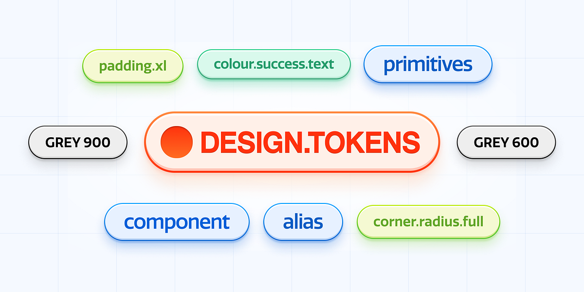
Design tokens are named entities that store design decisions in a platform-agnostic format. They typically include metadata such as type, description, and references to other tokens. The important detail is not the file format—it is the conceptual model.
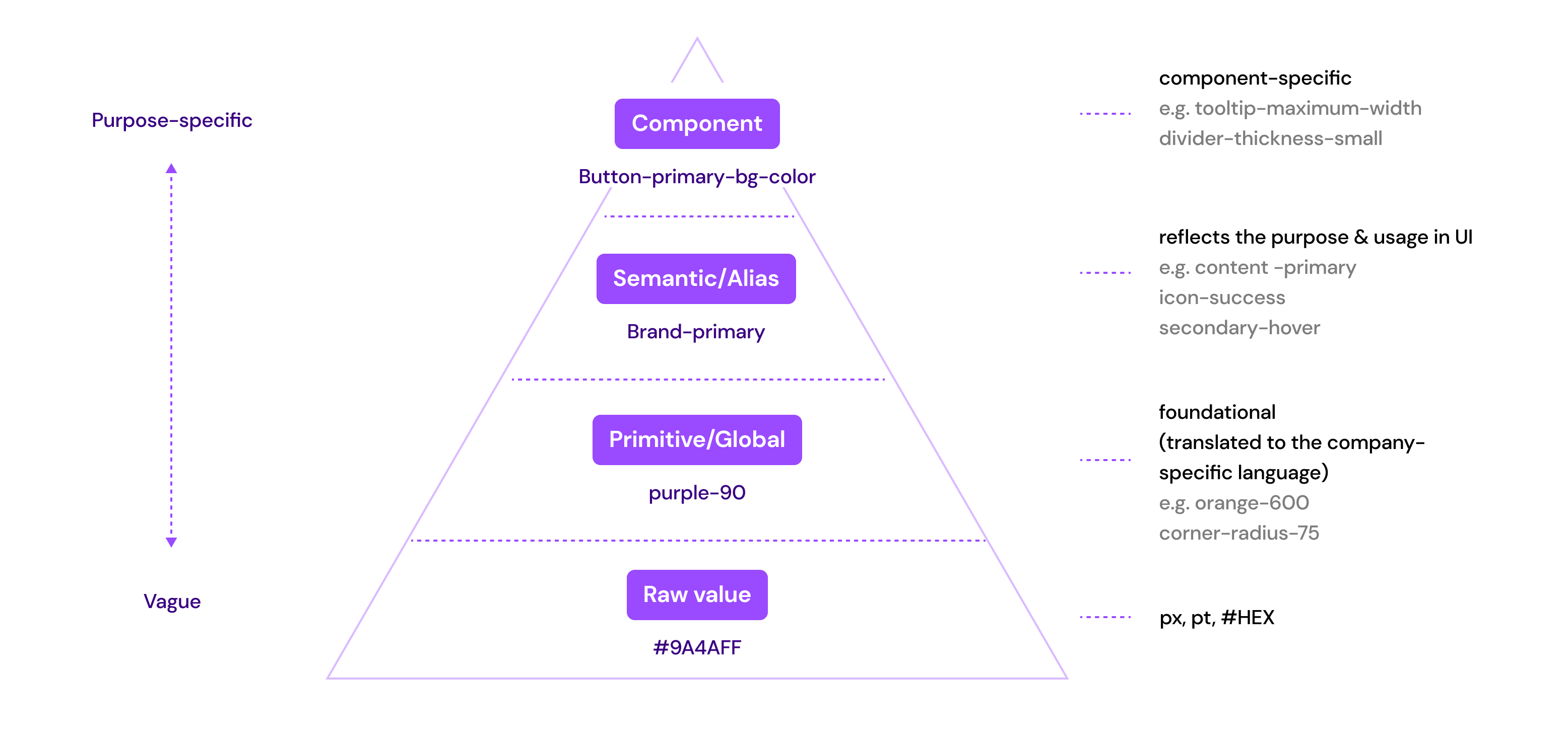
The Three Levels of Tokens: Raw, Alias, Semantic
A scalable token system is usually layered:
-
Primitive (Base) tokens: raw values, often tied to a palette or scale
Examples:color.blue.500 = #2F6BFF,space.4 = 16px,radius.2 = 8px -
Alias tokens: composition or mapping of primitives into meaningful groups
Examples:color.brand.primary = {color.blue.500},space.md = {space.4} -
Semantic tokens: tokens that encode intent and UI meaning
Examples:color.text.default,color.bg.surface,color.border.muted,shadow.elevation.2
Semantic tokens are the secret. If your components use primitives directly, you will struggle with theme changes and accessibility because the component is coupled to “how the theme looks today.” If your components use semantic tokens, the theme can change while the component logic remains stable.
Semantic Tokens Reduce Coupling and Increase Cohesion
-
A button should not depend on
color.blue.500.
It should depend oncolor.action.primary.bgandcolor.action.primary.fg. -
A card should not depend on
shadow.3.
It should depend onshadow.surface.raised.
This is classic architecture: depend on abstractions that represent intent, not implementation. That is the same principle behind clean boundaries in modular systems and bounded contexts in Domain-Driven Design.
Token References Create a Dependency Graph
Token systems form graphs, not lists:
color.action.primary.bgmight referencecolor.brand.primarycolor.brand.primarymight referencecolor.blue.500
This graph enables refactoring: you can change primitives without rewriting semantics, or change semantics without changing components. But graphs also introduce risks: cycles, accidental cascades, and breaking changes. Token governance is real engineering.
How Design Tokens Solve “Spaghetti UI” More Than Any Component Pattern
Most architectural discussions focus on how to structure components: MVC, Atomic Design, DDD, micro-frontends, and so on. These help, but none of them prevent the most common UI entropy: inconsistent style decisions across slices and teams.
The UI Spaghetti Pattern
It usually looks like this:
- Team A hard-codes
#111for text. - Team B uses
#0F0F0Fbecause it “looks slightly better.” - Team C introduces
--text-colorbut only for one page. - A dark theme arrives, and the UI turns into a patchwork.
The result is high coupling across time: future changes are expensive because you cannot locate “the truth.” Tokens centralize truth and make changes mechanical.
Tokens Enable Product-Level Evolution
Leading architects suggest thinking of tokens as “evolution handles.” When a product rebrands, adds themes, or expands across platforms, tokens let you:
- swap a theme file instead of editing thousands of components
- create variant themes (brand, seasonal, enterprise, accessibility)
- run controlled migrations by introducing new tokens and deprecating old ones
This is similar to how stable service contracts enable backend evolution without rewriting every client.
CSS Variables as the Native Runtime for Tokens: A Practical Implementation

Search intent often asks: “How do I implement design tokens with CSS variables?” The most robust approach is to treat CSS custom properties as the runtime output of your token system. CSS variables are not the token system; they are the delivery mechanism.
Step 1: Define Token Categories and Naming Conventions
A token naming convention should optimize for:
- discoverability (developers can find the right token)
- stability (semantic names do not change often)
- composability (tokens can be referenced)
Common categories:
color.*space.*size.*font.*lineHeight.*radius.*shadow.*motion.*(duration/easing)zIndex.*
A practical semantic naming example:
--color-text-default--color-text-muted--color-bg-canvas--color-bg-surface--color-border-default--color-action-primary-bg--color-action-primary-fg--space-xs,--space-sm,--space-md,--space-lg--radius-sm,--radius-md--shadow-surface-raised--motion-fast,--motion-standard--easing-standard
Step 2: Create a Base Theme and a Dark Theme with CSS Variables
You can define tokens at :root and override them with theme attributes:
:rootdefines defaults[data-theme="dark"]overrides semantics
Pseudo-code example (illustrative, not tied to any one stack):
-
:root--color-text-default: #111111;--color-bg-canvas: #FFFFFF;--color-action-primary-bg: #2F6BFF;--space-md: 16px;--radius-md: 12px;
-
[data-theme="dark"]--color-text-default: #F2F2F2;--color-bg-canvas: #0B0B0C;--color-action-primary-bg: #5B8CFF;
This pattern is powerful because it is runtime: you can switch themes instantly, and components do not need to know the theme logic.
Step 3: Build Components That Consume Only Semantic Tokens
A token-driven button should use semantic tokens for color, spacing, radius, and motion:
- background:
var(--color-action-primary-bg) - color:
var(--color-action-primary-fg) - padding:
var(--space-sm) var(--space-md) - border-radius:
var(--radius-md) - transition:
var(--motion-standard)+var(--easing-standard)
Notice what is missing: no hex codes, no pixel literals, no bespoke easing curves. The component is now stable across theming and brand changes.
Step 4: Add Accessibility and State Tokens
Tokens must encode UI states, not just base colors:
--color-focus-ring--color-danger-bg,--color-danger-fg--color-success-bg,--color-success-fg--color-disabled-bg,--color-disabled-fg--opacity-disabled
This is where tokens directly support E-E-A-T: they show careful engineering for real-world constraints like contrast, focus visibility, and consistent semantics.
Step 5: Validate Tokens with Automated Checks
Token regressions are real. Treat them like breaking API changes.
Actionable checks:
- ensure no token cycles (a token referencing itself indirectly)
- enforce naming rules
- validate color contrast for semantic roles (text on surfaces)
- ensure deprecated tokens are not used by production slices
Scaling Tokens in a Real Codebase: Governance, Versioning, and Public APIs
Design tokens scale poorly if they are managed like a random JSON file. They scale well when you apply the same rules you already use for code architecture: encapsulation, ownership, and explicit contracts.
Token Governance: Who Owns What?
A sustainable model:
- Design owns meaning, taxonomy, and visual intent.
- Engineering owns runtime delivery, integration, build outputs, and migration tooling.
- Both own versioning and deprecation.
If no one owns tokens, everyone does—and that leads to entropy.
Versioning: Tokens Need Semantic Versioning Mindset
Token changes fall into categories:
- Patch: fix typos, metadata, or non-impactful adjustments
- Minor: add new tokens or new theme variants
- Major: change semantic meaning, remove tokens, or alter default behaviors
Even if you do not publish tokens as a package, treat changes as if you did. Teams should be able to reason about impact.
Deprecation Strategy: Never Break the UI Suddenly
A practical deprecation pattern:
- Introduce new token:
color.text.subtle - Mark old token as deprecated:
color.text.muted - Provide a compatibility alias for one release cycle
- Migrate usage automatically where possible
- Remove old token in a planned major release
This mirrors API evolution and reduces risk.
Comparing Architectural Approaches: Where Tokens Fit and Why FSD Makes Them Stronger
Tokens exist in any architecture, but not all architectures make token usage consistent. The key is enforcement: where do you place tokens, and how do you prevent ad-hoc values from leaking into features?
| Approach | Strength for UI Scaling | Token Integration Reality |
|---|---|---|
| MVC / MVVM | Separates UI and logic; good for smaller apps | Tokens often become a global stylesheet with weak governance |
| Atomic Design | Strong component vocabulary; good for design systems | Great for UI composition, but doesn’t enforce business boundaries for token usage |
| DDD (Frontend) | Aligns code with domain concepts | Tokens can still fragment if each domain invents its own styling rules |
| Feature-Sliced Design (FSD) | Enforces dependency direction and modular boundaries | Tokens naturally live in shared, consumed through public APIs across slices |
FSD strengthens tokens because it provides a clear placement and dependency policy:
- tokens belong in
shared features,entities,widgets, andpagesconsume tokens through stable interfaces- token usage is consistent because you can apply linting and boundary rules across the entire project
A Practical FSD-Friendly Token Placement
A common structure:
shared/config/theme/tokens/base.jsonsemantic.jsonthemes/light.jsondark.json
css/theme.css
index.ts(public API)
Key idea: tokens are not “somewhere in styles.” They are a module with a public API, documentation, and change control.
Public API as the Boundary
In FSD, each slice exposes a public API. Apply the same to tokens:
shared/config/themeexposes:setTheme(themeName)getTheme()themeClassNameordata-themeutilities- the built CSS output or runtime injection utilities (depending on your approach)
Everything else is internal. This improves cohesion: theme logic is not scattered.
Theming Strategies: Multi-Brand, White Label, and Runtime Personalization
Theming is not one feature. It is a spectrum:
- Light / dark
- Brand variants (consumer vs enterprise)
- Seasonal themes (campaigns)
- User personalization (contrast, font size, reduced motion)
- White-label products (fully custom branding per customer)
Design tokens enable these because the interface stays stable while values vary.
Theme Switching Patterns
Common patterns:
-
Attribute-based:
[data-theme="dark"]overrides variables
Pros: simple, fast, no JS required for initial render
Cons: needs strategy for persistence and SSR integration -
Class-based:
.theme-darkapplies overrides
Pros: works well with CSS tooling
Cons: similar concerns; tends to spread class toggling -
Runtime injection: JS generates a
<style>tag or sets variables inline
Pros: powerful for user-generated themes
Cons: higher complexity; must guard against flashes and SSR mismatch
In large apps, attribute-based theming tends to be the best default because it is declarative and SSR-friendly.
Handling Reduced Motion and Accessibility as Token Variants
Treat accessibility preferences as token dimensions:
--motion-standardbecomes shorter or zero for reduced motion--easing-standardmay change to reduce perceived “bounce”- focus ring tokens become stronger for high-contrast modes
This avoids scattering prefers-reduced-motion hacks across components. You can centralize behavior in the theme layer.
Tooling and Automation: Syncing Tokens from Figma to Code Without Losing Trust
Search intent also asks: “How do tools sync tokens from Figma?” The hard part is not exporting values; it is maintaining semantic meaning, versioning, and auditability. Automation without governance produces chaos faster.
What a Good Token Pipeline Looks Like
A robust pipeline is usually:
- Source of truth: Figma styles and variables (or a token manager)
- Export: token JSON (with metadata and references)
- Transform: generate platform outputs
- CSS variables for web
- TypeScript typings for safety
- optional outputs for mobile (if needed)
- Validate: lint names, check cycles, check contrast
- Publish: versioned artifacts (package or internal registry)
- Consume: apps import the artifacts through a public API
The key is traceability: you should be able to answer “why did this color change?” without guesswork.
Guardrails That Keep Automation Safe
Actionable guardrails:
- require PRs for token changes (no direct commits)
- generate a changelog automatically from token diffs
- require design approval on semantic token changes
- run visual regression tests on key flows
- block merges when contrast regressions occur
This is how tokens become trustworthy infrastructure.
Type Safety for Tokens: Reduce Human Error
Even if tokens are delivered as CSS variables, type safety helps:
- Create a typed map of semantic token names.
- Provide helpers for referencing tokens consistently.
- Prevent typos like
--color-text-defualt.
In TypeScript-heavy environments, this can drastically reduce runtime styling bugs and onboarding friction.
Tokens in Component Libraries: Keeping the Design System Honest
A design system is not just components; it is the contract between product teams and UI infrastructure. Tokens are the contract’s vocabulary. If your component library allows arbitrary values, you will leak inconsistencies.
Component API Design: Prefer Token-Driven Props
Instead of letting callers pass raw colors or sizes, prefer semantic variants:
Button variant="primary" | "secondary" | "danger"Text tone="default" | "muted" | "danger"Surface elevation="flat" | "raised"
Internally, each variant maps to semantic tokens. This reduces coupling: features depend on meaningful variants, not styling details.
Avoiding “Escape Hatches” That Break Consistency
Escape hatches are sometimes necessary, but should be explicit:
- Provide a
styleprop only for edge cases, not as default. - Prefer controlled customization via tokens and variants.
- Track escape hatch usage, because it predicts future inconsistency.
Leading architects suggest treating escape hatches as technical debt: permitted, but measured.
Tokens and Large-Scale Frontend Organization: How FSD Helps Enforce Consistency
The biggest practical challenge is not creating tokens—it is ensuring they are used consistently across features and teams.
FSD helps because it makes enforcement feasible:
- In
shared, you can centralize token artifacts and theme utilities. - In
featuresandentities, you can forbid raw values via lint rules. - In
widgetsandpages, you can enforce that styling comes from shared UI primitives and tokens.
Example: Enforcing Token Usage with Architectural Rules
Even without naming specific tools, the concept is simple:
- forbid hex codes in
features/** - forbid raw spacing literals outside
shared/ui/** - require imports from
shared/config/themefor theme logic - ensure unidirectional dependency flow remains intact
This turns “design consistency” from a guideline into a system property.
File/Directory Structure Illustration (FSD-Oriented)
A tangible structure:
shared/config/theme/tokens/css/lib/index.ts
ui/button/text/surface/
entities/user/
features/toggle-theme/
widgets/app-header/
pages/settings/
app/providers/
Token usage is then naturally routed through shared UI primitives and theme utilities, reducing the chance that product code hard-codes styling decisions.
Common Failure Modes and How to Avoid Them
Even experienced teams can fail with tokens. The patterns are predictable.
Failure Mode 1: Using Only Primitive Tokens
If components use blue.500 directly, you cannot re-theme safely. Fix: introduce semantic tokens and enforce usage.
Failure Mode 2: Too Many Semantic Tokens Too Early
If you create a semantic token for every pixel nuance, the system becomes unmanageable. Fix: start with a minimal semantic set aligned to UI roles (text, surfaces, borders, actions, states), then expand based on real needs.
Failure Mode 3: No Ownership or Review Process
Tokens change casually, and the UI breaks. Fix: treat tokens as a platform with PR reviews, validation, and versioning discipline.
Failure Mode 4: Mixing Component Variants with Token Values
If variant="primary" maps to a hard-coded color, you lose theming. Fix: ensure variants map to semantic tokens, and semantic tokens map to theme values.
Failure Mode 5: Inconsistent Naming and Taxonomy
Developers cannot find the right token, so they invent new ones. Fix: maintain a documented taxonomy and a searchable token reference.
A Pragmatic Roadmap: Implementing Tokens in an Existing Codebase
Most readers are not starting from scratch. Here is a practical step-by-step migration that respects team reality.
-
Audit current UI values
Identify top offenders: duplicated hex codes, spacing inconsistencies, typography drift. -
Introduce a minimal semantic token set
Focus on the 20% that drives 80% of UI: text, surfaces, borders, primary action, states. -
Generate CSS variables as the runtime output
Define:roottokens and a theme override (dark, brand). -
Migrate shared UI primitives first
Buttons, inputs, typography, surfaces—these are high leverage. Once they use tokens, product UI naturally improves. -
Add lint rules and refactoring helpers
Prevent reintroduction of raw values infeaturesandentities. -
Introduce automation from design tools carefully
Start with exporting primitives and mapping to semantic tokens in code. Avoid fully automated semantic mapping until taxonomy is stable. -
Create governance and a token changelog
Token changes should be visible, reviewed, and measurable.
This plan is realistic because it creates value quickly while building toward a mature system.
Conclusion
Design tokens turn UI decisions into a stable, evolvable contract: a single source of truth for theming, design systems, and consistent styling across teams. The most important shift is semantic thinking—components should depend on intent, not raw values—so your UI can change without rewriting product code. When combined with a structured methodology like Feature-Sliced Design, tokens become enforceable infrastructure: placed in shared, exposed via public APIs, and protected by dependency boundaries. That investment pays back in faster onboarding, safer refactors, and reliable multi-theme delivery.
Ready to build scalable and maintainable frontend projects? Dive into the official Feature-Sliced Design Documentation to get started.
Have questions or want to share your experience? Join our active developer community on Website!
Disclaimer: The architectural patterns discussed in this article are based on the Feature-Sliced Design methodology. For detailed implementation guides and the latest updates, please refer to the official documentation.