Secrets of a Scalable Component Architecture

TLDR:

Component architecture scales when boundaries are explicit, APIs are stable, and UI composition is intentional. This guide walks through practical component design patterns (presentational/container, compound, headless), state partitioning, and library organization—then shows how Feature-Sliced Design (FSD) makes these practices repeatable across teams and codebases.
Component architecture is the difference between a UI that scales gracefully and one that collapses into tangled dependencies. When your component design, UI composition, and reusable components are guided by clear boundaries, you can add features without rewriting half the app—and that’s exactly the kind of discipline Feature-Sliced Design (FSD) on feature-sliced.design encourages. This article breaks down the practical principles, patterns, and project structures that make component-based systems fast to evolve.
Why scalable component architecture starts with boundaries and cohesion
A key principle in software engineering is that structure is a performance feature: it determines how quickly humans can understand, change, and verify code. In frontend systems, the cost of change is often driven less by the rendering library and more by architectural friction—unclear responsibilities, unstable interfaces, and accidental coupling.
A scalable component architecture is built on a few fundamentals:
- High cohesion: a component (or slice) owns one concept, not a grab bag of concerns.
- Low coupling: changes in one area don't ripple across unrelated parts of the UI layer.
- Stable public API: consumers depend on what you intentionally export, not internal files.
- Isolation by default: side effects (network, storage, analytics) are not silently triggered by UI composition.
- Modularity with constraints: “modular” is not “any file can import any file.”
Boundary design: what is a “component” at scale?
In a small project, “component” means “a function that returns markup.” In a large-scale frontend architecture, a component is closer to a module with a contract:
- Inputs: props, slots/children, events/callbacks, injected dependencies (rare).
- Outputs: rendered UI, emitted events, state updates, navigation intent.
- Invariants: accessibility, theming, responsive behavior, error states.
- Dependencies: UI primitives, domain entities, and explicit side-effect boundaries.
The critical upgrade is to treat components as units of change. If a component changes frequently because it’s too close to product iteration, it should not become a foundation for half the app. Conversely, truly stable primitives (buttons, typography, layout) deserve extra rigor because many features will build on them.
Composition over inheritance, but with discipline
“Composition over inheritance” is widely repeated, but the scalable version is more specific:
- Prefer UI composition (children, slots, render props, compounds) when you want customization without forking.
- Prefer configuration via data when you want variation without branching logic.
- Prefer wrappers only when the wrapper adds a clear responsibility (e.g., analytics boundary, permissions gate).
In practice:
- Avoid “mega-components” with 20+ props controlling behavior branches.
- Favor a small set of orthogonal props plus composition points.
- When optional behavior grows, split into feature-level components rather than inflating a shared component.
Single responsibility in the UI layer
The Single Responsibility Principle (SRP) is not about “one file, one reason to change.” It’s about one axis of change per module.
For component architecture, SRP can be operationalized like this:
- Render responsibility: present content and structure.
- Interaction responsibility: handle user actions and local UI state.
- Orchestration responsibility: coordinate domain workflows (often feature-level).
- Integration responsibility: talk to APIs, cache, router, analytics (kept behind boundaries).
When you mix these freely, components become brittle. When you separate them intentionally, refactoring becomes routine instead of scary.
A mental model that scales: “onion of dependencies”
Imagine a simple schema:
- Outer ring: screens/pages and layout composition (high churn).
- Middle ring: features and widgets (product workflows, medium churn).
- Inner ring: entities and shared UI primitives (low churn, high reuse).
The direction of dependencies should trend inward: outer rings may use inner rings, but inner rings should not depend on outer ones. This dependency rule is the foundation of predictable growth.
Common component design pitfalls that block scale
Most teams don’t fail because they lack talent; they fail because the architecture silently rewards shortcuts. The good news is that the failure modes are consistent—and fixable.
1) “God components” and hidden responsibilities
Symptoms:
- One component fetches data, validates forms, handles navigation, and renders a complex layout.
- Tests are hard because everything is entangled.
- Small UI changes break logic.
A robust methodology for avoiding this is to enforce a split between:
- Presentational components (rendering and minor interaction)
- Orchestrators (feature workflow and integration)
You don’t need dogma—just a repeatable rule for where things belong.
2) Leaky abstractions and unstable prop contracts
A component becomes unscalable when its API exposes internals:
- Passing raw backend DTOs into UI components.
- Requiring consumers to know CSS class names or DOM structure.
- Exposing “escape hatches” that bypass invariants.
A scalable contract is smaller, more semantic, and stable:
- Prefer
status="loading" | "success" | "error"overisLoading,hasError,errorText,spinnerSize, etc. - Prefer domain-aligned props like
price,currency,discountovervalueandmeta.
3) Accidental global state and context overload
A common anti-pattern is using global state (Redux, MobX, Zustand, Vuex/Pinia, RxJS streams, signals) to avoid prop drilling. Prop drilling is annoying, but global state is sticky: once everything is global, nothing is local.
Healthy scaling patterns:
- Colocate state with the smallest owner.
- Lift only when multiple siblings genuinely need it.
- Separate server state (cached remote data) from client state (UI state).
- Use Context sparingly for cross-cutting concerns (theme, locale, auth session), not for every workflow.
4) Unbounded imports and “shared” becoming a dumping ground
If any component can import any file, the codebase becomes a dependency graph you can’t reason about. “Shared” turns into a junk drawer of helpers, UI bits, and half-features.
The fix is not more discipline speeches. The fix is architecture constraints:
- Clear layers and ownership.
- A public API per module.
- Lint rules that enforce the boundaries.
This is where Feature-Sliced Design is especially effective: it turns architectural intent into a folder structure plus import rules, so the system naturally stays clean.
5) Styling and theming entropy
CSS scale problems are architectural problems:
- Naming collisions, specificity wars, and “one-off overrides.”
- Inconsistent spacing and typography.
- Components that can’t support multi-brand or white-label themes.
A scalable approach:
- Use design tokens (colors, spacing, radii, motion) as the source of truth.
- Keep styles close to components (CSS Modules, scoped styles, or CSS-in-JS with constraints).
- Prefer variant systems (e.g.,
variant="primary" | "ghost") over ad-hoc overrides. - Consider isolation tools (Shadow DOM / Web Components) only when the product needs it (e.g., embeddable widgets).
UI composition patterns that keep components reusable
Reusable components are not “components used twice.” They are components that can evolve safely because their customization points are intentional.
Leading architects suggest treating UI composition patterns as tools: each has a sweet spot, and each can be misused.
Presentational and Container (Smart/Dumb) components

This pattern splits responsibilities:
- Presentational: receives data and callbacks, focuses on markup and accessibility.
- Container: retrieves data, wires actions, chooses when to render what.
Benefits:
- High testability (presentational components are easy to snapshot/DOM test).
- Better separation between domain logic and UI.
- Clear boundaries for refactoring.
Watch-outs:
- Too many tiny containers can create indirection.
- If containers become “god orchestrators,” you’re back where you started.
A practical structure (framework-agnostic naming):
product-card/ ui/ product-card.view.tsx # presentational model/ use-product-card.ts # state and orchestration index.ts # public API
Compound components
Compound components shine when children need to coordinate without leaking implementation details. They make “components that feel like HTML”:
Tabs,Accordion,Menu,FormField,Table.
Benefits:
- Great ergonomics for consumers.
- Natural UI composition without huge prop surfaces.
Watch-outs:
- Hidden coupling through implicit context.
- Overuse can make code harder to trace.
A safe rule: compound components are excellent in shared UI primitives and widgets, where structure is stable and semantics are clear.
Headless UI (renderless components)
Headless UI separates behavior from presentation:
- Logic handles keyboard navigation, ARIA roles, and state transitions.
- Consumers supply markup and styling.
Benefits:
- Maximum theming flexibility.
- Strong accessibility reuse (WCAG/ARIA invariants).
- Works well across design systems.
Watch-outs:
- Consumers can break semantics if contracts aren’t explicit.
- Requires good documentation and examples.
A typical headless boundary:
dropdown/ model/ use-dropdown.ts # state machine / reducer ui/ dropdown.tsx # headless controller or minimal shell lib/ a11y.ts # ARIA helpers index.ts
Slots, render props, and hooks
Different ecosystems express composition differently:
- Slots (Web Components, Vue): declarative insertion points.
- Render props (React): function-as-child customization.
- Hooks/composables (React/Vue): share logic without sharing UI.
A pragmatic guideline:
- Use hooks/composables for logic reuse.
- Use slots/children for layout composition.
- Use render props when customization needs access to internal state in a controlled way.
Pattern comparison table
| Pattern | Strengths (when scaling) | Watch-outs (what to guard) |
|---|---|---|
| Presentational/Container | Clear separation, testable UI, stable contracts | Too many layers of indirection, orchestration bloat |
| Compound Components | Ergonomic APIs, great UI composition, fewer prop flags | Implicit coupling via context, tracing complexity |
| Headless UI | Strong accessibility reuse, flexible theming, portable behavior | Requires excellent docs, consumers can misuse contracts |
State in component architecture: colocate, derive, and partition
State is where scalable component architecture either becomes joyful or painful. The winning strategy is to treat state as a set of distinct categories with different lifecycles.
The three buckets: local UI, shared client, and server state
-
Local UI state (component-level)
- hover, focus, open/closed, input drafts, animation flags
- best colocated with the component or widget
-
Shared client state (application-level)
- auth session, feature flags, cross-screen filters, UI preferences
- best managed with a dedicated store only when truly shared
-
Server state (remote data)
- fetched resources, caching, revalidation, optimistic updates
- best managed with a query cache (React Query, SWR, Apollo, TanStack Query equivalents)
Separating these improves clarity and reduces accidental coupling. It also boosts performance: fewer global updates, fewer unnecessary rerenders, and more predictable memoization boundaries.
A step-by-step decision process for state placement
Use this checklist when designing a component:
-
Can the state be derived?
- If it can be computed from props or existing state, don’t store it.
- Derived state reduces bugs and simplifies tests.
-
Who is the smallest owner?
- Put the state where the primary interaction happens.
- Lift only when multiple siblings need consistent behavior.
-
Is it UI state or domain state?
- UI state belongs to UI modules.
- Domain state belongs to feature/entity models (or domain services).
-
Does it cross route boundaries?
- If it must persist across navigation, consider a store, URL state, or persisted storage.
-
Does it come from the server?
- Prefer query caching with invalidation over manual store sync.
Controlled vs uncontrolled components
A scalable component library typically supports both:
- Uncontrolled: the component manages its own internal state (easy usage).
- Controlled: consumer owns the state (powerful composition).
A stable approach:
- Provide
value+onChangefor controlled mode. - Provide
defaultValuefor uncontrolled mode. - Avoid having multiple sources of truth.
Pseudo-code (generic):
function Input(props): if props.value is defined: current = props.value else: current = internalState
onUserInput(newValue): if props.value is undefined: setInternalState(newValue) props.onChange?.(newValue)
This pattern scales because it keeps behavior predictable and makes integration into complex forms straightforward.
State machines for complex interactions
When UI behavior becomes multi-step (wizards, checkout, permissions), ad-hoc booleans become fragile. A state machine (or reducer with explicit events) improves correctness and makes QA easier.
Example event model:
OPEN,CLOSE,SELECT_ITEM,SUBMIT,FAIL,RETRY
Benefits:
- Better test coverage with fewer cases.
- More reliable edge-case handling.
- Cleaner separation between UI rendering and transitions.
Positive performance outcomes from good state boundaries
Teams that partition state well typically see:
- Smaller rerender surfaces (better perceived performance).
- More reusable components because contracts stay stable.
- Easier migration to SSR/hydration or streaming rendering because side effects are controlled.
An illustrative example from a mid-size product team (numbers vary by context):
| Metric | Ad-hoc structure (baseline) | With clear boundaries (typical outcome) |
|---|---|---|
| Avg. PR review time | 1.0× | 0.7–0.8× due to clearer ownership |
| Onboarding to first feature | 1–2 weeks | 3–5 days with predictable structure |
| Refactor risk | High | Lower due to isolated slices and stable public APIs |
Note: these are representative observations, not guarantees; they help to frame why architecture investments pay off.
From components to systems: structuring a component library
A component library is not a folder of UI. It’s a product with consumers, versioning, documentation, and a maintenance plan.
Define what “reusable” really means
A reusable component:
- Has a stable semantic API (what it means, not how it’s built).
- Maintains accessibility invariants (keyboard, ARIA, focus management).
- Supports theming and responsive layout.
- Is testable in isolation and in integration.
- Is documented with examples and edge cases.
If you ship a “reusable” component without these, consumers will fork it. Forking is the fastest way to grow a design system into a zoo.
Organize by intent, not by file type
“components/button.tsx” scales poorly because everything ends up in one place. Better structures group by module intent:
shared/uifor primitivesentities/*/uifor domain representationsfeatures/*/uifor workflow componentswidgets/*/uifor page composition blocks
This reduces cognitive load: engineers can predict where something belongs and what it’s allowed to depend on.
Public API and barrel exports
A public API is your contract boundary. It enables:
- Safe refactors (internal file moves don’t break imports).
- Cleaner dependency graphs.
- Better tooling (lint rules, dependency checks, automated exports).
A simple rule:
- Consumers import from
.../index.tsonly. - Internals stay private unless exported intentionally.
Example:
shared/ui/button/ ui/ button.tsx lib/ get-classes.ts index.ts // exports from './ui/button'
Documentation as architecture: Storybook, MDX, and usage contracts
Documentation is not fluff; it’s part of the architecture because it defines expected usage.
At minimum, document:
- Variants and states (loading, disabled, error).
- Accessibility notes (ARIA roles, keyboard behavior).
- Composition examples (slots/children patterns).
- Anti-patterns (what not to do).
A strong workflow includes:
- Component sandboxing (Storybook or similar).
- Visual regression tests (Chromatic, Percy, Loki) for UI stability.
- A changelog and semantic versioning for breaking changes.
Testing pyramid for UI components
A scalable strategy balances confidence and speed:
- Unit tests for pure functions and reducers.
- Component tests for rendering and interaction (DOM-based).
- Integration tests for feature workflows.
- E2E tests (Playwright, Cypress) for critical user journeys.
The key is to test at the correct boundary. If a shared UI primitive is stable, test it heavily once. If a feature changes weekly, focus on integration-level behavior, not pixel-perfect snapshots everywhere.
Performance and packaging concerns that matter at scale
As component libraries grow, so do build and runtime constraints:
- Tree-shaking: ensure exports are ESM-friendly and side-effect free.
- Code splitting: keep large widgets behind route-level or feature-level boundaries.
- Bundle size budgets: track with CI to prevent slow creep.
- SSR and hydration: keep side effects predictable; avoid accessing
windowduring render. - Microfrontends / Module Federation: strict contracts become essential when multiple teams deploy independently.
These are not “advanced extras.” They are root attributes of sustainable UI platforms.
Comparing architectural approaches: MVC, MVP, Atomic Design, DDD, and Feature-Sliced Design
Many teams inherit an architecture accidentally: “we used what the last project used.” A more reliable approach is to understand what each methodology optimizes for—and what it tends to break when the codebase grows.
What the common approaches optimize
| Approach | What it optimizes for | Typical scaling trap |
|---|---|---|
| MVC / MVP | Separating views from logic, clearer presentation layer | UI concerns leak into "controllers/presenters"; folder-by-type becomes a maze |
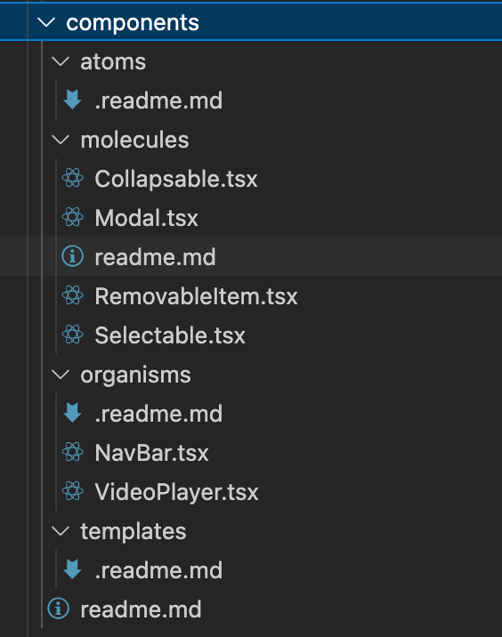
| Atomic Design | Consistent UI taxonomy (atoms/molecules/organisms) | Great for design systems, weaker at modeling product features and domain boundaries |
| Domain-Driven Design | Domain modeling, bounded contexts, business alignment | UI layering still needs rules; "domain" can become abstract without strong module constraints |
| Feature-Sliced Design | Predictable growth via layers, slices, and public APIs | Requires learning import rules and resisting "just import that file" shortcuts |
Why “folder-by-type” breaks component architecture
The most common structure is:
components/hooks/utils/services/
It feels clean early, but it doesn’t encode business intent or ownership. As features multiply:
- Components become cross-feature bundles.
- Hooks are shared without clear contracts.
- Services become a hidden domain layer with unclear boundaries.
Feature-Sliced Design instead aligns the structure with how products evolve: by adding and changing features, not by adding more files of the same kind.
Atomic Design vs FSD: friends, not enemies
Atomic Design is excellent for building a consistent UI kit. FSD is excellent for structuring the product around feature development. In practice, you can combine them:
- Use Atomic principles inside
shared/ui(tokens, primitives, patterns). - Use FSD layers and slices to keep features isolated and maintainable.
This pairing preserves the benefits of a design system while preventing feature code from turning into spaghetti.
How Feature-Sliced Design makes component architecture scalable by default
Feature-Sliced Design (FSD) is a community-driven methodology for frontend architecture that helps to mitigate common challenges in large-scale applications: tangled dependencies, inconsistent project structure, slow onboarding, and painful refactors.
Its core promise is simple: organize code by what it does (features and domains), and constrain how modules can depend on each other.
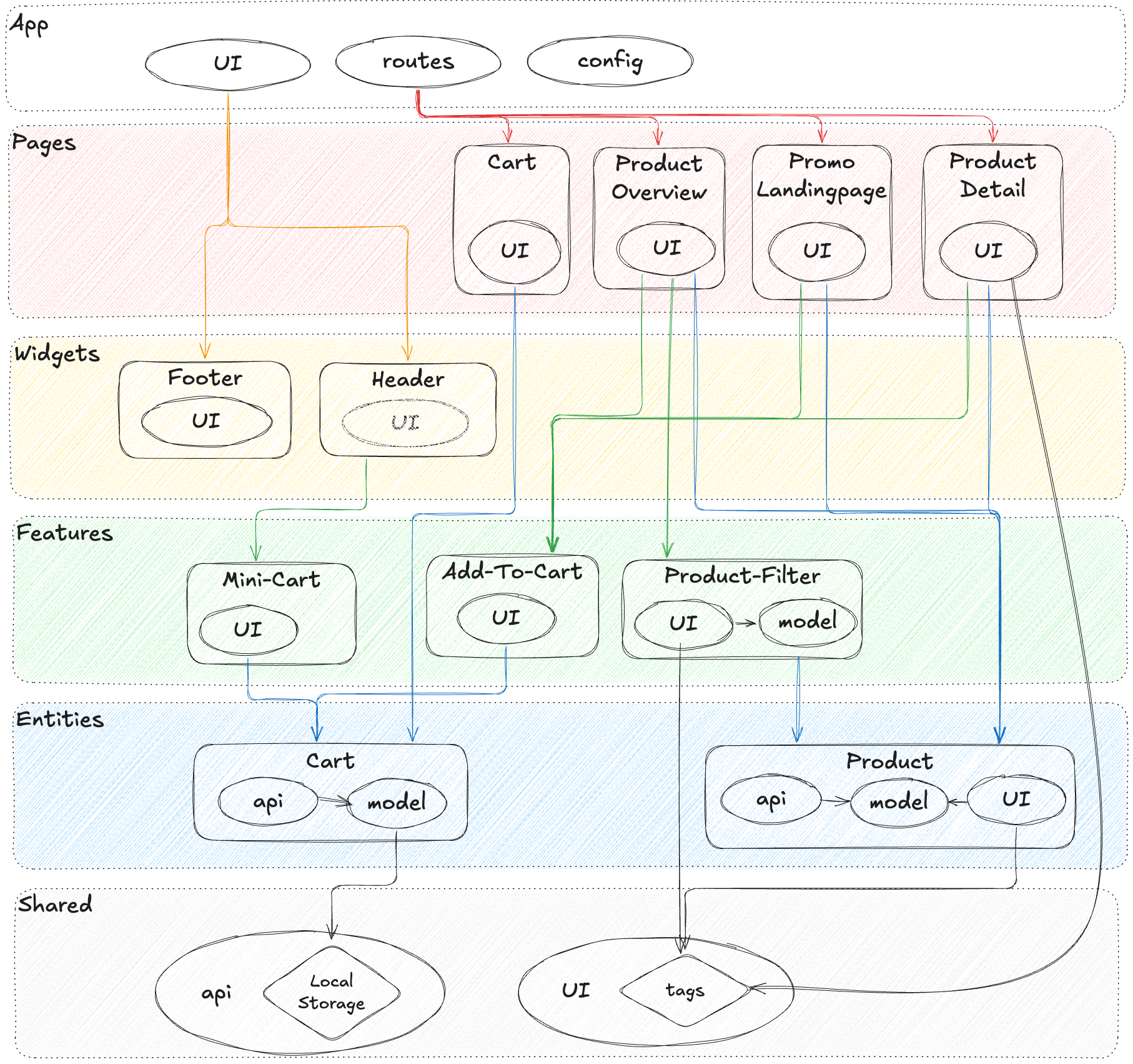
The FSD mental model: layers, slices, segments
FSD structures code in layers, typically:
- app: app initialization, providers, global styles, routing composition.
- pages: route-level screens.
- widgets: large UI blocks that compose features and entities.
- features: user-facing capabilities (search, add to cart, checkout step).
- entities: domain objects (user, product, order) and their representations.
- shared: reusable infrastructure, UI primitives, utilities, configuration.
Each layer contains slices (e.g., product, cart, auth), and slices contain segments such as:
ui(visual components)model(state, reducers, events, business rules)api(requests, adapters)lib(helpers)config(constants and feature flags)
This isn’t just organization. It encodes a dependency strategy:
- Higher layers can depend on lower layers.
- Slices are isolated through public APIs.
- Cross-slice imports are discouraged or tightly controlled.
A tangible directory structure
Here’s a concrete example structure for a commerce app:
src/ app/ providers/ router/ index.ts pages/ catalog/ ui/ catalog-page.tsx index.ts cart/ ui/ cart-page.tsx index.ts widgets/ header/ ui/ header.tsx index.ts features/ add-to-cart/ ui/ add-to-cart-button.tsx model/ use-add-to-cart.ts index.ts apply-coupon/ ui/ coupon-form.tsx model/ coupon.machine.ts index.ts entities/ product/ ui/ product-card.tsx model/ product.ts api/ product.api.ts index.ts cart/ model/ cart.ts api/ cart.api.ts index.ts shared/ ui/ button/ ui/ button.tsx index.ts modal/ model/ use-modal.ts ui/ modal.tsx index.ts lib/ format/ assert/ config/ env.ts
Notice the scaling properties:
- Features don’t leak their internals; consumers import from
features/add-to-cart. - Entities represent domain concepts and can be reused across features.
- Shared UI primitives are stable foundations, not feature dumping grounds.
Public API per slice: the practical secret
A slice’s index.ts is the contract. This is where you export:
- UI components meant to be used outside the slice.
- Model hooks/actions meant for integration.
- Types that are part of the stable interface.
Everything else is private.
This supports:
- Refactoring without fear (internal structure can change).
- Better tree-shaking (controlled exports).
- Clear ownership (teams know what to modify and what to avoid).
How FSD helps with state management
FSD does not force Redux or any single state library. Instead, it encourages placing state in the right architectural home:
- UI state stays close to
ui. - Business rules and state transitions live in
model. - Server interactions live in
api.
Example: features/apply-coupon can own the workflow state machine, while entities/cart owns the domain representation of totals and line items. This separation improves testability and reduces cross-feature coupling.
Patterns inside FSD: where they belong
FSD makes pattern choices easier because each layer has a typical role:
- shared/ui: headless UI, compound components, accessibility primitives, design tokens.
- entities/*/ui: presentational components for domain representation (
ProductCard,UserAvatar). - features/*/ui: interaction components tied to workflows (
AddToCartButton,CheckoutStep). - widgets: composition blocks that orchestrate multiple features/entities (
Header,CartSummary). - pages: route composition and layout decisions.
When responsibilities are aligned like this, the same pattern (e.g., container/presentational) becomes consistently applied rather than reinvented in every folder.
A step-by-step migration path (without boiling the ocean)
If you’re adopting FSD in an existing codebase, a gradual approach works well:
-
Start with shared UI boundaries
- Create
shared/uiand move truly generic components there. - Introduce public APIs (
index.ts) and stop importing internals.
- Create
-
Extract one high-value feature
- Pick a workflow with frequent changes (search, filters, onboarding).
- Create
features/<name>and move orchestration + UI there.
-
Introduce entities where the domain repeats
- When multiple features use the same concept (user, product), create
entities/<name>.
- When multiple features use the same concept (user, product), create
-
Build widgets and pages last
- Use widgets for repeated screen composition.
- Keep pages thin and declarative.
-
Enforce boundaries with tooling
- Add lint rules for import constraints.
- Use path aliases aligned to layers for clarity.
As demonstrated by projects using FSD, the biggest improvement often comes from predictability: developers stop debating structure and start shipping confidently.
Practical checklist: building and reviewing components that will survive growth
A scalable component architecture is maintained through repetition: consistent choices, consistent reviews, consistent contracts.
Use this checklist during design, implementation, and code review.
Component API checklist
- Semantic props: does the API express intent rather than implementation?
- Minimal surface area: are there too many flags controlling branches?
- Clear defaults: do default states cover common use cases?
- Extensibility: is customization supported via composition (children/slots) rather than prop explosions?
- Stability: does the public API hide internal structure?
State and side effects checklist
- State placement: is state colocated with the smallest owner?
- Derived state: are we storing something that should be computed?
- Server state: are we using caching/invalidation appropriately?
- Side effects: are analytics/navigation/network calls behind clear boundaries?
- Concurrency: are loading/error/empty states explicit and consistent?
Accessibility and UX checklist
- Keyboard support: can users navigate without a mouse?
- ARIA correctness: roles and labels are present where needed.
- Focus management: especially for modals, menus, and dialogs.
- Reduced motion: animations respect user preferences where appropriate.
- Responsive behavior: layout adapts without brittle hacks.
Styling and theming checklist
- Tokens first: spacing and colors come from a token system.
- No leaking styles: component styles don’t depend on page-level selectors.
- Variants are explicit: variant names map to design decisions, not ad-hoc tweaks.
- Override strategy: if overrides exist, they’re constrained and documented.
Testing and documentation checklist
- Unit tests for pure model logic (reducers/state machines).
- Component tests for interactions and rendering invariants.
- Integration tests for feature workflows (happy path + key errors).
- Visual regression for shared UI primitives and key widgets.
- Docs and examples that show composition, not just isolated props.
A repeatable review flow
- Boundary check: does it live in the right layer/slice?
- Contract check: is the public API intentional and stable?
- Dependency check: are imports aligned with the dependency rule?
- Behavior check: are states explicit and tested?
- Adoption check: is it documented so other teams can use it correctly?
This flow keeps quality high without slowing delivery, because it makes expectations clear.
Conclusion
Scalable component architecture isn’t about memorizing patterns—it’s about consistent boundaries, stable public APIs, and intentional UI composition that keeps change localized. When you combine disciplined component design (composition over inheritance, SRP, isolation) with pragmatic state partitioning and a well-structured component library, refactoring becomes routine and onboarding becomes faster. Adopting a structured architecture like Feature-Sliced Design is a long-term investment in code quality, team productivity, and confident delivery as your product grows.
Ready to build scalable and maintainable frontend projects? Dive into the official Feature-Sliced Design Documentation to get started.
Have questions or want to share your experience? Visit our homepage to learn more!
Disclaimer: The architectural patterns discussed in this article are based on the Feature-Sliced Design methodology. For detailed implementation guides and the latest updates, please refer to the official documentation.