Atomic Design: Build UIs That Actually Scale

TLDR:
Atomic design is a great way to structure UI composition—from atoms and molecules to organisms, templates, and pages—but taxonomy alone won’t stop large codebases from turning into spaghetti. This guide walks through the full Atomic Design model, shows how to build a scalable design system, and explains how Feature-Sliced Design (FSD) complements it with clear boundaries, public APIs, and predictable modular structure.
Atomic design is a powerful way to think about UI composition and to grow a component library into a consistent design system—but many teams discover that taxonomy alone doesn’t prevent frontend entropy. This article explains the five stages (atoms → pages), shows how to apply them in real projects, and then connects the dots to Feature-Sliced Design (FSD) from feature-sliced.design as a modern, production-ready way to scale beyond components.
Table of contents
- Why Atomic Design matters for scalable UI composition
- The five stages: atoms, molecules, organisms, templates, pages
- Where Atomic Design breaks down in large product codebases
- How to build a design system with Atomic Design
- A practical Atomic Design folder structure (and its limits)
- Atomic Design vs MVC/MVP/DDD and why comparison matters
- Feature-Sliced Design: scaling beyond components with clear boundaries
- Atomic Design + FSD: a pragmatic hybrid that scales
- Atomic Design in React, Vue, and Svelte
- Migration strategy: from ad-hoc UI to a scalable system
- Checklist: guardrails for long-term maintainability
- Conclusion
Why Atomic Design matters for scalable UI composition
A key principle in software engineering is that systems scale when boundaries scale: high cohesion inside modules, low coupling across modules, and clear public APIs. Atomic design supports this by giving teams a shared language for component granularity and reusability.
When a UI grows from “a few screens” to “hundreds of flows,” developers face recurring issues:
- Inconsistent components: three buttons, five modals, ten “cards,” all slightly different.
- Hard refactors: changing typography or spacing requires touching dozens of files.
- Slow onboarding: new teammates can’t predict where things live.
- Hidden coupling: a “simple” component imports feature logic, routing, analytics, or business rules.
Atomic design helps you:
- Build a pattern library and component catalog that’s easy to reason about.
- Improve UX consistency with shared primitives, tokens, and accessibility defaults.
- Reduce duplication by encouraging composition instead of copy/paste.
But atomic design is not a complete frontend architecture. It’s primarily a design system methodology and a UI decomposition model. The moment you start asking “Where does business logic go?” or “How do we prevent cross-feature imports?”, you need stronger structural rules—this is where Feature-Sliced Design (FSD) is often a better fit for product-scale code.
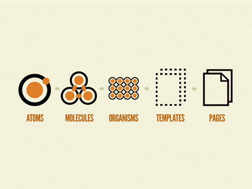
The five stages: atoms, molecules, organisms, templates, pages
Atomic design (popularized by Brad Frost) models UIs as a hierarchy, similar to chemistry. The goal is to make composition explicit, so teams can build reliable building blocks and assemble them predictably.
Think of it as a pyramid of responsibility:
Pages (real routes, data, state)
  Templates (layout + slots)
    Organisms (sections, complex UI blocks)
      Molecules (small composed controls)
        Atoms (basic primitives)
Atoms: primitives with strong contracts
Atoms are the smallest reusable UI elements: buttons, inputs, icons, labels, typography, spacing helpers. In practice, atoms often map to:
- HTML elements with styling and accessibility baked in (
Button,Link,Text,Icon) - Design token consumers (colors, typography scale, spacing scale)
- Foundation behaviors (focus rings, keyboard navigation, ARIA attributes)
What makes an atom “good” is not size—it’s stability and a clean public API.
Example contract (conceptual):
Button props:
  - variant: "primary" | "secondary" | "ghost"
  - size: "sm" | "md" | "lg"
  - disabled: boolean
  - onClick(event)
Rules:
  - no routing imports
  - no business logic imports
  - accessible by default (aria-disabled, focus-visible)
If your Button imports useAuth() or hardcodes analytics events, it’s no longer a foundation primitive—it’s an application component.
Molecules: composed controls that still feel “generic”
Molecules combine atoms into slightly richer controls: an input with label and hint, a search box with icon, a dropdown trigger with selected value. They typically:
- Implement micro-interactions (toggle, validation display)
- Encapsulate input wiring (label association, error slots)
- Provide consistent UX patterns across features
The key is generic composition. A molecule should be reusable across multiple contexts without importing feature rules.
Good molecule examples:
LabeledInput=Label + Input + HelperTextPasswordField=Input + IconButton + show/hide stateSearchInput=Input + Icon + clear action
Organisms: complex UI blocks with a purpose
Organisms are larger sections made of atoms and molecules: headers, footers, product cards, filter panels, navigation bars, data table toolbars.
This is where teams often lose control, because organisms feel “close to the product.” The question is: close to which product part?
If an organism is truly generic (e.g., AppHeader used across the entire app), it can belong to the design system layer or shared UI kit. But many organisms are domain-specific (e.g., CheckoutSummary, UserProfileHeader). When you treat every organism as “shared,” you risk cross-domain coupling and an unmaintainable mega-library.
A healthy rule of thumb:
- If it’s used broadly across unrelated areas, it’s a candidate for shared UI.
- If it’s used mainly inside one domain/feature, keep it near that domain/feature.
Templates: layout without concrete data
Templates define structure and layout—not final content. They answer: “How are these organisms arranged?” They are usually:
- Grid systems, layout wrappers, slot-based composition (
Header + Sidebar + Content) - Page scaffolds for consistent structure across flows
- A place to encode responsive behavior and layout tokens
Templates are valuable when layout consistency matters and you want a reusable “page skeleton” that doesn’t care about which data fills it.
Pages: real screens, routes, and integration points
Pages are where application concerns converge:
- Routing
- Data fetching
- State management
- Feature orchestration
- Error handling and loading states
- Observability hooks (analytics, performance)
In atomic design terms, pages compose templates and organisms into real user experiences. In architectural terms, pages are integration points and therefore require explicit boundaries to avoid turning into “God components.”
Where Atomic Design breaks down in large product codebases
Atomic design answers “What is this UI piece made of?” It does not fully answer “How should modules depend on each other?” That gap becomes painful as teams scale.
Leading architects suggest separating:
- Taxonomy: how you classify UI pieces (atoms/molecules/organisms)
- Topology: how modules depend on each other (layers, slices, boundaries)
Atomic design is taxonomy. FSD is topology (and more).
Taxonomy isn’t a dependency boundary
A typical atomic design folder structure looks clean at first:
ui/
  atoms/
  molecules/
  organisms/
  templates/
  pages/
But nothing prevents this:
atoms/Buttonimportsfeatures/checkout(coupling foundation to product logic)molecules/SearchInputimports routing to navigate on submitorganisms/UserCardimports user domain services and transforms data
Over time, “atoms” stop being atoms, and “organisms” become mini-applications.
The “organism inflation” problem
In many codebases, organisms become dumping grounds:
- A “UserProfileOrganism” that includes fetching, caching, routing, and business rules
- A “ProductListOrganism” that includes filters, pagination, experiments, analytics
- A “HeaderOrganism” that includes authentication flows and permissions checks
This increases coupling and reduces testability. It also makes reuse look possible (“it’s an organism!”) while reuse becomes unsafe (“it imports three features and global state”).
Why coupling grows faster than you expect
If you have N modules and allow arbitrary imports, the number of possible dependency edges grows roughly like:
- Worst case:
N * (N - 1) / 2
That's quadratic growth. Even if you never reach the worst case, the mental overhead grows fast: "Can I safely import this here?" becomes a daily tax.

Architectures that enforce layering reduce this by limiting import directions. Atomic design doesn’t prescribe that, which is why teams often supplement it with additional rules (lint constraints, boundaries, and module public APIs).
Common failure modes to watch for
If you’re “doing atomic design” but still feeling stuck, you’re probably hitting one of these:
- Inconsistent granularity: everything is either an atom or an organism; molecules don’t exist.
- Design system drift: “shared” components diverge across teams because no governance exists.
- Over-abstraction: components become too generic (“ConfigurableRenderer”) and hard to use.
- Under-abstraction: components are copied and renamed, creating hidden variants.
- Broken public APIs: consumers import deep paths (
ui/organisms/Header/internal/useHeader) and lock you in. - Domain leakage: design system components import domain entities, API clients, or feature toggles.
Atomic design isn’t “wrong” here. It’s just incomplete as a strategy for product-scale modularity.
How to build a design system with Atomic Design
Atomic design shines when you treat it as a design system architecture: a disciplined approach to building a UI kit, defining component contracts, and maintaining a consistent visual language.
Here’s a pragmatic step-by-step approach that works for React, Vue, Svelte, and Web Components.
Step 1: Start with design tokens as the stable foundation
Design tokens are the shared source of truth for:
- Color palette (including dark mode)
- Typography scale
- Spacing scale
- Border radius, elevation, motion, z-index
- Responsive breakpoints
- Semantic tokens (
color.text.primary,color.surface.elevated)
Tokens reduce “magic numbers” and make global changes safer.
A useful mental model:
- Base tokens: raw values (e.g.,
blue-600) - Semantic tokens: meaning (e.g.,
color.primary) - Component tokens: optional overrides for specific components (
button.bg.primary)
Token adoption improves consistency and enables theming, localization (RTL), and cross-platform alignment (web + mobile) without rewriting components.
Step 2: Define contracts and public APIs for every component
A robust component library is built on explicit contracts, not conventions.
For each component, define:
- Props / inputs
- Events / outputs
- Slots / composition points (especially in Vue and Svelte)
- Accessibility behavior (keyboard interactions, ARIA)
- Theming surface (what tokens affect it)
- What it does not do (no data fetching, no routing)
Also enforce a public API boundary:
- Consumers import from
@ui/buttonorshared/ui/button - They don’t import
internal/helpers - They don’t reach into subfolders
A simple convention that scales:
shared/ui/button/
  index.ts          (public API)
  button.tsx        (implementation)
  button.test.ts
  button.styles.ts
  internal/
    useButtonA11y.ts
Only index.ts is importable from outside.
This makes refactoring and versioning dramatically safer.
Step 3: Build a component catalog and documentation workflow
Atomic design pairs naturally with tools like Storybook and modern documentation:
- A Storybook (or similar) instance for interactive demos
- MDX/Markdown docs for usage guidelines and do/don’t examples
- Visual regression (Chromatic or equivalent) for UI stability
- Accessibility checks (axe, keyboard testing, color contrast)
Treat docs as part of the product:
- Each atom should have “variants and states” documented.
- Each molecule/organism should show composition examples.
- Templates should show layout constraints and breakpoints.
A design system without discoverability becomes shelfware.
Step 4: Establish governance and contribution rules
A design system is a product. Without governance, it becomes inconsistent.
Strong teams define:
- A contribution checklist (API review, a11y review, tests, docs)
- Deprecation rules (how to replace components safely)
- Versioning strategy (monorepo tags, semantic versioning)
- Ownership model (design system team or rotating maintainers)
This prevents the “everyone adds variants” collapse.
Step 5: Bake in quality via testing and automation
A scalable UI system needs layered testing:
- Unit tests for behaviors and edge cases
- Interaction tests for keyboard navigation and focus
- Snapshot tests sparingly (avoid brittle snapshots)
- Visual regression for styling stability
- Type-level constraints (TypeScript) for API safety
A positive loop emerges: stable primitives → faster feature delivery → fewer regressions → higher confidence.
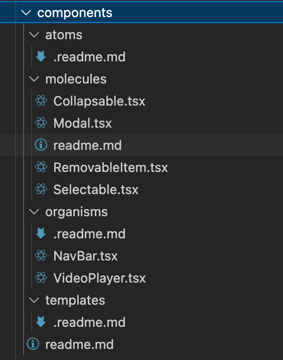
A practical Atomic Design folder structure (and its limits)
Atomic design often appears as a directory taxonomy. That can work—especially for a standalone UI kit—but you need to be clear about the scope.
Option A: A pure Atomic Design UI kit (design system repository)
This is ideal when your main goal is a reusable component library shared across products.
ui-kit/
  tokens/
  atoms/
    button/
    text/
    icon/
  molecules/
    labeled-input/
    search-input/
  organisms/
    app-header/
    data-table-toolbar/
  templates/
    dashboard-layout/
  pages/
    (optional demos)
  docs/
  tooling/
Pros:
- Clean taxonomy for design system work
- Easy Storybook mapping
- Good for multi-product reuse
Cons:
- Doesn’t solve product code organization
- Risk of pushing domain UI into “organisms”
Option B: Atomic taxonomy inside an application repo
Common in single-product apps:
src/
  ui/
    atoms/
    molecules/
    organisms/
  pages/
  features/
  entities/
  shared/
This is where confusion happens: ui/organisms becomes a magnet for “reusable but domain-ish” components, and boundaries blur.
A concrete example: login form composition
Atomic design encourages building up from primitives:
- Atoms:
Text,Input,Button,Icon - Molecules:
LabeledInput,PasswordField - Organism:
LoginForm - Template:
AuthLayout - Page:
LoginPage
A conceptual structure (framework-agnostic):
ui/
  atoms/
    button/
    input/
    text/
  molecules/
    labeled-input/
    password-field/
  organisms/
    login-form/
  templates/
    auth-layout/
  pages/
    login-page/
Where it goes wrong:
login-form/includes API calls and navigationauth-layout/includes feature toggles and user state- Atoms import application-specific analytics
Fixing this requires separating UI composition from feature logic, which is precisely what architectures like Feature-Sliced Design formalize.
Atomic Design vs MVC/MVP/DDD and why comparison matters
Comparing architectures is useful because each solves a different class of problems:
- MVC/MVP: separation of responsibilities (presentation vs logic)
- DDD: modeling complex domains with bounded contexts
- Atomic design: UI composition and design systems
- Feature-Sliced Design: scaling product code through slices, layers, and explicit boundaries
A practical comparison (3 columns max):
| Approach | What it organizes well | Typical scaling risks |
|---|---|---|
| MVC / MVP | Responsibilities (model/view/presenter), screen-level structure | Weak guidance for component reuse; UI modules still sprawl |
| Atomic design | Component library taxonomy, reusable UI composition, design system thinking | Taxonomy ≠ boundaries; organisms become mini-apps; domain leakage into shared UI |
| Feature-Sliced Design (FSD) | Product modularity by slices and layers; clear dependency rules; public APIs | Requires discipline and education; initial setup is an investment |
MVC and MVP: helpful for responsibilities, not enough for modular UI
MVC and MVP can improve separation of concerns, especially in older UI architectures. But modern component-based frameworks already push you toward composition.
What you still need:
- A strategy for reusable UI patterns
- A strategy for domain boundaries and feature isolation
- A predictable module layout and public API discipline
DDD and bounded contexts: great for domain complexity
DDD helps when your domain is complex (fintech, logistics, B2B workflows). It encourages:
- Explicit domain models
- Bounded contexts and domain boundaries
- Ubiquitous language shared by engineers and stakeholders
But DDD doesn’t prescribe UI component taxonomy. You can (and often should) use atomic design inside a DDD-inspired product architecture—provided you keep UI primitives clean and domain logic well-bounded.
Component-driven development and pattern libraries
Many teams use a “component-driven development” approach:
- Build components in isolation (Storybook)
- Compose into screens
- Document patterns and states
Atomic design fits nicely here, but again: without module boundaries and dependency rules, you still risk coupling and sprawl.
Feature-Sliced Design: scaling beyond components with clear boundaries
Feature-Sliced Design (FSD) is a frontend architectural methodology focused on maintainability at scale. It answers questions atomic design doesn't:
- Where does feature logic live?
- How do features depend on entities and shared UI?
- How do we prevent "deep imports" and accidental coupling?
- How do multiple teams work in parallel without stepping on each other?
FSD introduces layers, slices, and segments with explicit dependency direction. The exact layer naming can vary by implementation, but the core idea is consistent:
- Separate code by its role in the product (shared primitives vs domain entities vs features vs pages)
- Enforce dependency rules (higher-level modules depend on lower-level ones, not the reverse)
- Expose module functionality through public APIs
Why FSD improves modularity and refactoring safety
FSD encourages:
- High cohesion: feature logic stays inside a feature slice
- Low coupling: cross-feature usage goes through entities or shared code
- Isolation: features don’t import each other’s internals
- Discoverability: predictable folder structure across teams
As demonstrated by projects using FSD, developers can onboard faster because the architecture communicates “where things belong” and “what is safe to import.”
Public API as a first-class architectural tool
One of the most pragmatic FSD practices is explicit public APIs per slice:
features/
  checkout/
    index.ts          (public API)
    ui/
    model/
    lib/
    api/
Consumers import from features/checkout rather than deep paths. This:
- Enables internal refactors without breaking imports
- Improves encapsulation and reduces accidental coupling
- Supports versioning and gradual migration
Atomic design also benefits from this practice; combining the two is often the sweet spot.
Atomic Design + FSD: a pragmatic hybrid that scales
The most sustainable approach in real products is often:
- Use atomic design to build a consistent design system and shared UI primitives.
- Use Feature-Sliced Design to structure the product codebase by domain and feature boundaries.
Mapping Atomic Design stages into FSD layers
A practical mapping (3 columns max):
| Atomic stage | What it represents | Typical place in FSD |
|---|---|---|
| Atoms | Primitive UI building blocks (tokens, buttons, inputs, icons) | shared/ui (plus shared/config for tokens) |
| Molecules | Generic composed controls (labeled inputs, search box) | shared/ui or shared/lib (keep domain out) |
| Organisms | Complex blocks; can be generic or domain-specific | Generic: shared/ui; domain-specific: entities/<entity>/ui or features/<feature>/ui |
| Templates | Layout scaffolds, slot-based composition | Often pages/<page>/ui or widgets/<widget>/ui depending on scope |
| Pages | Routes/screens, integration points | pages/<page> (composition + orchestration) |
This mapping solves a common atomic design pain: not every organism is shared.
An example structure: scalable and searchable
A hybrid structure might look like this:
src/
  app/
    providers/
    routing/
    styles/
  shared/
    config/
      tokens/
    ui/
      button/
      input/
      labeled-input/
      modal/
    lib/
      a11y/
      format/
  entities/
    user/
      model/
      ui/
        user-avatar/
        user-card/
      api/
  features/
    auth-by-email/
      ui/
        login-form/
      model/
      api/
  pages/
    login/
      ui/
        login-page.tsx
      model/
  widgets/
    app-header/
      ui/
        app-header.tsx
Notice the difference:
- Atomic design concepts live inside
shared/uiand inentities/*/uiorfeatures/*/ui. - Feature logic and API calls don’t leak into atoms.
- Organisms are placed based on scope, not just “size.”
A concrete rule set that prevents spaghetti
If you want UIs that actually scale, write rules that your tools can enforce:
- No feature imports from shared UI primitives.
- No deep imports across slices (import from slice public API only).
- Entities are reusable; features are not (features are product capabilities, not libraries).
- Pages orchestrate; primitives render (pages assemble data + state, primitives focus on UI).
These rules are easy to explain, easy to lint, and easy to maintain.
Atomic Design in React, Vue, and Svelte
Atomic design is framework-agnostic, but the implementation details differ. Below are pragmatic patterns that preserve isolation, testability, and predictable composition.
React: composable components with typed public APIs
React encourages composition through props and children. Combine that with TypeScript for contract clarity.
Atom example:
shared/ui/button/index.ts
  export { Button } from "./button"
  export type { ButtonProps } from "./types"

shared/ui/button/types.ts
  export type ButtonProps = {
    variant?: "primary" | "secondary" | "ghost"
    size?: "sm" | "md" | "lg"
    disabled?: boolean
    onClick?: () => void
    children: ReactNode
  }
Molecule example (generic):
shared/ui/labeled-input/labeled-input.tsx
  function LabeledInput({ label, hint, error, ...inputProps }) {
    return (
      <div>
        <Label>{label}</Label>
        <Input aria-invalid={!!error} {...inputProps} />
        {error ? <HelperText tone="danger">{error}</HelperText> : <HelperText>{hint}</HelperText>}
      </div>
    )
  }
Organism example (feature-specific):
features/auth-by-email/ui/login-form/login-form.tsx
  function LoginForm() {
    const { form, submit, isLoading, error } = useLoginFormModel()
    return (
      <form onSubmit={submit}>
        <LabeledInput label="Email" value={form.email} onChange={form.setEmail} />
        <PasswordField label="Password" value={form.password} onChange={form.setPassword} />
        {error && <Alert>{error}</Alert>}
        <Button variant="primary" disabled={isLoading}>Sign in</Button>
      </form>
    )
  }
Notice how atomic design composition exists, but boundaries come from FSD:
shared/ui/*has no feature imports.features/*is allowed to use shared UI and entities.
Vue: single-file components and slots for flexible composition
Vue’s slots are excellent for controlled extensibility—perfect for molecules and organisms.
Atom-like component with semantic props:
shared/ui/Button/Button.vue
  props:
    variant: "primary" | "secondary" | "ghost"
    size: "sm" | "md" | "lg"
Molecule with slots:
shared/ui/LabeledInput/LabeledInput.vue
  props:
    label: string
    error: string?
  slots:
    default (the input)
    hint (optional hint content)
This makes the molecule reusable across domains while allowing flexibility.
Feature organism in Vue:
features/auth-by-email/ui/LoginForm/LoginForm.vue
  uses shared/ui components and feature model composables
  never imported by shared/ui
Svelte: stores and actions with clean module boundaries
Svelte’s component model is concise, but it’s easy to leak app logic into shared components. Keep atoms dumb and isolate state in feature slices.
Atom:
shared/ui/Button.svelte
  export let variant = "primary"
  export let disabled = false
Feature logic:
features/auth-by-email/model/login.store.ts
  export const loginState = writable({ email: "", password: "", status: "idle" })
Feature organism:
features/auth-by-email/ui/LoginForm.svelte
  imports shared/ui atoms and feature store
  handles submit, loading state, errors
This preserves atomic design composition without mixing concerns.
Migration strategy: from ad-hoc UI to a scalable system
Most teams don’t start with atomic design or FSD. They inherit a codebase with inconsistent components, mixed responsibilities, and unclear ownership. The good news: you can migrate incrementally.
Step 1: Inventory and de-duplicate UI patterns
Start by cataloging:
- Buttons (variants, sizes, states)
- Form inputs (labels, errors, hints)
- Modals, toasts, alerts
- Typography and spacing patterns
Create a small “UI audit” doc with screenshots and component names. This is a practical way to align design and engineering on what should become atoms and molecules.
Step 2: Introduce tokens and normalize primitives
Before building a huge library, pick the highest-leverage primitives:
ButtonInputTextIconStack/ spacing utilitiesModal(if central)
Make them accessible by default. You’ll immediately reduce UI drift.
Step 3: Create a shared UI layer with strict boundaries
Add a shared/ui (or ui-kit) area with a strong rule:
- No feature logic imports.
- No API clients.
- No routing.
This protects your design system from becoming application-specific.
Step 4: Move domain UI to entities and features
As you extract larger components, place them intentionally:
- If it represents a domain concept (User, Product, Order), it often belongs in
entities/<entity>/ui. - If it represents a product capability (auth, checkout, filters), it belongs in
features/<feature>/ui. - If it’s a reusable layout block used across pages, it may become a
widget.
This is how you avoid “organism inflation.”
Step 5: Add public APIs and lint boundaries
The fastest way to improve maintainability is to prevent future damage:
- Add
index.tspublic APIs for slices - Add lint rules to forbid deep imports
- Add import constraints between layers
This doesn’t require rewriting the whole app. It creates a safer path for incremental refactoring.
Step 6: Upgrade documentation and onboarding
Document:
- Where shared atoms/molecules live
- How to add a new component
- How to decide between
shared,entities,features,widgets, andpages - How to deprecate and replace components
A small architectural README pays dividends in team productivity.
Checklist: guardrails for long-term maintainability
Use this checklist to keep atomic design and your architecture healthy as the project grows.
Component quality
- • Atoms are stable primitives with a small public API.
- • Molecules are generic and don’t embed domain rules.
- • Organisms are scoped correctly (shared vs entity vs feature).
- • Every component defines states: hover, focus, disabled, loading, error.
- • Accessibility is default: keyboard support, ARIA, focus management.
Architectural boundaries
- • Shared UI never imports features.
- • Features don’t import other features’ internals.
- • Entities expose reusable domain UI and models through public APIs.
- • Pages orchestrate; they don’t become dumping grounds.
- • Deep imports are forbidden; use slice
indexexports.
Maintainability and scale signals
- • If “finding the right component” takes more than a minute, improve discoverability.
- • If the same UI appears in 3+ places, extract a shared pattern with a clear contract.
- • If a shared component requires feature flags or routing, it likely belongs in a feature or widget.
- • If refactoring breaks unrelated pages, coupling is too high—tighten boundaries.
A simple decision heuristic
When you’re unsure where a component belongs, ask:
- Scope: Is it used across unrelated domains?
- Meaning: Does it represent a domain concept (User, Order)?
- Behavior: Does it implement a product capability (auth, checkout)?
- Dependencies: Does it require state, routing, or API calls?
Atomic design helps with “what it is.” FSD helps with “where it belongs.”
Conclusion
Atomic design provides an excellent mental model for building a component library and evolving it into a design system: start from stable atoms, compose into molecules and organisms, and assemble templates and pages with predictable UI composition. The biggest scaling wins come from strong contracts, accessible primitives, tokens, and disciplined reuse. But to scale a real product codebase, you also need enforceable boundaries, clear ownership, and a public API strategy—this is where Feature-Sliced Design (FSD) helps to mitigate common challenges like cross-feature coupling and unmaintainable “mega-organisms.” Adopting a structured architecture is a long-term investment in code quality, refactoring speed, and team productivity.
Ready to build scalable and maintainable frontend projects? Dive into the official Feature-Sliced Design Documentation to get started.
Disclaimer: The architectural patterns discussed in this article are based on the Feature-Sliced Design methodology. For detailed implementation guides and the latest updates, please refer to the official documentation.